

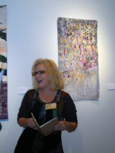
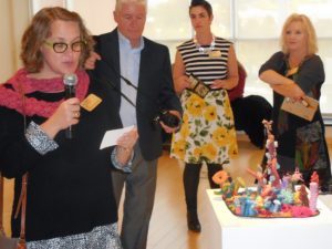
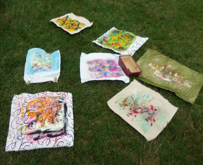
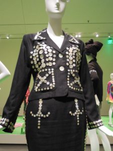
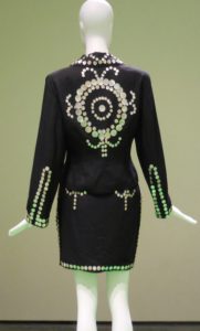
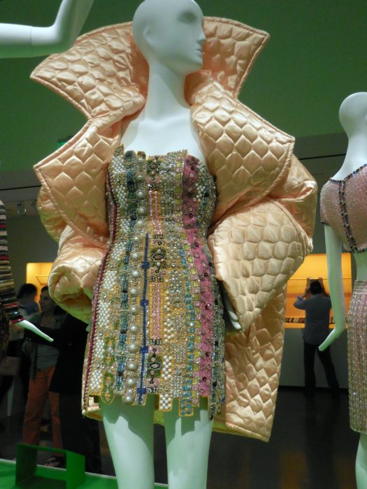
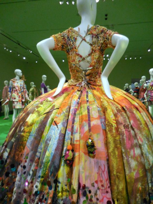
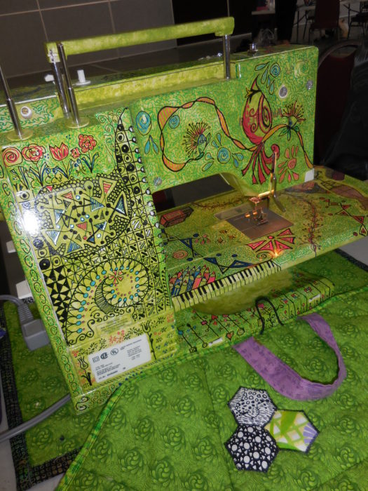
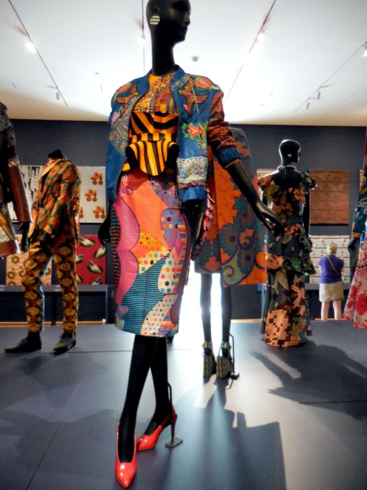
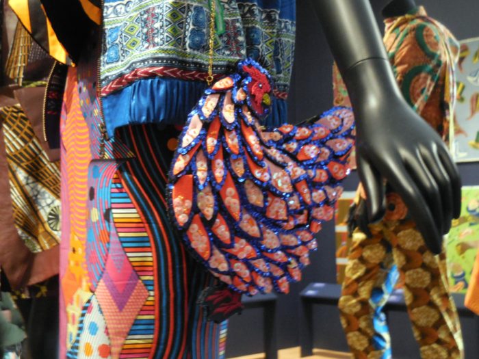
Sharing today some of the more sophisticated, inspiring pieces at the show. Apologies that the photography is not up to par, but google these artists and see more of their work on their websites.
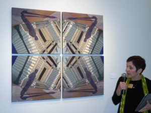
Cindy Friedman discusses this quartet (quadriptych?), like much of her work, a mirrored shadow-play. I always wanna shadow Cindy in her studio!
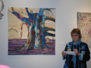
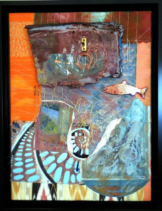
Marty Ressler created a paean to the oldest tree in America. Found objects and unusual colors grow along the bark.
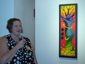
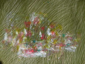
Sara Mika of Mock Pie Studio Art Quilts cooked up another view of tree-hugging…and one of the most colorful pieces.
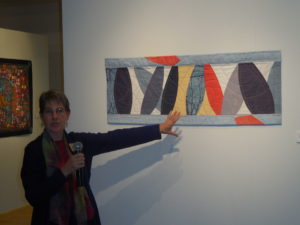
Elizabeth Bennett gave up using lots of little shapes to go in a new direction. Very modern, just enough hand-quilting in lines that playfully balance and complement.
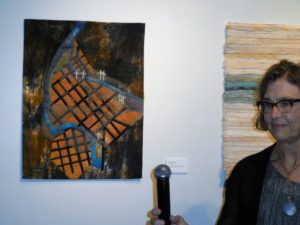
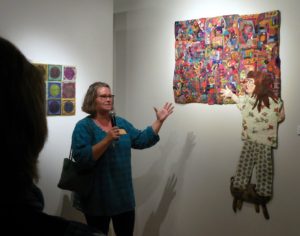
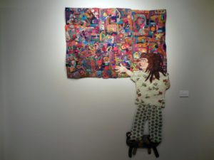
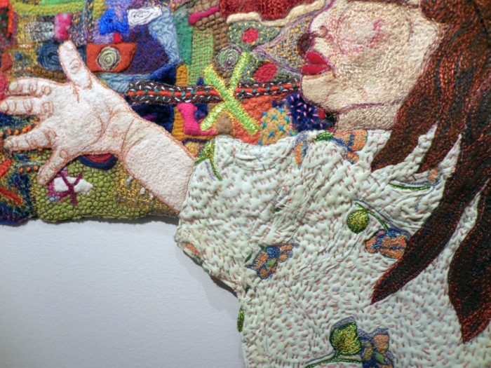
Elizabeth Danish put the inexpressible sadness of a flood that took many family lives into this piece, and into the moving statement she delivered.
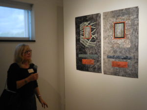
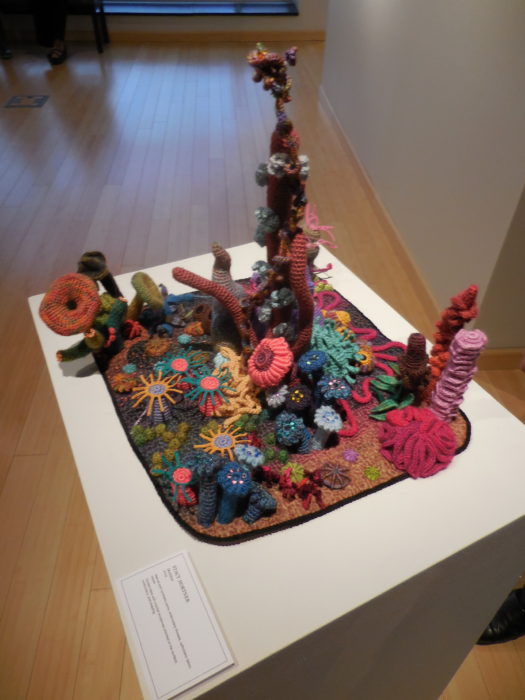
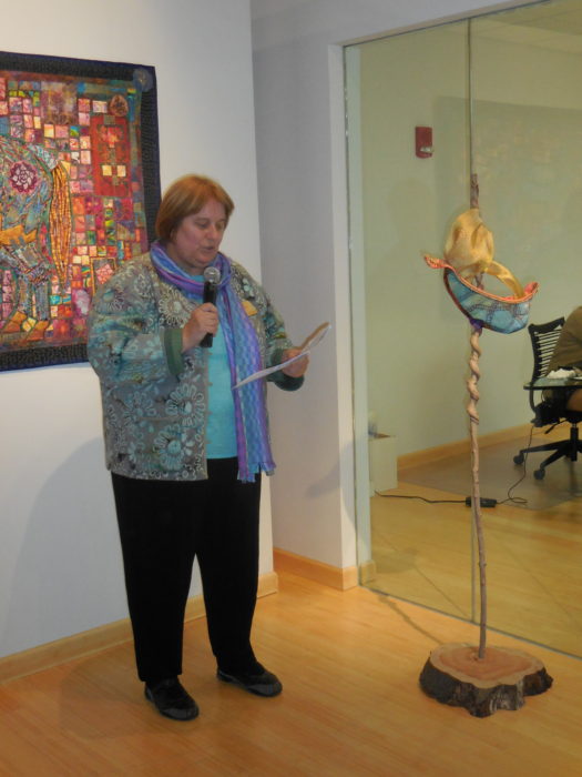
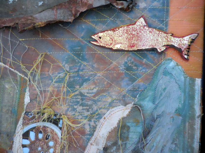
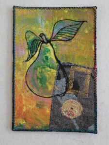
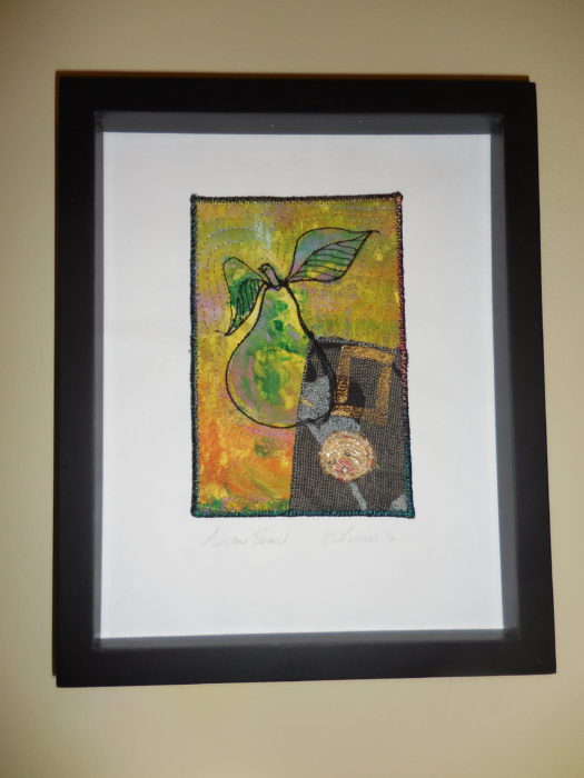
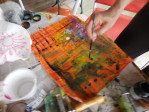
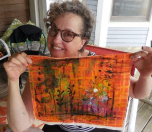
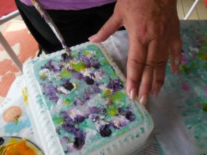
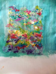
Lots of interesting techniques in this piece by Paula Swett. I sure want to know more…
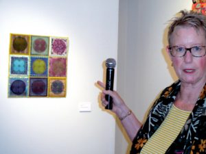
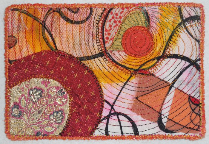
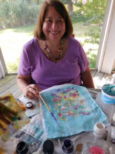
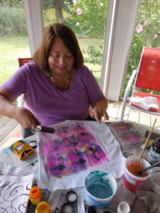
Susan Leonard often works in series of circles in squares, exquisitely, perfectly rendered…and she generously divulged the secrets of her techniques.
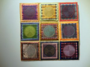
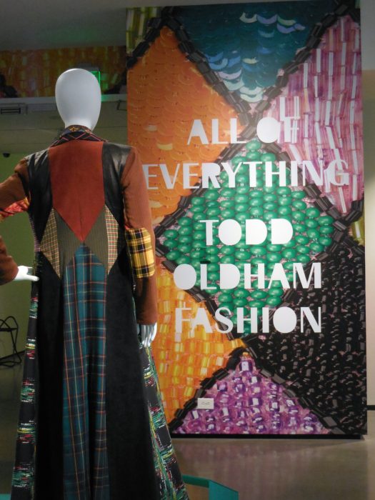
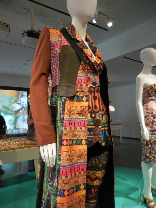
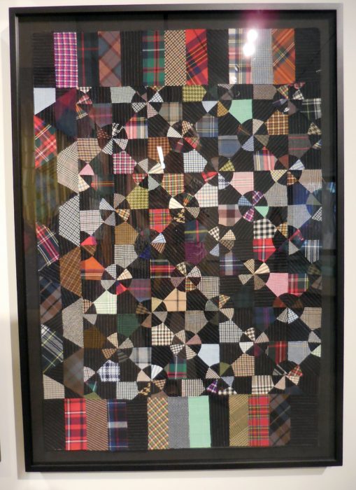
A second Susan Leonard piece is called School Daze, as its plaids reminded her of what she (and we all) wore…
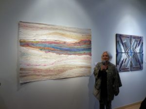
Made with silk ribbons cut from vintage Japanese kimonos. Elena Stokes is great at flow, no?
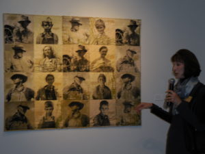
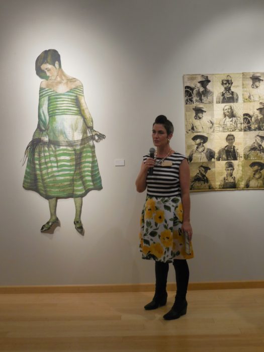
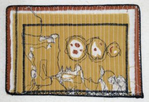
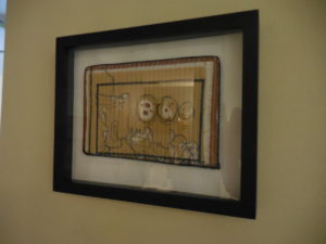
Patricia Kennedy-Zafred transfered vintage photos from the old west onto feedsack bags.
I covet this vividly, visually textural diptych by Donna Albert, with images of bamboo stalks at the center of each. What’s the feminine form of the adjective masterful?


So inspiring! Kinda makes me want to take up quilting.Thanks for sharing–you are somewhat mistressful yourself. (grin)
Keep up the weaving, but think about stitching together all those trimmed pieces, or simply couch or applique them over a ready-made jacket so it expresses your aesthetic. I still love my Bonnie Tarses wrapped threads pin, woven padded box, colorful cards…
Hi Eleanor, thanks for including me and my work in your post! Actually, it’s made with remnants of old silk saris from India that have been torn into strips. Though, I am wearing a Japanese hoari, similar to a kimono. So much gorgeous silk, so little time!
So glad to get that clarification, Elena. Your work is stunning.
Thanks Elly! Just a note that the piece you are showing is comprised of silkscreened images on hand dyed fabric. The other quilt had images silkscreened on old vintage feed sacks. The images are from the Farm Security Administration collection taken in the 1930’s, courtesy of the Library of Congress. Great work in this exhibition!
Thanks for the explanation! Both pieces are powerful.