Eleanor Levie HomeAboutEditorial ServicesBooksGallerySpeaker TopicsWorkshopsPast BookingsFree StuffLInks Contact Me

Inspiring Quilting: Elly's blog to boost your creative IQ

Archive for the ‘Exhibitions’ Category

Line, contrast, form

Wednesday, February 17th, 2021

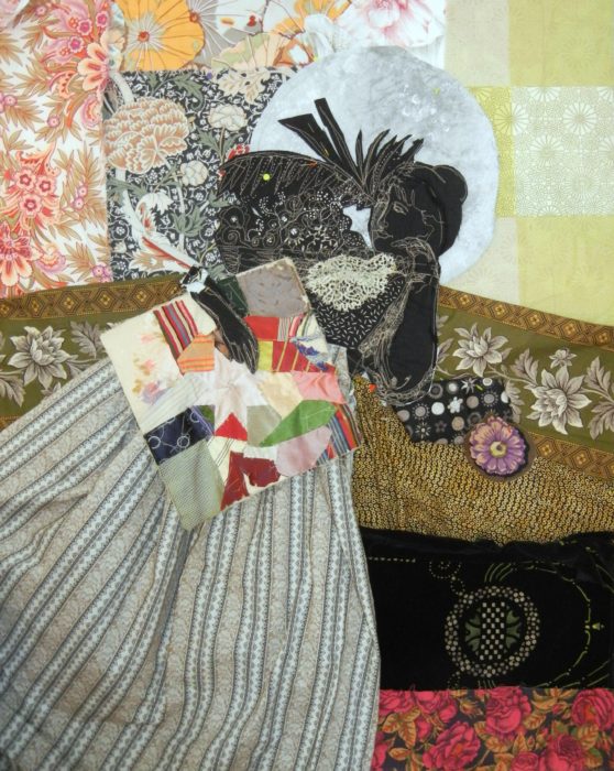
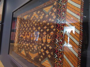
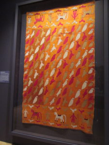
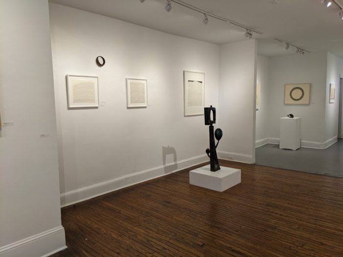
No, not quilts this time. But I just have to share the sublime work of Cheryl Levin which I caught on the last day of her exhibition at Da Vinci Art Alliance on Valentine’s Day.

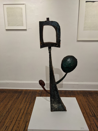
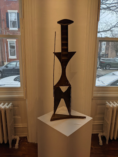
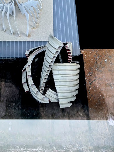
Here’s the description on DVAA’s website: “Forms for a Continued Life is an exhibition of ink drawings by Cheryl Levin shown alongside sculptures and fragments by her late husband, metal worker Robert Phillips (1962-2012), and their son, Electrical Engineer and Generative Artist Aidan Phillips. This visual art exhibition contrasts weight and form to investigate impermanence, collective grief, and emergence of life from loss.”

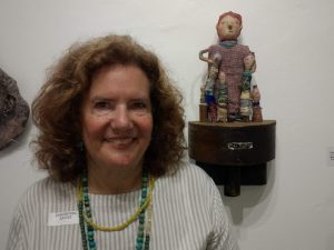
Heavy, right? I met Cheryl a few years ago, when she worked alongside her friend DaVid Harari to paint our balconies. DaVid is a highly skilled housepainter; the tall, dark, and handsome Israeli has a flip side: musician and music lover. Cheryl is a warm and gracious, humble, petite and pretty woman who sometimes joins DaVid for some house-painting jobs, and offers custom faux finishes and murals to clients. And, she’s a highly conceptual contemporary artist. I’m dazzled by her backstory of partnering with her late husband in creating big works of public art and the ways she evokes very quiet, private emotions in the work of this exhibit. Learn more about her many dimensions — including her very colorful paintings — on her website: http://www.cheryllevin.org

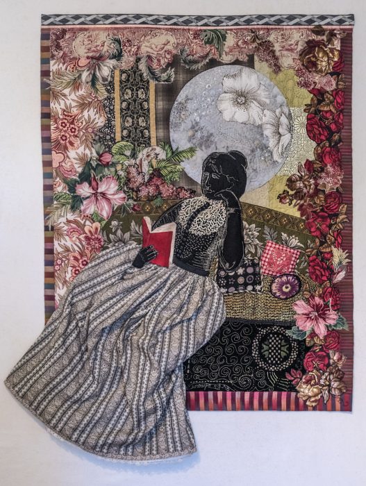
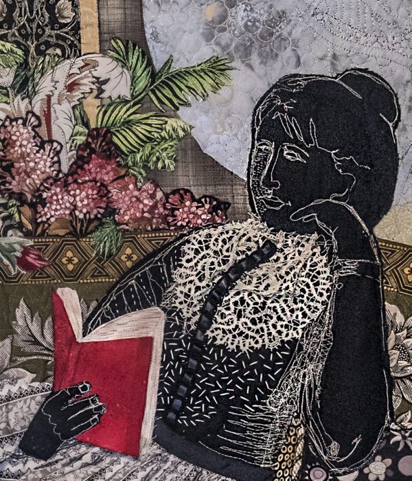
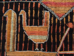
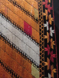
I’m posting to share my own reaction to this exhibit of tightly curated works. And since this is my quilting blog, I’ll take the privilege of citing the elements I savored which echo the ones that get me jazzed about art quilts:

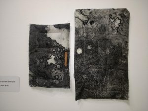
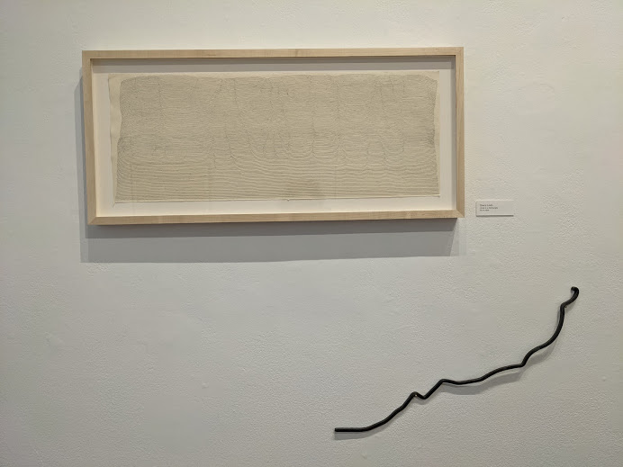
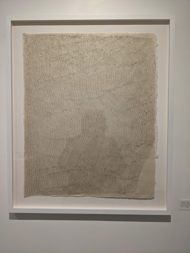
1–Fine lines (like dense, hand-driven machine quilting)

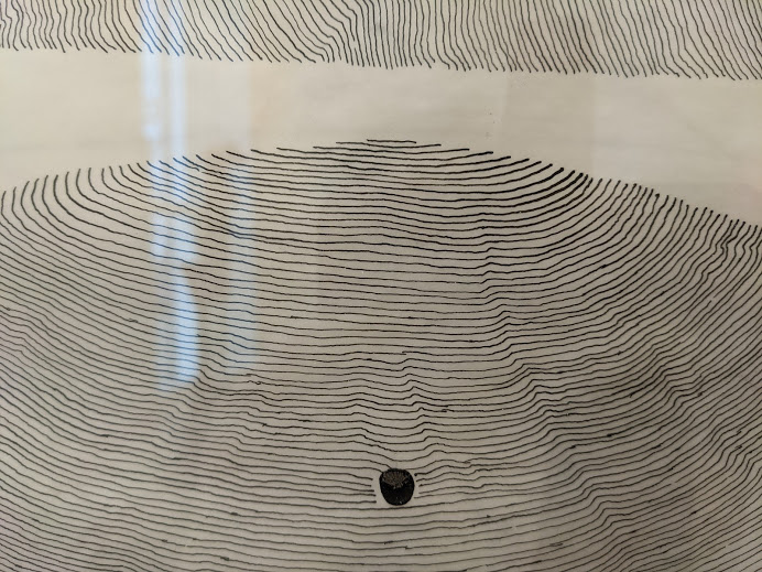
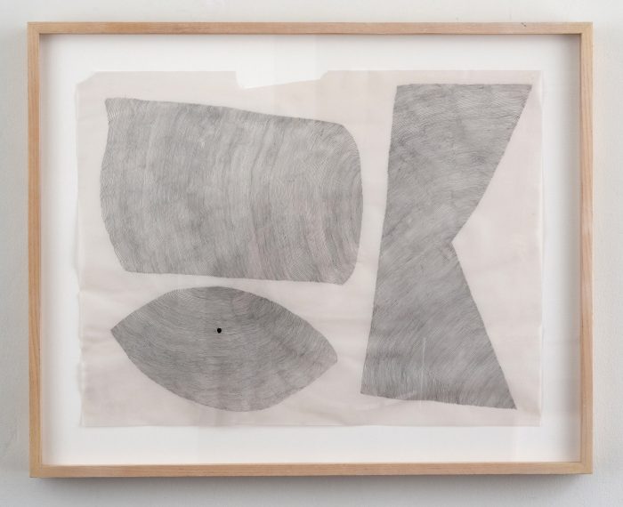
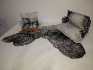
2–Contrast of delicacy and strength (In contemporary quilts, I’m talking about pinstripe stitching paired with monumental shapes and dimensions.) Oooh, those fine lines hand-inked with a pen in rhythmic repetition vs. the weight of the substantial, seemingly solid forms they fill. And, of course, the absolutely huge contrast of her meditative drawing with the often craggy and robust steel sculptures of her late husband.

3–How being at the exhibit in real life allowed me to interact with it: Moving through the spaces. Seeing how the light hit at different angles. Avoiding the inevitable glare from the glass but occasionally tickled by how spots of track-light reflections occupied the margins. Unknowingly casting my shadow on it, and thereby becoming a part of the art. (OK, that was presumptuous and vain of me).

How fortunate I am to be a member of Da Vinci Art Alliance, which allows me to visit during Covid closures elsewhere — albeit by appointment, masked, with only the executive director of DVAA and my husband present. Kudos to all the people and places that allow us to interact with art and artists in the only ways possible during the pandemic. I’m surfing the net, Zooming with other artists, watching lots of different PowerPoint presentations.

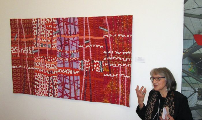
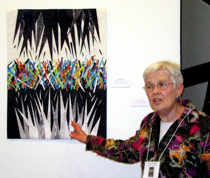
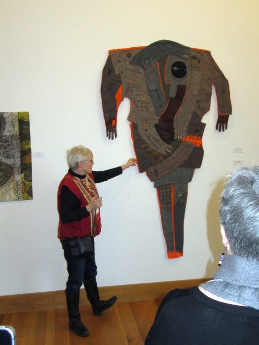
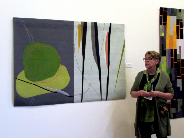
But aren’t we all starving to visit museums and galleries IRL–in real life, to be alongside teachers and students in art classes, workshops, and live crit sessions? There’s just nothing like seeing art — and art quilts — up close and personal. There’s nothing as great as getting together in person, unmasked, with the talented makers, critics, and art lovers to share our stories and perspectives as well as what we make.

Art in Aarhus

Tuesday, February 2nd, 2021

Because we have a son and daughter-in-law and baby grandson living in Aarhus, Denmark has graciously allowed us to visit — with all due process of Covid testing, natch. Denmark is on lockdown, with only grocery stores and pharmacies open. Even so, walks in icy, mostly gray January and February weather yield lots of cool sights re: architecture, design, and art. And plenty of inspiration for quilting, I daresay.

The above mural continues, as shown below. It occupies the wall of a driveway leading to a parking lot.

Believe it or not, the “gallery” below takes up two facing walls of another passageway to a parking lot:

Murals aren’t nearly as numerous as in hometown Philly — dubbed the City of Murals with a Mural Arts Program that has made it the largest public arts program in the United States. Still, art finds a home in Aarhus on many a vertical space, no matter how odd-shaped, narrow or wide it may be:

The next photo depicts tagging more than street art, and comes with a message of protest:

Look down to find pure pattern:

Then, look up: specifically, at the ceiling under the library. I hear that Penn Station in NYC adopted this upside down design idea for a ceiling as well. Has anyone seen it?

In the windows of what I take to be an art school, I gather the instructors have presented some pretty cool assignments.

Finally, at least for now, our son’s latest art project in his spare time: 3-d printed photos. The thinnest areas allow the most light to penetrate, the thickest are almost opaque. Result, a really detailed image. Of the grandson, of course. Which we’ll hang in a window when we get home.

Mali Medallion

Monday, August 12th, 2019

It’s my favorite thing: art quilts as advocacy.

So I was quick to answer the call from Quilt for Change and The Advocacy Project. Under the initiative, known as Sister Artists, survivors of gender-based violence created embroidered blocks depicting scenes of their life in Mali. Quilters — mostly American — were invited to choose a block and turn it into an art quilt. The plan is for the quilts to be posted online, exhibited, and auctioned. And then all proceeds will go to support the artists in Mali and Sini Sanuman (“Healthy Tomorrow”), a Malian advocacy program for women’s rights.

That sounded totally worthwhile to me. I especially liked the roundhouses on the block shown at the upper left, and below. For reasons of safety and policy, the young woman, i.e., Sister Artist, may not be named. Nevertheless, my priority was to honor her and her work.

I immediately envisioned the lovely, pictorial embroidery surrounded by geometric designs used in Mali villages. A good friend, artist Janet Goldner, visits Mali quite frequently, and shared pictures she recently took of a house painting festival that takes place once a year in Siby, a village about 30 miles from Bamako (the capital and largest city in the country). Women draw from the local clay colors for their color palette. Wow, right?! So with the embroidery at the heart of my art, I set out to build around it, log-cabin-style.

The embroidery background was not square, so I went with an assymetrical medallion setting, sketched out on graph paper. Now, I invariably depart from my original plan fairly quickly, but this time — surprise, surprise — I basically stuck to it. Oh, I didn’t keep to a specific scale, nor did I measure, cut, and sew precise patchwork or applique circles as dictated by the sketch. Instead, queen of the quick and dirty that I am, I used freehand-cut fused triangles and patterned fabric from my stash of African, batik, and hand dyed and printed fabrics. There was quite a bit of seat-of-the-pants fudging-it as I added rounds of borders. Conveniently, African beads camouflage spots where angles and corners lack sharp points.

I hope my piece does justice to the embroidered block. I hope it calls attention to the need for human rights, justice, and equality in Mali, as they are needed and deserved everywhere in the world. My efforts here are a small show of support, relatively insignificant. If I could, I would pin a medal on each courageous woman anywhere who struggles and strives and supports her sisters. For now, my Mali Medallion will have to do.

My Sanctuary City

Friday, April 26th, 2019
Sanctuary City, detail

Last summer, I took a collage class at QSDS–Quilt & Surface Design–from Deborah Fell.

Standing alongside my design wall in Deborah Fell’s class.

See that sprawling assemblage to the left of my hip? It started as a small abstract composition…abstraction being something I aspire to. But I can’t help myself; my work invariably calls to mind some object or scene, and I’m off to flesh out figurative or landscape designs.

This held true here: I saw buildings and began to recreate my current hometown of Philadelphia. I had a few recognizable buildings, some vague representations, the Schuylkill River on the left, the Delaware River on the right. It came together in stages, and I placed sturdy pieces of canvas or upholstery weight fabric under the expanding areas as foundations for a large, odd-shaped wall hanging.

City between two rivers…

A few months later, I read about a SAQA (Studio Art Quilters Association) call for entry: Forced to Flee. The theme resonated. As a volunteer, I’ve long advocated for compassionate immigration reform and protested against Muslim bans, the Wall, family separations, and inhumane detention centers. I decided to finish my cityscape to express pride that Philadelphia is one among hundreds of sanctuary cities in the U.S. My “city of brotherly love” (sisterly love is implied!) accepts its moral obligation to protect immigrants and refugees. City leaders and activists alike fight against detentions, deportations, family separations, and discrimination. We rise to welcome the stranger, give shelter, secure safe haven for those “forced to flee.”

Knowing the caliber of work submitted to a SAQA show, I thought I’d have less competition for a 3-D piece, and be more likely to get in. So, I traced around an oval trashcan for a pattern — cuz what better to give me elegance than a trashcan? I continued to build my city over thick Pel-tex stabilizer so the vessel would be an upstanding example. Alternately, I worked on the inside surface, using a vintage quilt fragment for its soft, comforting associations, plus emergency mylar thermal blankets of the sort that are given to detainees. I cannot express how much struggling, how much cursing, how many broken needles went into assembling this beast. It stands 28” high. To ensure steadiness without adding weights, I fashioned a spiral pathway with signs and symbols of concern and welcome: bi-lingual expressions, caution tape, keys and safety pins and zippers.

There were further frustrations as I hand-stitched the elements together. Then I had to photograph it to try and meet the demands for pixels, clarity, background, and appropriate depth of field. I managed to submit my information and images 45 minutes before the deadline.

I didn’t get in to the Forced to Flee show. I get it. Jurors receive hundreds of submissions and usually curate down to under 50 — for a cohesive, high-quality exhibit at venues with limited spaces. Perhaps my piece was too discombobulated and did not appeal to the judge. Perhaps there were no other 3-D pieces and this would have been odd man out. And perhaps my photos weren’t up to what SAQA demands for not only the judging, but also the catalog.

Rejection gave me several advantages: I really wasn’t satisfied with the piece, and was now free to make significant changes. Another SAQA call for entry beckoned: 3-D expressions. I had time to revise and polish the composition from all sides and the inside. New construction and embellishment strengthened the overall aesthetic and referenced more Philly iconography. I added more vintage mini-blocks and doilies to the inside, and crocheted an oval rug to cozy up the “inner sanctum.” I want those who see the piece to take time to walk around it and peer inside. And yeah, I’m tempted to throw in little stuffed heart-shaped pillows, additional keys, and poems of welcome…but mostly because I don’t know when to stop. What do you think? More secrets and treasures? Or enough already?!?

Happier with the piece, I took the time to hire an expert photographer — Gary Grissom — and set it up in a better-lit niche. Now I felt more confident submitting it to the other show.

More time and attention to detail and good workmanship, along with professional shots, did the trick. I got in!

Icing on this cake is the impressive decision-maker, an art professor and gallery director who is one of the finest modern fiber curators in the world. (Oh, and he’s a Philadelphian.!) SAQA’s website states, “The wide variety of pieces selected by juror Bruce Hoffman include vessels, wearables, wall-pieces, and sculptural artworks. This cutting-edge exhibition shows how textile art can expand both into the third dimension and into the future.”

This exhibition, 3-D Expression, will premiere at the Gerald R. Ford Presidential Museum in Grand Rapids, Michigan in September 2019. I am angling to see while it’s there. Aside from the honor of having my work included, I would be thrilled to study all the other works in the only way they can truly be appreciated: by walking around them and checking them out from every angle.

Meanwhile, I’m back to making essentially 2-D art quilts for a while. Oh, and shopping for a workhorse of a sewing machine that may allow for thick, sculptural work in the months to come.

Threads of Resistance, in the cloth!

Sunday, September 16th, 2018

At the same time I launched United We Quilt, a group of fabric artists called the Artists Circle Alliance put out a call for entry to Threads of Resistance.

The two shows are sisters–both expressing deep concerns for the character, policies, and actions of the Trump administration.

UWQ has been, from the beginning, strictly a digital gallery–and if you’re reading this, do consider submitting a work of your own. The only deadline is when democracy has been restored. Every day the president gives us something else to provoke anger and concern and inspire speaking up for justice, with words, deeds, and art. I’m proud of the capacity and accessibility of UWQ for doing justice to each work and its maker.

ToR, however, was designed as a traveling show. No doubt it has involved a huge investment; the managing of finances, insurance policies, and storage; negotiations and legal contracts with venues and insurance agencies; transportation coordination; and answering to the needs of everyone who submitted work and everyone involved in showing the work. The political theme made this show exponentially more time-consuming and risky. In fact, several venues were cancelled and one was shortened…I can’t help thinking it was because the booking was arranged before the producers understood how subversively “in your face” some of the content was; I assume they caved to complaints.

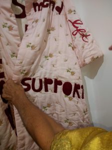
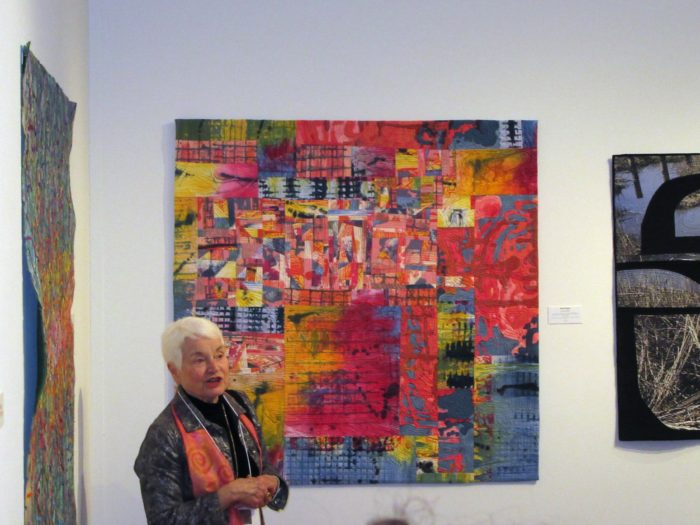
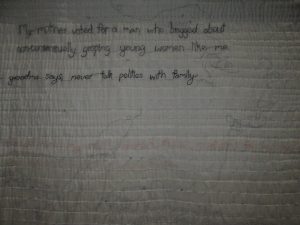
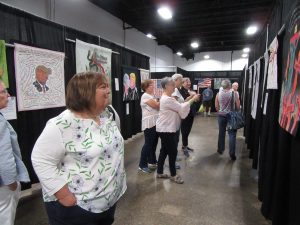
Yesterday, I got to see ToR at the Pennsylvania National Quilt Extravaganza. It was one among many exhibitions and competitions of quilts eliciting oohs and aahs over extraordinarily gorgeous workmanship, composition, brilliance or graphic power. Signs on the ends of the aisles of this exhibit clarified a disclaimer.

And yes, the Mancuso team that manages PNQE received complaints about gratuitous nudity, use of expletives, and anger expressed in, of all things, a quilt.

BUT. No doubt about it, ToR attracted the most attention, had the biggest crowds, and garnered the most lingering views, cell-phone photography, and conversation of anything in the cavernous exposition halls. I think many viewers were not used to seeing statement art quilts. And I give them, the often apolitical, traditional quilters a lot of credit for taking it all in and responding enthusiastically to many of the works.

I have poured over this website, and I hope you will, too. Links at the top of ThreadsofResistance.org take you to “Traveling exhibit”–those juried into the show. Even the biggest quilt shows will have space limitations for each of their exhibits, and the Artist’s Circle Alliance choose between 50 and 60 pieces–about one-tenth of the works that were submitted. However, to their credit, they decided to have every single piece that came in put on their website, under the link “The Artwork.”

Take as much time on the website as you can. Of course, as with all quilts, art quilts– really, art in any medium, an image can’t hold a candle to seeing a piece in all its tactile glory…even if you can’t touch it. What I can do here on my blog is share views of pieces that are beyond anything you can get online…let you look closely and peek under, as I did with the help of a white-glove lady.

Let’s start with this one:

Equal means Equal by Jessica Levitt

I read the artist’s statement “This quilt was created to be carried as a protest sign for The Women’s March on Washington on Jan. 21, 2017.” I thought holding a quilt high in a large crowd probably meant that the back of the piece must hold some interest. And indeed it did. 

A stunning favorite of mine is Seeking Refuge by Do Palma. It’s a heart-rending response to the ongoing refugee crisis. I love how the artist used silk screen, printing and stenciling on fabric to silhouette long lines of people forced to flee. Even more, I loved how a sheer overlay added depth, obfuscation, and clouded views of these people who are forced to live in the shadows. When the delicate overlay was carefully lifted by a white-glove lady, I was able to photograph the under layer.

On the other extreme to graphic power is a really soft, subtle piece in the exhibit called There’s Something Between Us, by Heidi A. Parkes. You can see it in its entirety here. But you cannot appreciate it from a small image, nor from the statement on the site:  

“In recent years, my mother’s politics have shifted, and she has made it clear that she doesn’t want to discuss her politics with my brother or me. This election has been deeply troubling, and has raised ethical questions that I cannot shrug off as ‘just politics.’ It has created a tangible discomfort in our relationship.”

No, you have to look closely at this pale, highly textural work, and be aware that the artist has embroidered text over a  curtain that her mother made, and then hand quilted it. It takes time to discern the phrases, such as, “My mother voted for a man who bragged about nonconsensually groping young women like me”….. “If we can’t talk about this, how can we talk about anything?”…. “Grandma says never talk politics with family.”

If it’s curtains for honest conversations with loved ones, could it be curtains for democracy? Not when we stay informed, stay vigilant, speak up, persist, resist. As these artists and the Artists Circle Alliance have done.

I don’t want the curtain to drop on this exhibit.

I know the PNQE is the next to last stop for ToR. Maybe the artists are looking forward to getting their pieces back, even though these are not artworks that most of us want in our living rooms when mom or grandma come to visit. I would also put forth that individually, these are masterpieces, but all together, this show is an important piece of history. How I wish that George Soros, George Clooney, or George Stephanopoulos will purchase the show in its entirety and donate it to a museum as a permanent collection or one that gets mounted from time to time. Like Judy Chicago’s The Dinner Party. It’s that good, and it’s that worth preserving.

In the meantime, permit me another shout-out to United We Quilt: Sewing Justice. If Threads of Resistance inspires you to make quilt art as a protest against the Trump administration, or as a celebration of what patriotism ought to look like, we’re eager to show your work, in the most democratic way possible: No jurying. No size restrictions. No packing. No shipping. No entry fees. No censoring. No deadline. How ’bout it?


Shelter

Friday, September 7th, 2018

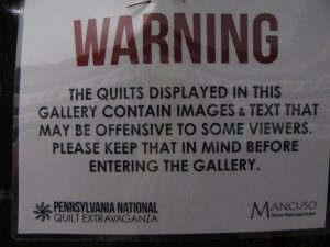
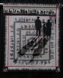
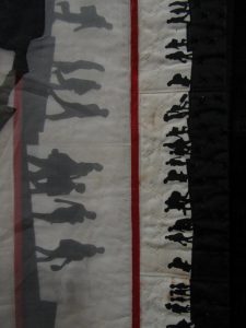
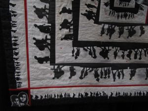
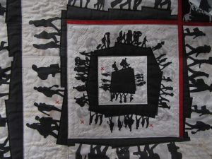
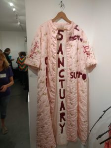
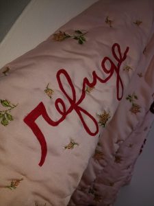
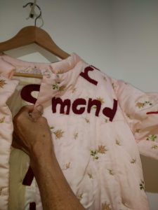
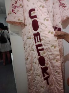
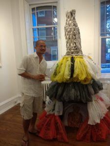
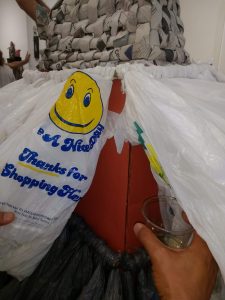
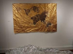
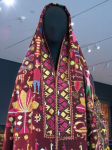
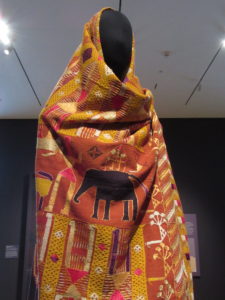
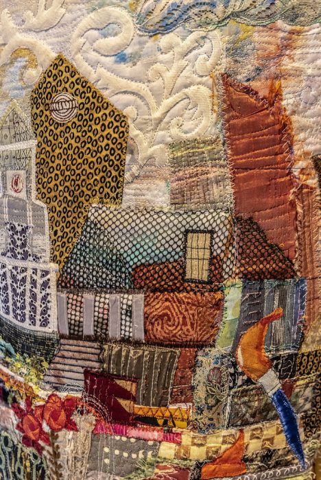
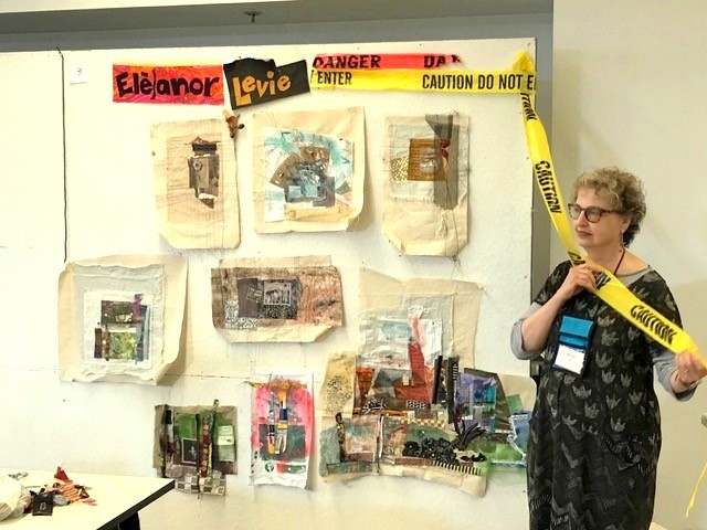
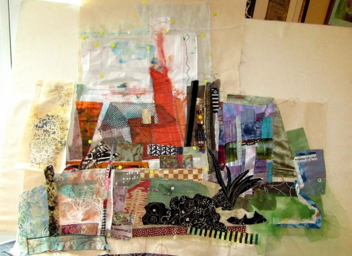
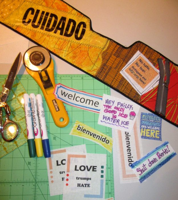
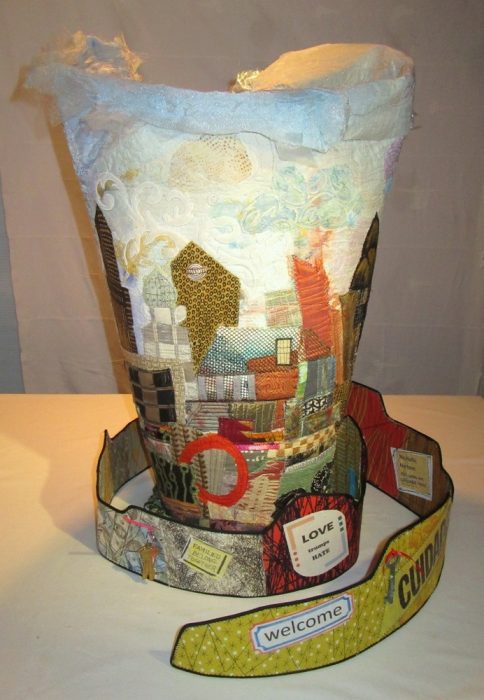
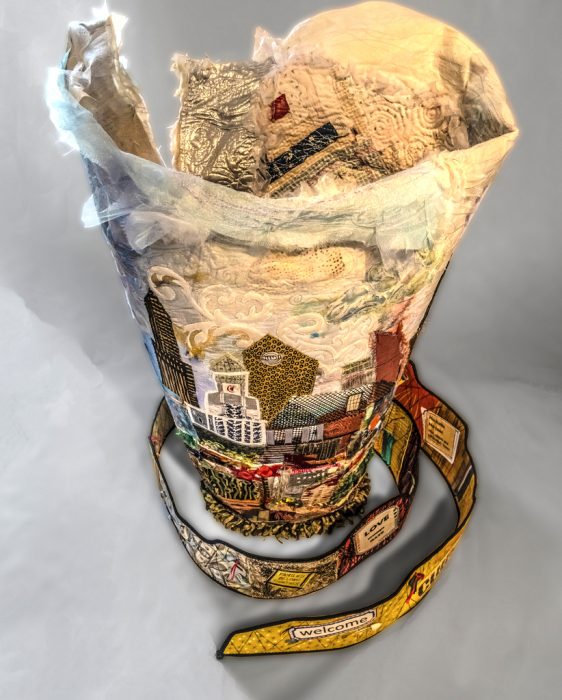
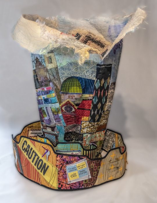
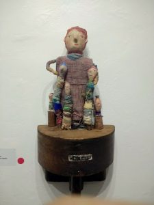
A fascinating exhibit opened this week at the Da Vinci Art Alliance here in Philly, and it i. a collaborative exhibition with Philadelphia Sculptors. Sculpture–or at least 3-D media of any kind was the requirement, addressing the theme of “shelter.” The theme of refugees and immigration resonated with many of the artists, and a number of them used their work to present a shared desire to create a safe haven for people fleeing unsafe environments. Perfectly appropriate for a show in Philadelphia, a sanctuary city with an ongoing battle against Immigration and Customs Enforcers, or ICE.

Nothing in the show was quilted in the traditional sense, but there was a lot of soft sculpture as homey, enveloping, forgiving, resilient. Well, then again, there was this quilted bathrobe, a vintage piece augmented with text in felt, thread, and paint by Carole Loeffler.


The largest piece was “Buddha’s Sustainable Shelter” by Chanthaphone Rajavong, who stands beside his tower. He gave me a peek into the underlying structure–all recycled cardboard. Can I say how much I covet a dress with a woven newsprint bodice and tiers of plastic bags? But I only committed to getting on my hands and knees to photograph the painted pillow inside this shelter.

Artist Cindy Lu also used recyclables for her pieces: emergency mylar blankets. She poses in front of her very large beaded map, called, simply, “Home.” Opposite that work is an intimate patchwork and crochet grouping, called “Play.”


On the very small-scale front were two groupings by Chelsea Nader. They are intaglio prints on linen. ” Where she told me” features a miniature living room vignette, and “Open your doors and take down your walls” has two doors.


Gotta admit, my favorite pieces–and the hubby’s as well, were by Dumpster Diver Ellen Benson. Her “Friendship Circle Divas” (at the top of this post and below, with Benson) and her “For Every Bird a Nest” take the idea of shelter straight to the personal and endearing.

As I mentioned, none of these works are quilts in any traditional sense. Nevertheless, the use of fabric and thread, of layers and soft, tactile textures and dimensionality does hie back to quilts as a part of our heritage and legacy as bedcovers, as security blankets, as protection against the cold. How does your work fit the theme shelter?

From Painting to Quilting, and Black

Tuesday, April 3rd, 2018

Back home in the bosom of my family for the Passover seder, I took the opportunity to see an art quilt exhibition at the Baltimore Museum of Art that’s been getting a lot of great press, which it richly deserves. It’s comprised of new work by Stephen Towns, trained as a painter, self-taught to quilt — for this body of work in particular. BTW, you can see it in the cloth if you get to the BMA before Sept. 2.

The piece above and below, titled “Birth of a Nation,” is the star of the show. A black mammy, tenderly suckling a white baby against the backdrop of an American flag of 1777, puts slavery and white supremacy in tension with each other. A coffee and tea-dyed dress, patched with toile prints and barely clearing the bed of dirt below the quilt evokes the humble status of the Madonna-like figure.

Surrounding this installation are seven smaller story quilts; whether portrait or landscape orientation, each is about a yard along its longest edges. These works depict key moments in the life of Nat Turner’s life and the rebellion he led against slavery in 1831. My favorite one featured another mother and child: Under the cover of night, when plantation work was done, Nat Turner’s mother teaches her young son to read, or schools him in gospel. The composition proves Mr. Towns’ incomparable talent as a portrait painter…just as the materials and techniques give away his seat-of-the-pants sewing and quilting skills. Fabrics are from an old stash (perhaps his mother’s?): those of us sewing and quilting in the ’60s, and ’70s will recognize the calicos, ginghams, and synthetics, and that proud feeling when you think to add translucent tulle and sparkly beads to skies, buttons to clothing.

Titled, “Special Child,” this piece is the first in the cycle, which all show what how the facts known about Nat Turner coalesced into myth and icon: slave, keenly intelligent child, preacher man, leader of an effective slave rebellion. It’s refreshing to have the story, told so often by whites such as William Styron (The Confessions of Nat Turner), reclaimed by an African-American living and working in the Black Lives Matter era.

Stephen Towns assesses his “framed” portraits of Nat Turner and his wife, Cherry Turner, which accompany the exhibit.

Stars, moons, or suns (plus the occasional butterfly) play a role in each work of art, connecting people with the universe, and with the spirit as creator. Celestial bodies stand in as haloes, symbolizing sainthood or martyrdom. And is the red scroll below an ecclesiastical stole, or a symbol of the bloodshed already committed and also up ahead?

In each work of another series of paintings, the halo is a blue moon behind an enslaved rebel leader who has been caught. A hangman’s noose and a fist figure prominently. Click here to read what happened with these intensely powerful, provocative portraits.

On a lighter note, quilters viewing this blog post may want to look back at the story quilts and note the minimal free-motion quilting in thread that matches the fabrics flattens the backgrounds, so they recede. In contrast, large stitches that most seasoned quilters would decry as “toe-hookers” become strong design lines in Towns’s narratives. Not only do they define important features, they add naivete, the mark of the hand.

As an art-lover, I have so much respect for Towns’s cohesive works within series, for his conceptual underpinnings and iconography–sun, moon, stars, haloes, butterflies, and the gold-leaf that recalls the elaborate frames on medieval religious art (as in the “framing” on Nat and Cherry Turner’s likenesses). The piece below is from yet another series. Each work depicts a child who experienced slavery, and each work bears a title from the Lord’s Prayer.

Riveting. Heart-rending.

And yet one detail resonates most for me as a quilter. Can you guess what that is?


Heart-pounding inspiration, biennially

Monday, March 19th, 2018

What a privilege and thrill, every other year, to see the Art Quilt Elements show at the Wayne Art Center.

An even bigger adrenaline rush to be there at the Artists’ Reception, to be able to catch up with many friends and make new connections. To hear the makers talk about their work, is it just coincidence how many works are about the ability or inability to make connections in our country, and in our world?

Transfusion #3, by Catherine W. Smith: Lines of red fabric like a blood transfusion that flows from one body to another.

Seeking A Common Thread, by Karen A. Brown. Sharp pointed forms are filled with loud and destructive words and actions, such as pain, anger, poverty, fear…

Structurally Unsound, by Diane Savona. Assembled from Salvation Army jackets, sweaters, and the clothes of workers, and embedded with construction tools. Expresses a deep concern for our rich, powerful country that does not have the political will to maintain our roads, bridges, and railroads that allow us to connect.

Juxtaposition 1: Crossing Lines, by Karen Schulz. We are taught not to divide our art in half, but Karen achieves a dialogue, one half with the other, and strikes a balance.

Conversation, by Marti Plager. “Is it possible for opposing sides to have a conversation? Is it wishful thinking on my part that the conversation can be a civil one?

This poorly photographed collection of beautiful works and their beautiful makers pushes me to research and save up for a better camera. I only hope it pushes you to get to the Wayne Art Center, in Wayne PA, by April 28, to see these powerful pieces in the cloth!

Well Past Midnight

Monday, February 26th, 2018

A class experiment at a Quilt Surface Design Symposium back in 2006: Cynthia Corbin assigned us to make and remake what she calls a black fabric sketch–a unique patchwork block from a sketch of lines. As happens in these intensive classes, I joined my classmates staying up quite late one night, making up a patchwork block in many different color and pattern iterations. Finally, I mutinied, and created the patchwork all in black fabric, and opted to show the side where the seam allowances are exposed. Soon after, I “sketched” on the piece, using tan thread to free-motion-stitch a figure. Years later, I embellished the “drawing” with embroidery.

Another sample stuck away in a drawer—a paint-dabbled moon. And when the Studio Art Quilters Association announced a call for entry: From Dusk to Dawn, I decided to combine these UFO’s (unfinished objects) and rise to the challenge. I slapped lots of different fabrics from my overflowing stash up on my design wall, trying for a pleasing, William Morris-style feeling.

I kind of like what I came up with early on, and should have stopped there with a sketchy expression.

But no, I kept auditioning other fabrics for backgrounds, and growing out the figure to complete it. I also tried miniature quilt projects under her hand, suggesting that she, too, was a quilter.

I found, however, that the quilting projects merely increased the cacophony of prints and negated the pensive mood I was after. So I ended up giving the figure a book instead. This allowed me to connect personally with the figure and the quilt, since I often stay up all hours of the night reading. I completed the piece with that pleasantly addictive, obsessive behavior in mind.


I call it, “Well Past Midnight.” Ahhh, to have and to hold a book so good you cannot put it down. Along with the supreme luxury of not needing to put it down. All is quiet. You succumb to the thrall of great literature, a world of enchantment, and a fantastical bower  grows around you long into the wee hours…

Far better, this poem expresses the mood and the moment: 

Just learned my art quilt did not make the cut for the SAQA exhibit From Dusk to Dawn. I never thought it would. It’s over-labored, tries to be too pretty and figurative, at a moment when the art world and the art quilt world savors abstract expression. I totally get it, because  I know that small exhibits must be cohesive, creating a flow around the room.

For me, a call for entry, particularly from SAQA, is often the kick in the behind I need to produce work, to hone my design skills and my technical skills, too. I am glad to have made this piece, to share it with any readers of my blog, and to put it away, not look at it for a while.  I do look forward to seeing the pieces that have been accepted into this show should it come to my part of the country. Bet you will, too.

Another Kind of Folk Art: Embroidered Punjabi Shawls

Tuesday, June 27th, 2017
Phulkari.
Phul (pronounced either pool or fool) means flower.  I certainly felt that I had stepped into a glorious flower garden when I entered a featured  exhibition at the Philadelphia Museum of Art last week (see it through July 9, 2017).
Kari means work, and it’s readily apparent that phulkaris take months or even years to make.
And oh, how richly ornate are these flower works, silk embroidered shawls that are often started upon a daughter’s birth, or stitched by the girl herself, to bring into her husband’s house as an important part of her dowry. Phulkaris are worn draped over head and shoulders by women all over Punjab–the area that straddles Pakistan and India — during marriage festivals and other joyous occasions. They can also serve as bedding and wall hangings. Like quilts!
 Phulkaris from the Jill and Sheldon Bonovitz Collection are supplemented by others from the Philadelphia Museum of Art’s collection, and most were created in the early 20th century. In Phulkari embroidery–silk and cotton threads ornament the cloth, usually a handspun, handwoven cotton. Folk art folk and animals seem to be making their way across the shawl, while flowers and geometric forms provide a well-balanced cacophony of figures. It’s fun to imagine the story being told in the stitches.
.
We quilt-lovers of quilt history can draw many parallels between the domestic arts of Punjab and of 19th century America. Like quilting, the making of phulkaris was usually done in the home, fulfilled creative urges, and brought color into what may have been a drab day-to-day existence. Both were and are often remain celebrated folk art forms.  Check out this appliqued quilt top, below, known as “Bird of Paradise,” made in the Albany NY area between 1858 and 1863, from the collection of the Museum of American Folk Art.
 
The charming story quilt below was appliqued and tied by a self-taught African-American woman who was born a slave in Georgia. Known as the “Harriet Powers” quilt, it is thought to have been made between 1895 and 1898.
 
 Getting back to punjabi shawls: I love this one below: peacocks strutting, rain falling, plus a floral border with a little section of red, like an error but not, thought to ward off the evil eye. Just like the deliberate mistakes in Amish quilts, because “only God is perfect.”
    
Notice the similarity in pictorials between these eastern and western examples? Many different cultures obviously like to feature images symbolic of marriage, family, fruitfulness/fertility, and home. Art of “just folks.” Folk art.
As mentioned, most phulkaris show the background cloth, much like applique. You would think these birds, horses, and people are done on a background fabric where the warp floats over a few threads to make a sateen textile.
But no, the marigold background is all embroidered. That’s a “bahg” phulkari, embroidery so dense that the base cloth can’t be seen.
Another example is below, with shapes that recall gems, jewelry, and other embellishments. With silk thread from China, these were very costly to make. No wonder then, that the threads are stitched mostly on the front of the cloth.
 
Also on view in this exhibit are a couple of gowns and a man’s jacket created with phulkaris by a famous contemporary designer, Manish Malhotra. I wonder if he was given a hard time for cutting up phulkaris for his posh outfits? One can only hope he used damaged pieces, just as we should only cut up a ragged quilt or fragments to make wearables,  pillows, holiday stockings, and bags.

Want to learn more, and see more, about phulkaris? Watch this lovely, informative video produced for the Philadelphia Museum of Art.