After following the dazzling techniques Pat Pauly taught me for printing fabrics and creating strong compositions with them, I feel pretty proud of my latest art quilt.
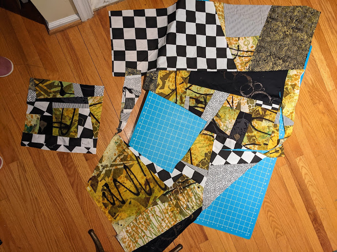
This piece started with a fabric that featured yellow-gold leopard spots on a white background. In Pat’s Glorious Prints class, I added visual texture by stenciling, squeegeeing, and “drawing” big, black arcs with a squeeze bottle. For maximum kickiness, I brought in black fabrics stamped by the Textile Workshop and discharged by Lisa Reber of Dippy Dyes, plus graphic black & white commercial fabrics–a large checkerboard and little polka dots. One of my husband’s worn-out pin-stripe shirts and a batik gave me more contrasts in pattern and scale. Here, I’ve done a bunch of cutting and piecing, improv-style.
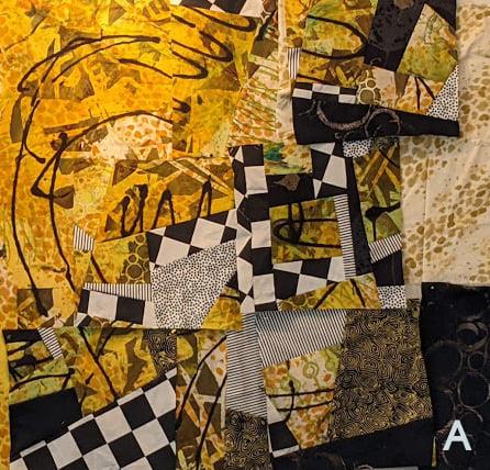
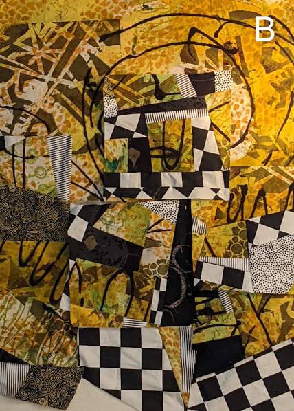
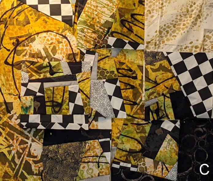
I composed with units in various ways, and asked my Facebook friends to help me decide on the strongest composition.
A was the clear winner, especially since that version got the votes of not only Pat Pauly, but also Elizabeth Busch–another brilliant art quilter. Rather than voting, my buddy in Studio Art Quilt Associates (SAQA) for Pennsylvania, Camille Romig, wrote “Jazz” in the comments, naming the piece perfectly for me.
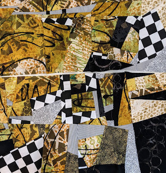
The composition went through some further finicky piecing as it came off the design wall…
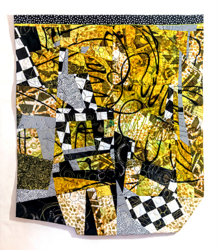
…and then I rotated it, added a border along the top, and carved out a couple of chunks from the bottom. My feeling is, since my art quilts aren’t going on stretcher strips or into a frame, they are free to diverge from the rectangle.
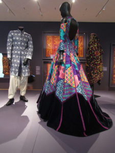
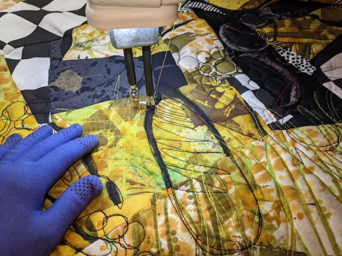
For the quilting, I reunited with my HQ midarm, which hadn’t gotten much use in way too long a time. Was quick and so much fun. Here’s the finished art quilt:
Jazz, by Eleanor Levie
It’s actually one of the very few art quilts I’ve made that I don’t wish to part with! And I cannot wait to use this method again of composing with a combo of my hand-printed fabrics and bold commercial fabrics.
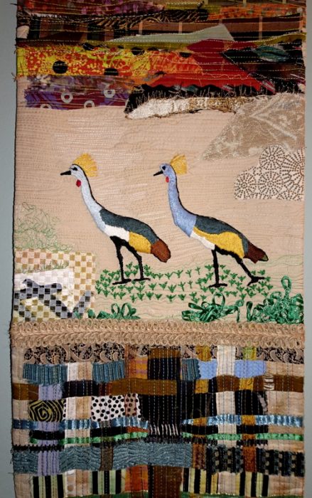
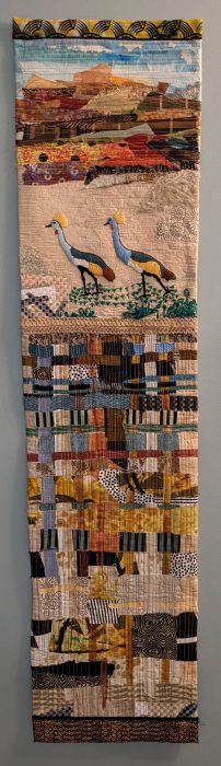
The skinny quilt is finished! I sure hope my Kenyan collaborator Meryline Ingaso likes it, and that folks out there will want to bid on it when the Advocacy Project holds its auction of art quilts later this year, which will raise funds for services that will benefit Meryline and her Sister Artists.
But first, here’s the skinny on African crested cranes: thanks to storyteller.travel for this info and video!
1–The African crested crane is quite the looker: light blue eyes, bright red neck, and gorgeous plumage on its head. It stands at over 3 feet tall and from wing-tip to wing-tip can measure over 6 feet. Despite such a wingspan, the adult weighs less than 8 pounds. Hollowed out honeycomb-like bones means the bird is light enough to take flight.
2–It’s the national bird of Uganda (right next door to Kenya) and featured on the Ugandan flag. The marshes and flat grasslands of both Kenya and Uganda offer the birds everything they love in a habitat. Rather than migrating, crested cranes tend to stay in place throughout the year. However, their habitat is slowly being depleted, due to over-use of water for irrigating fields of crops. So, the population is declining and the crested crane has been designated as endangered.
3–The Crested Crane is quite the omnivore gourmand, eating leaves and seeds from a variety of plants, as well as insects, worms, and frogs. These birds have also been seen eating small fish, snakes, and various aquatic eggs.
4–Romance is in the air: Crested cranes choose a partner early on, and mate for life. The only cranes to nest in trees, they build nests that are high up, safe from the reach of predators. Females typically lay between 2 and 4 eggs in a clutch, and the eggs are ready to hatch in about 30 days. They are then ready to breed when they reach 3 years of age, and given their long life-span — about 22 years, they have plenty of years to find a mate and lay lady lay.
4– Not just for courting and breeding, crested cranes love to dance at any time of the year. Young birds often join in the dancing.
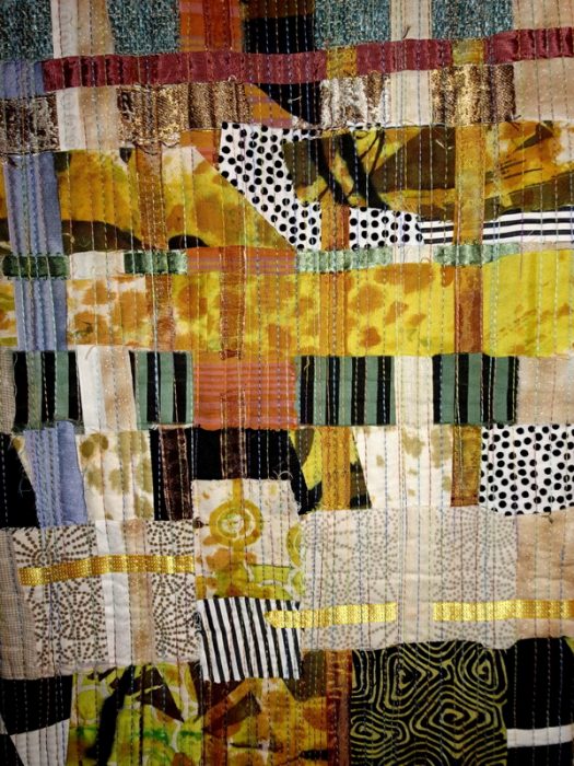
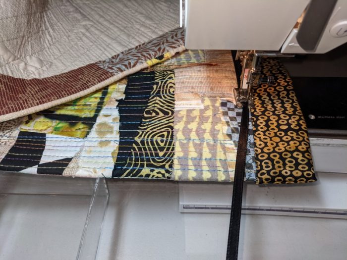
Moving on, I think I managed to combine the three sections — raw-edge applique landscape, Meriline’s embroidery, and a woven expanse — into a cohesive whole, 12″ x 48″. The quilting certainly helped integrate and tame the disparate elements, especially the warp and weft strips of the bottom section.
Facings along the long side edges kept the piece from feeling too circumscribed and hemmed in. African fabric for a top border, and a bottom border of batik couched with ribbon was, to my thinking, just enough definition.
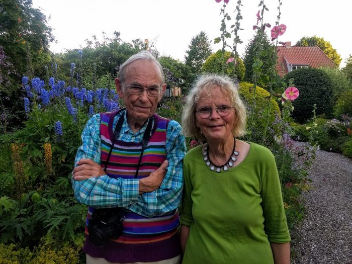
“I’m just a simple housewife,” she asserts, when I ask Bodil Gardner, if she calls herself a fabric artist or an art quilter. In fact, she is an international star of the quilt world beloved for her disarming, quirky masterpieces. “I just make my pictures, she says.” Her modesty is typically Danish.
As she explains on the website her husband, Peter put together for her, “I have not had any artistic training and was brought up to be the practical one in a creative family, which needed to get the washing-up done. Are my pictures art or not? The question is frequently asked. For me, it doesn’t matter what they are. I make them for my own sake, hoping all the same that you will also like them.”
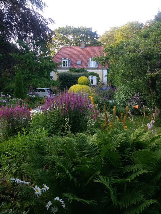
I have invited myself over, finding myself in her vicinity when the husband and I are visiting our son and his wife in Aarhus, Denmark. My daughter-in-law, Bev, volunteers to drive me over to the suburb of the city, where Bodil and Peter live. “Drive up the road through the garden,” are her emailed instructions, which turn out to be quite the understatement.
As you can tell, Bodil and her husband live up to their surname, Gardner. Like Peter, the garden style is English, transplanted and intermixed with Danish determination. The warmer seasons are mainly for gardening; winter is when Bodil devotes herself to working on “her pictures.” Playing with colors and patterns are the common source of joy.
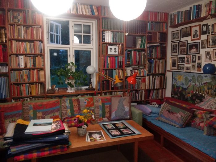
Bodil doesn’t have a “studio,” and when we visited, we sat at a dining table where she served us homemade apple crumble, with danishes and chocolates and tea. We brought a bottle of red wine, and a packet of various fabric prints. An old, portable sewing machine under its cover sits on the shelf behind the table, and there’s a jumble of fabric scraps on a trunk beside Peter’s computer table. Otherwise, no sign of a work space. Past a large archway, you’re in the sitting room, where appliquéd pillows and patchwork command the lower planes, and books and photos fill the walls from floor to ceiling.
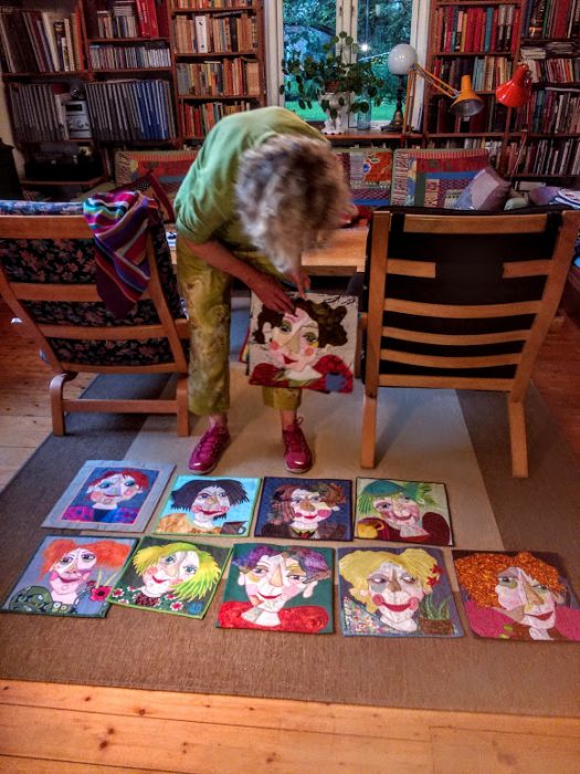
After dessert and far-ranging discussion, Bodil displays some of her pieces the same way she composes them: on the floor.
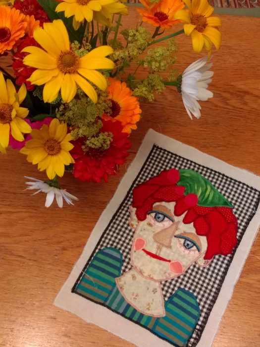
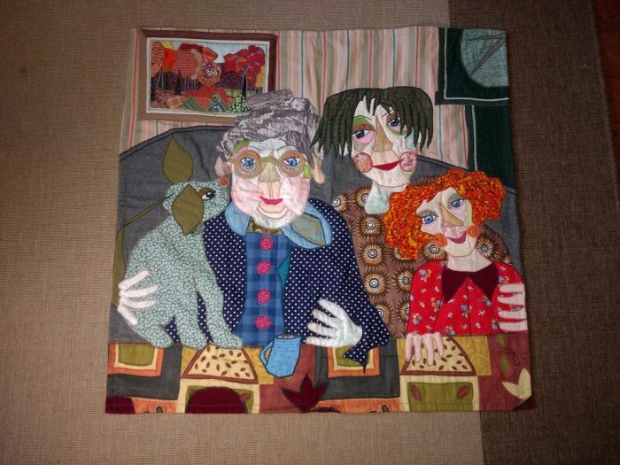
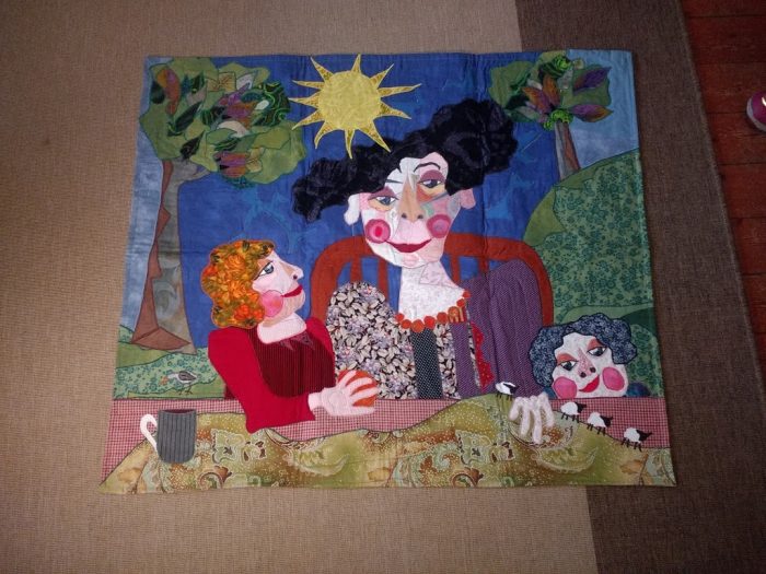
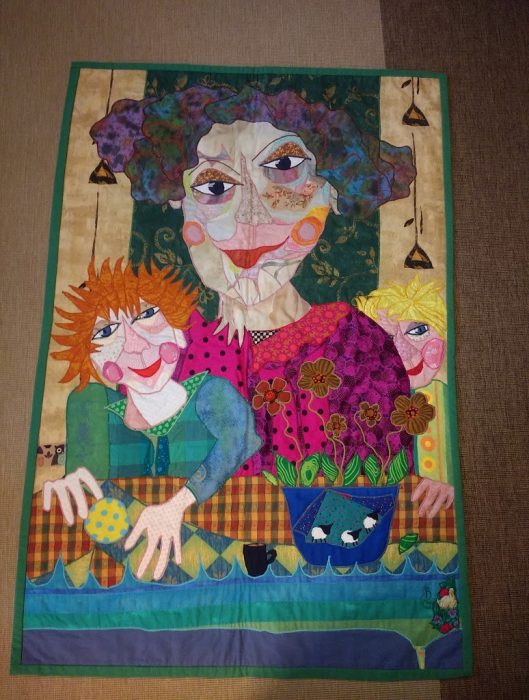
Lots and lots of delightfully funky portraits. Like Joni Mitchell’s Ladies of the Canyon, Bodil points out, each one has a unique personality. Fabulous hairstyles, flower accents, funky colors. Friends bring her fabric, and she uses what she has. No fusible web for her. She chooses from her assortment of scraps, cuts each piece freehand, assembles elements as she goes on larger background pieces, pins pieces to secure them in place temporarily. Only when she is satisfied with the entire composition does she moves to the sewing machine to satin-stitch over all the raw edges. Quilting and finishing details are minimal. Larger works elaborate on women at home, of generations, taking tea, counting sheep, gentle pets, and children, either confident or shy.
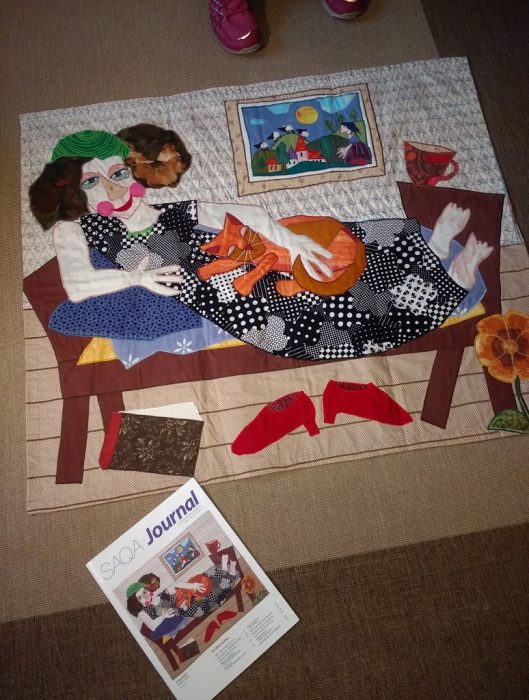
It’s easy to recognize a Bodil Gardner art quilt, isn’t it? And to feel the warmth and friendliness, and yes, a bit of zaniness embodied in each and every one. Far from quilt shops, shows, classes, she retains her own signature style, and doesn’t travel far, so relatively few students can learn from her way of working and her genius for face values, so to speak. Pamela Allen of Canada got her to join the Studio Art Quilt Association (SAQA), and Peter Gardner encourages his wife to respond to more of their calls for entry. Her work has been showcased in many top-drawer, juried exhibitions, within and outside of Denmark. But in many cases, a juror chooses a cohesive collection of sophisticated abstract and painterly tour-de-forces; Bodil’s pictorials stick out as being too different, and so don’t make the cut. That was the case when Bodil entered the piece below for the SAQA show for which the theme was Tranquility. Her reclining woman with cat, book, and teacup didn’t make it into the exhibit….yet SAQA saw fit to feature the piece on the cover of their magazine.
There’s not a whit of pretentiousness in these portraits of wise, nurturing women. I can easily imagine each one a sort of self-portrait…the alter ego of their maker. There are probably hundreds of them, a treasure trove of joyful folk art, with many more to come from from Bodil Gardner.
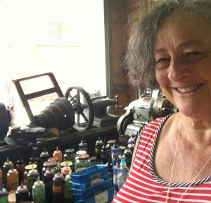
The always vivacious, irrepressible, and dare I say it, totally lovable Pat Pauly: Exuberant doesn’t begin to describe her, or her richly textured art quilts, which appear in THE most distinguished shows, private collections, and books about art quilts.
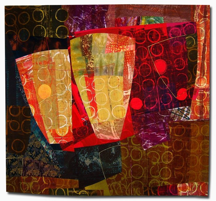
Mummy Bags, Canopic Jars, 66″ x 56″
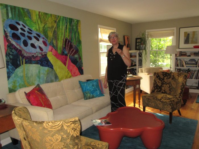
So you can imagine how thrilling it was for me, when I was in Rochester, NY last fall, to get a tour of her house. And now you can, too. The front is charming and neat, but friends come in through the back door.
Pat painted the clapboards of the exterior — she painted the interior, too. Installed cabinets, refinished furniture. A gardener, she planted all the containers, trees, and flower beds. What that means is that, just like with her fabric-printing and art-quilting students, she establishes the ground rules, guides their development, then lets them loose to do their thing.
Flowers, or rather, lotus pods command the big diptych which dominated the living room when I visited. This, however, is a space where Pat rotates her giant (relatively speaking) masterpieces. The throw pillows are her work, too. Hot tip: Pat sometimes jumpstarts the process, beginning with linen or cotton ready-made covers which she squeegees and marks with thickened dyes. High-style soft spots that unify the color scheme of the exhibit du jour.
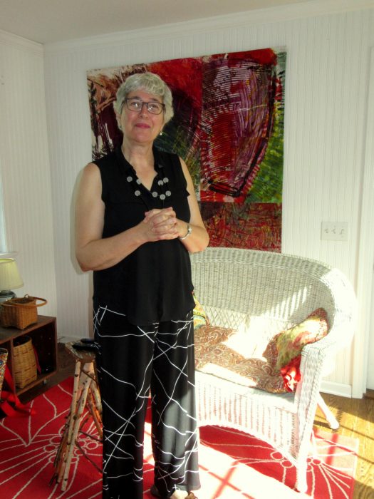
Other corners of the house showcase a cool mix of antiques, vintage, and modern, spare groupings of souvenirs, tchotkes, and art by friends. But it’s her own work, even with smaller dimensions, that invariably captivates your attention. Like the one shown below, Pat’s signature style of layering visual textures in strong, large-scale patterns make for abstract art that seems devilishly complex. Yet she will often produce 40″-squares following her own “Take Two” workshop technique, cutting and combining just two pieces of fabric.
Pat wouldn’t let me take pictures of her basement studio, where she does the messy work of printing on fabrics as well as the improvisational piecing and free-flowing free-motion quilting. Not a ton of space, but suffice it to say it allows her to be her authentic, whirlwind self and create a prolific body of work. Especially remarkable, given the demanding pace of her teaching gigs. She should bottle and sell that energy, if not that talent.
Lucky me, I had the incredible thrill of taking two classes with Pat at QSDS earlier this summer: Glorious Prints, and Take Two. If you hunger for art, inspiration, or adventures in surface design or composition, she’s the teacher you want— PatPauly.com. Check her calendar and see if it meshes with yours. Attend a presentation or program or workshop, and you’ll probably get the opportunity to purchase her gorgeous fabrics. Oh, and if you want the inexpressible pleasure of living with her art, salivate over her portfolio on that website.
After blogging about Pat Pauly, you may find I have some nerve showing you some of the fabrics I created in her workshop…in my next post. Gonna do it anyway…
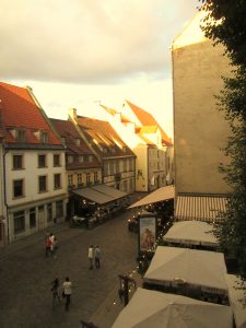
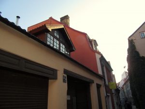
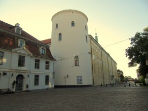
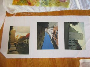
Two weeks before the Disperse Dyeing on synthetics workshop at Lisa “Dippy Dyes” Reber’s house, I was invited to send in photos for transferring. So I went through recent vacation photos, architectural landscapes I’d shot in Riga, Latvia. I wanted my fabric transfers to be correctly displayed, so I flipped them to the mirror image and sent them in as Lisa requested.
Lisa directed us to send our images right to Fine Balance Imaging Studios–which is located in Langley, on Whidbey Island. I have fond memories of vacationing on this charming island, a short boat ride away from Seattle, WA. Kudos for this top quality firm locating in a place where quality of life is so high. Anyhoo, their site says:
If your files are anywhere up to 20MB or so, please send us an email at theprintstudio@gmail.com your file as an attachment and instructions for your job. We’ll follow up with you within 24 hours to verify your request and provide a timeline and estimate.
Gmail user? You can send any size file through email – it will automatically upload to Google Drive and send us a link!
Alternately, Dropbox is a great free service we highly recommend that is easy to use. Upload your file and send us a link via email. [Maybe box.net will also work!]
Please do email us and let us know you’ve sent a file, and specify what you would like for your order.
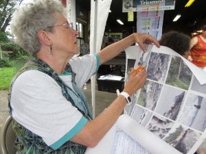
At the workshop, Lisa passed out the large sheets of paper that were imprinted with pigments made for synthetic fabrics. Presumably, you could ask FBI Studios to use the pigment that was right for natural fabrics, too. Here’s Kerry, my classmate, cutting her pictures into individual transfer sheets.
Photos were placed on fabrics, with right sides together, within the hot press. I began, using a poly-cotton broadcloth supplied by Lisa. Excellent saturation and detail!
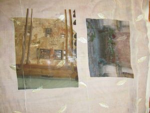
Next, I experimented with my own unusual fabrics. Below, two photos transferred onto a piece of polyester chiffon that is embroidered with little leaves or feathers. Under that, two photos transferred onto a peach polyester moire.
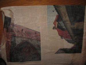
Here are transfers to a sheer pinkish polyester.
I think these will make ethereal overlays to abstract compositions which allude to the ghosts of my family members who lived in Riga and walked the same streets I did. Some were tradesmen, involved in manufacturing of paints and turpentine, so I believe they would approve.
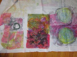
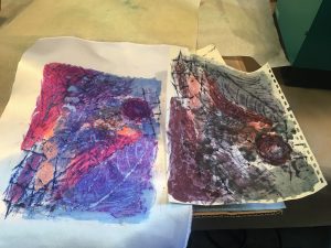
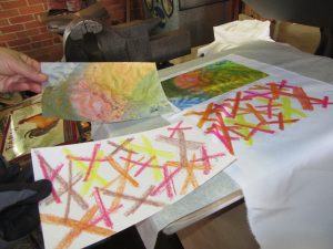
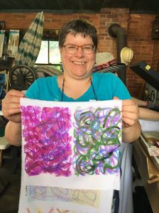
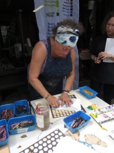
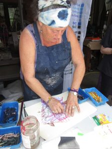
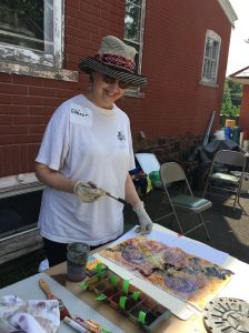
Brushing on “cool black” dye over painted and crayoned paper. Check out my last two posts here and here to find out why. My choice of dyes were squirted into ice cube tray compartments, because you only need a little. Each dye is identified with a green masking-tape tag, because really, the look of the dye is rarely telling.
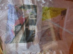
The right half is the transfer of my workings onto satin polyester fabric. Then I printed a second time, resulting in the quieter colors of the left half.
I preferred the poly cotton–more like the natural fabrics I use in my art quilts and craft pieces (table runners, pillow covers, tote bags, etc.). Here are two printings from one crayon-and-dye sketch, but with extra dye brushed on to bridge the gap between them.
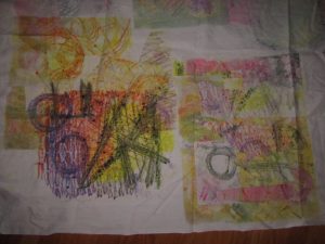
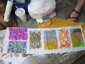
I was big into circles, and printing twice, with the second aligned. Inadvertently, I made myself a bodacious bra, huh?!
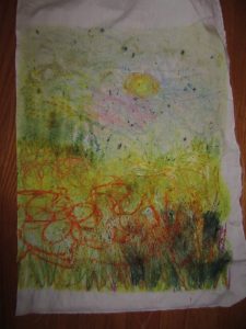
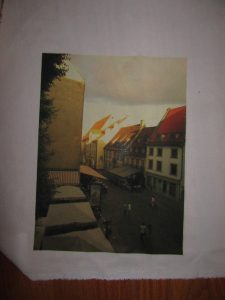
Last one shows a lapse back into traditional territory–a landscape. But even like the scribblings of the other experiments, this will probably be cut up and used as components of an abstract art quilt. Although, with all my circles, I can’t help but think toward Drunkard’s Path patchwork. In any case, I found these sips and gulps of disperse dyeing quite intoxicating.
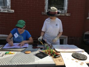
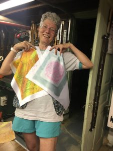
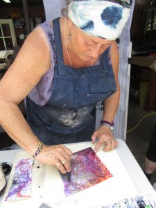
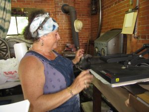
At the workshop mid August, I learned so much from the trials–almost all successful! Just a few tribulations!–of my sister classmates. Although they experimented with lots of surface textures a la Lisa “Dippy Dyes” Reber, I’m going to share what we did using Miriam Jacobs’ techniques, which I am absolutely jazzed about. As Miriam showed us (see my last post) we worked on paper, first with fabric crayons. We placed textures under the paper and then made rubbings, adding lines or marks as desired. Day one, I worked alongside Janet, who is making a rubbing. Then, we painted thick, liquid dyes on top. When we were done, we carried the paper and a piece of synthetic fabric over to the hot press. Kind of like using a sandwich press, but bigger, heavier, and tight enough to make the thinnest croque monsieur you can imagine. Lisa sets hers at 345 degrees and times the transfer for 29 seconds. Miriam sets hers for a little cooler, and a little longer.
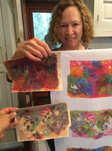
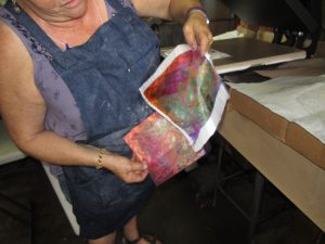
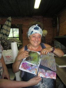
The biggest surprise is the Voila! moment, when you get to see exactly what color that dye produced. It’s not always obvious from the paper, that’s for sure. Check out these examples from Grace, with paper and resulting fabric:
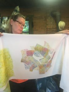
Janet quickly mastered ghosting: reprinting with softer and softer effects. Kerry was very diverse in disperse dyeing, but here’s her crayon and dye work.
Diana went bold, and produced a prodigious amount of work. “Hot off the press,” so to speak, she’s already ordered all the tools and supplies she needs to keep going.
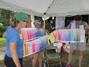
A mind-blowing bevy of techniques filled a two day workshop I took last weekend. Disperse Dyes on Synthetic Fabrics was going to be taught by two accomplished specialists, each with her own extensive repertoire. Held at the home of Lisa “Dippy-Dyes” Reber in quaint little Red Hill, PA, Lisa shared her methods for mottling, sun-printing, salt sprinkling, chain- and tube-wrapping, scrunching, photo-transfer and more. She shared her supplies–tools and liquid dyes which we could choose, referencing her thoughtfully painted chart of colors, tints, and hues.
At the same venue, Miriam Jacobs–formerly known as Mert, or Mertle the Turtle Fabric Arts, won over our attention to how she creates complex cloth, packing on a myriad of techniques including crayon drawing and rubbing, dye-painting, dye scraping, paper scrunching, heat-pressing, ghost-printing, and juxtaposing.
Glorious, jaw-dropping gorgeousness. In the next post, I’ll show you what my talented classmates did…and the wealth of surface designs on various fabrics that will doubtless fill my fall with quilting projects. Stay tuned.
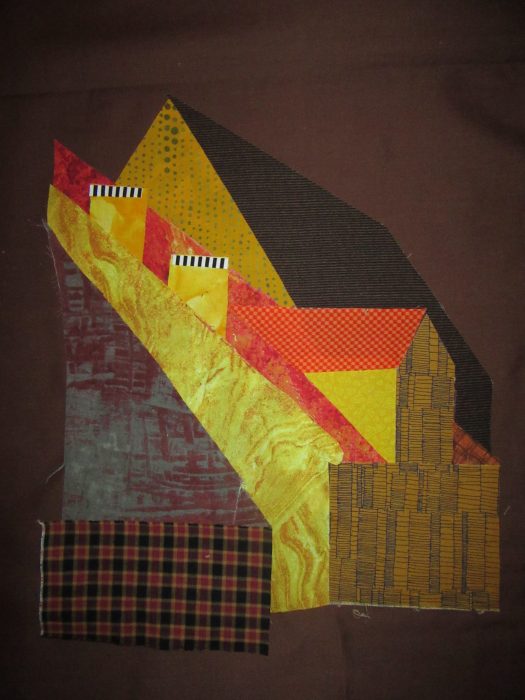
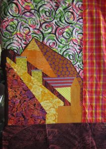
Using patterns traced from my blown-up photo [see previous two posts], I chose
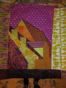
colors fairly reminiscent of the scene. Fabric pieces were backed with fusible web, and adhered to a dark brown fabric. In a freer mood/mode of working, I repeated the design with some bolder, more contemporary choices of fabric, more to my liking.
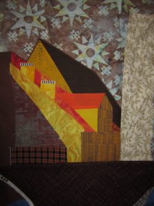
B1
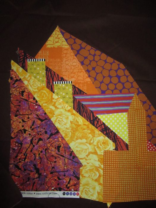
I cut out the rooftop silhouette leaving a slim margin showing, and then I was ready to audition some skies and windowpanes. Aimed to jazz up my milder rendering:
A2
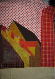
A3
A4
A5
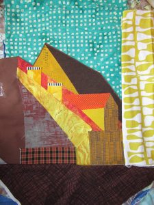
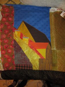
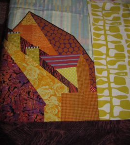
And then, I dressed/addressed my wilder version…
B2
B3
B4
Gonna sleep on these before committing. Always thrilled to get YOUR reactions…What’s working from your point of view?
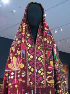
Phul (pronounced either pool or fool) means flower. I certainly felt that I had stepped into a glorious flower garden when I entered a featured exhibition at the Philadelphia Museum of Art last week (see it through July 9, 2017).
Kari means work, and it’s readily apparent that phulkaris take months or even years to make.
And oh, how richly ornate are these flower works, silk embroidered shawls that are often started upon a daughter’s birth, or stitched by the girl herself, to bring into her husband’s house as an important part of her dowry. Phulkaris are worn draped over head and shoulders by women all over Punjab–the area that straddles Pakistan and India — during marriage festivals and other joyous occasions. They can also serve as bedding and wall hangings. Like quilts!
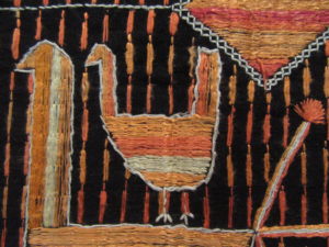
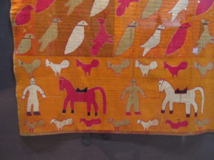
Phulkaris from the Jill and Sheldon Bonovitz Collection are supplemented by others from the Philadelphia Museum of Art’s collection, and most were created in the early 20th century. In Phulkari embroidery–silk and cotton threads ornament the cloth, usually a handspun, handwoven cotton. Folk art folk and animals seem to be making their way across the shawl, while flowers and geometric forms provide a well-balanced cacophony of figures. It’s fun to imagine the story being told in the stitches.
.
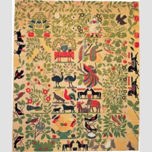
We quilt-lovers of quilt history can draw many parallels between the domestic arts of Punjab and of 19th century America. Like quilting, the making of phulkaris was usually done in the home, fulfilled creative urges, and brought color into what may have been a drab day-to-day existence. Both were and are often remain celebrated folk art forms. Check out this appliqued quilt top, below, known as “Bird of Paradise,” made in the Albany NY area between 1858 and 1863, from the collection of the Museum of American Folk Art.
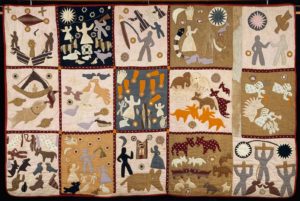
The charming story quilt below was appliqued and tied by a self-taught African-American woman who was born a slave in Georgia. Known as the “Harriet Powers” quilt, it is thought to have been made between 1895 and 1898.
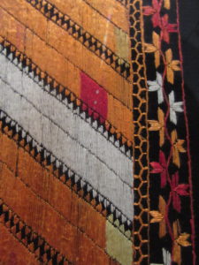
Getting back to punjabi shawls: I love this one below: peacocks strutting, rain falling, plus a floral border with a little section of red, like an error but not, thought to ward off the evil eye. Just like the deliberate mistakes in Amish quilts, because “only God is perfect.”
Notice the similarity in pictorials between these eastern and western examples? Many different cultures obviously like to feature images symbolic of marriage, family, fruitfulness/fertility, and home. Art of “just folks.” Folk art.
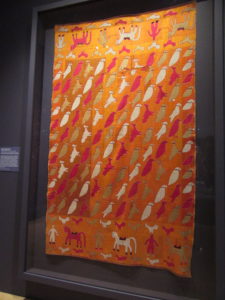
As mentioned, most phulkaris show the background cloth, much like applique. You would think these birds, horses, and people are done on a background fabric where the warp floats over a few threads to make a sateen textile.
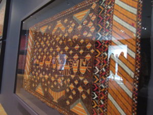
But no, the marigold background is all embroidered. That’s a “bahg” phulkari, embroidery so dense that the base cloth can’t be seen.
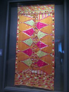
Another example is below, with shapes that recall gems, jewelry, and other embellishments. With silk thread from China, these were very costly to make. No wonder then, that the threads are stitched mostly on the front of the cloth.
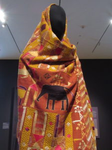
Also on view in this exhibit are a couple of gowns and a man’s jacket created with phulkaris by a famous contemporary designer, Manish Malhotra. I wonder if he was given a hard time for cutting up phulkaris for his posh outfits? One can only hope he used damaged pieces, just as we should only cut up a ragged quilt or fragments to make wearables, pillows, holiday stockings, and bags.
Want to learn more, and see more, about phulkaris? Watch this lovely, informative video produced for the Philadelphia Museum of Art.


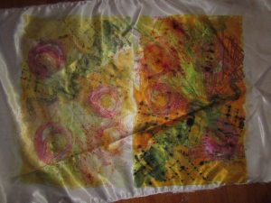 The right half is the transfer of my workings onto satin polyester fabric. Then I printed a second time, resulting in the quieter colors of the left half.
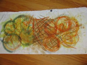 I preferred the poly cotton–more like the natural fabrics I use in my art quilts and craft pieces (table runners, pillow covers, tote bags, etc.). Here are two printings from one crayon-and-dye sketch, but with extra dye brushed on to bridge the gap between them.
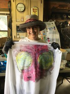 I was big into circles, and printing twice, with the second aligned. Inadvertently, I made myself a bodacious bra, huh?!