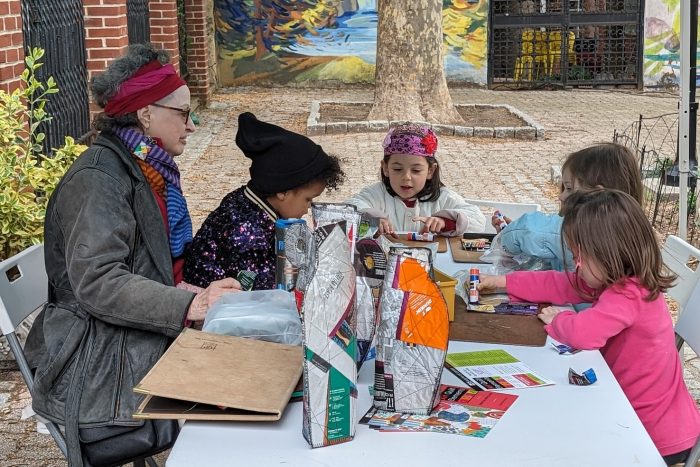
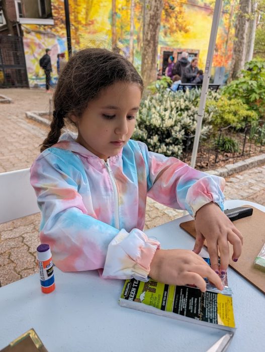
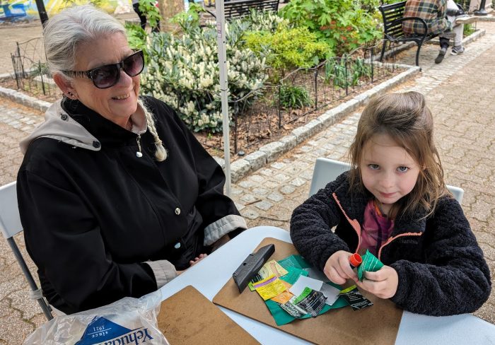
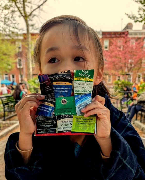
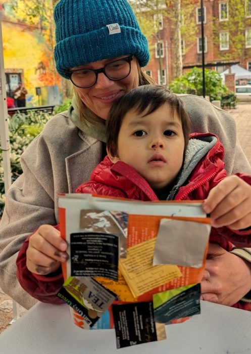
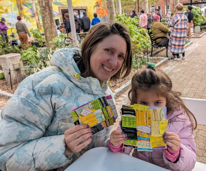
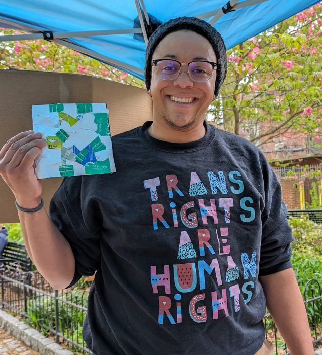
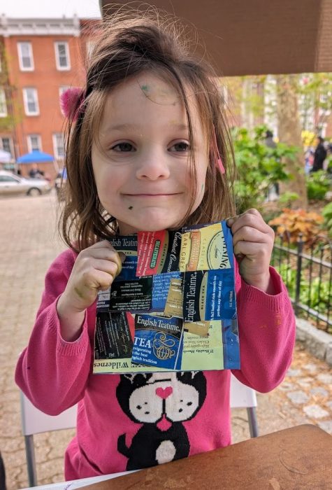
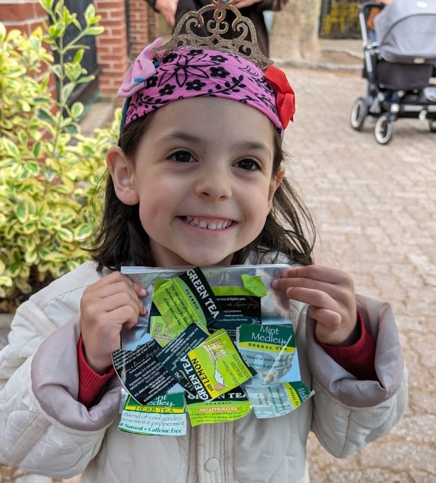
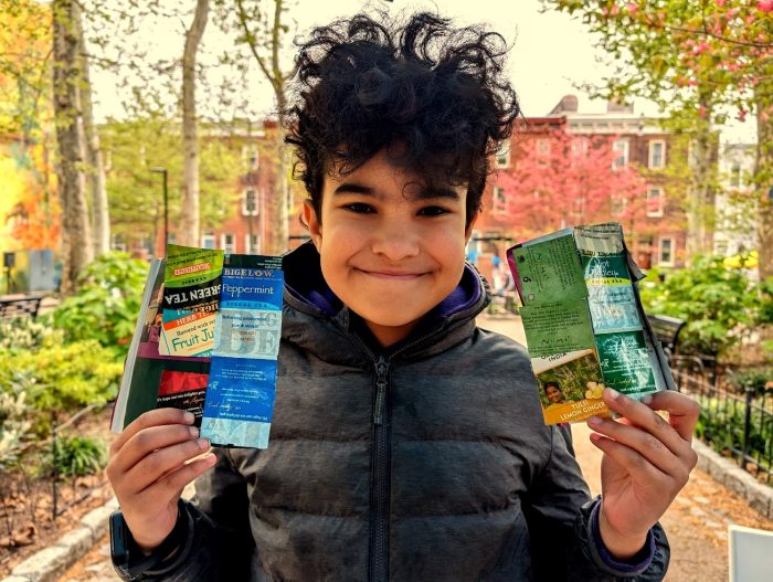
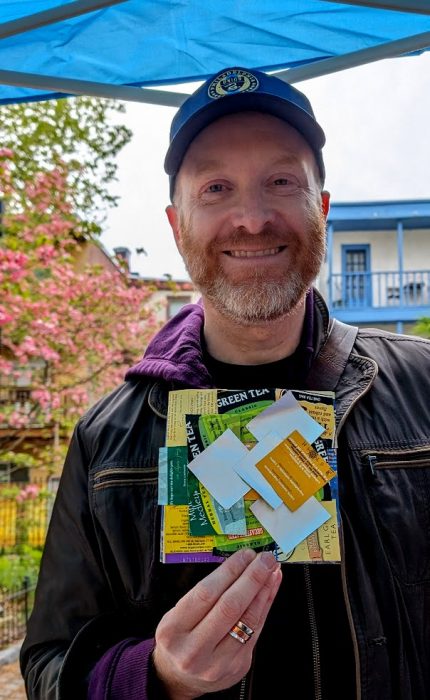
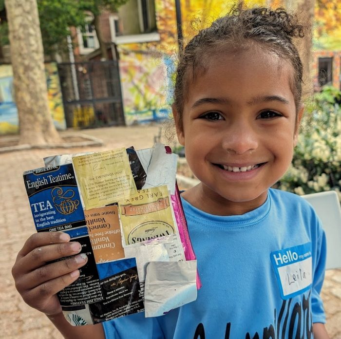
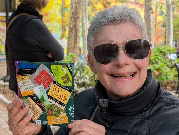
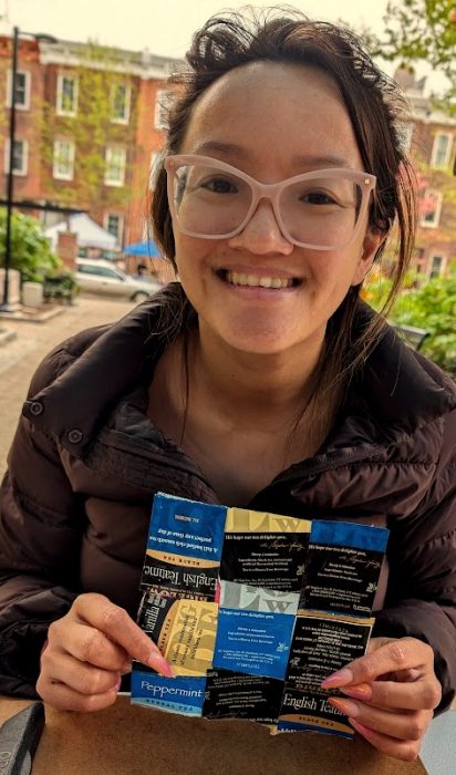
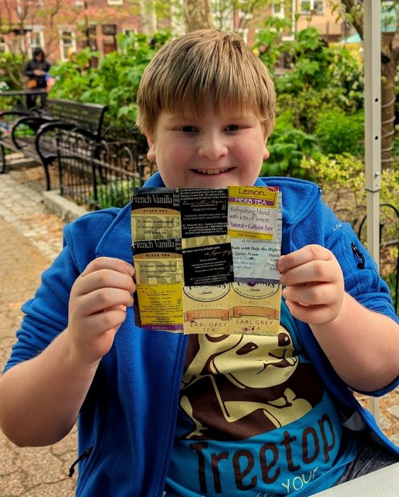
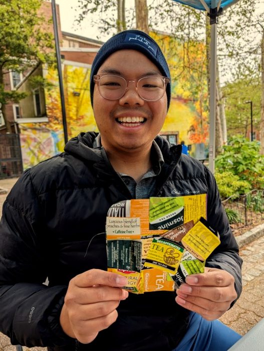
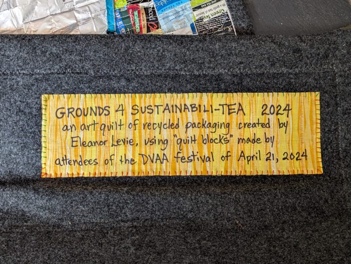
My booth at Da Vinci Art Alliance’s Everyday Futures Fest, April 21, 2024, which featured the theme of Sustainability, welcomed crafters of all ages. Supplies: 6″ squares cut from coffee bags (coffee GROUNDS), and 2″ squares cut from single-serve TEA bag packaging, glue sticks.Participants, a multi-generational, diverse group, needed very little guidance from me.
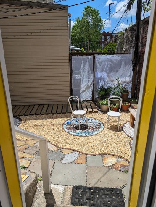
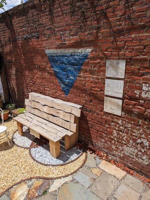
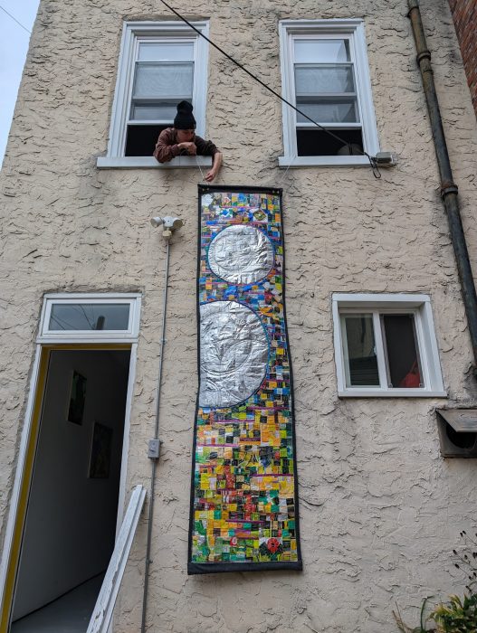
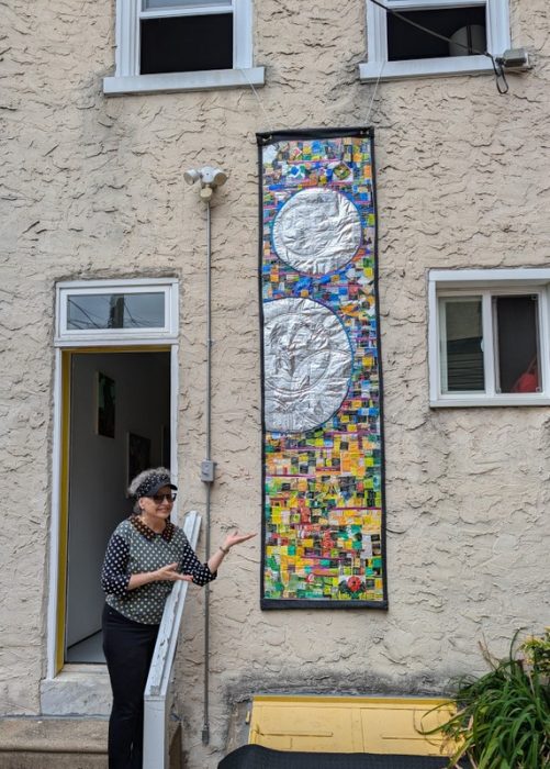
Next, I chose a site for the trash-stash art quilt, which would give me the dimensions. Nancy Agati’s Aqua Terrace at Da Vinci Art Alliance was the perfect space, since this work would withstand the elements. We chose the long, narrow wall alongside DVAA’s back door, above the basement doors.
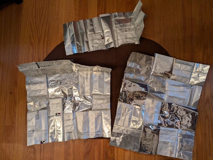
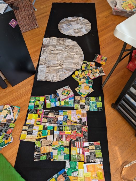
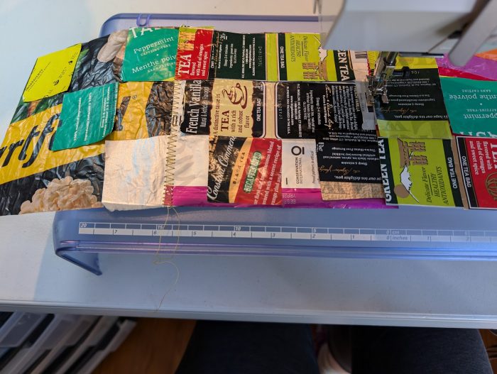
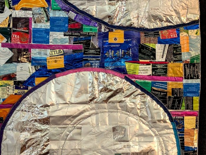
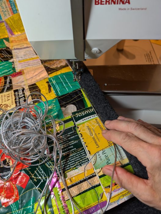
I cut a piece of Eco-felt, which is made from recycled plastic bottles, to the size of the final art quilt. Inspired by the mosaic circles on the Aqua Terrace floor, and in order to prevent the design from becoming too busy, I decided to give the viewer’s eye a place to rest: two large silvery moon shapes, made using a stitched patchwork of coffee bags and other foil-lined packaging. Then, I arranged the blocks around these circular shapes. When I was satisfied with the arrangement, I stitched the blocks together into rows, and then I stitched the rows together into sections.
I quilted heavily along the tea-bag envelope squares, and left large areas of the moons without quilting, so they would be puffy. Recycled zippers accented the circumference of the moons. Everything was backed with another layer of felt, cut 2″ larger all around, with edges folded to the front to form a binding. I dressed up the folded edge by couching silver cord as I secured the felt edge. Four grommets–which may have been the hardest part of the quiltmaking for me–allowed the piece to be hung. Samantha Connors, Executive Director of Da Vinci Art Alliance, hung out the office windows to do the mounting.
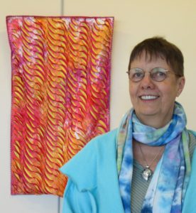
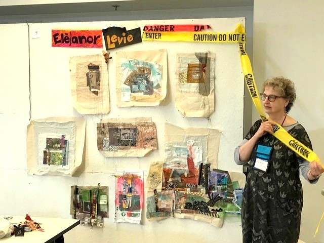
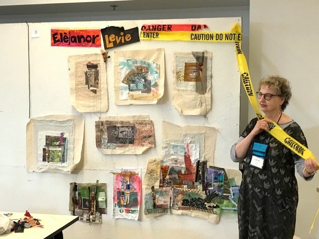
Last summer, I took a collage class at QSDS–Quilt & Surface Design–from Deborah Fell.
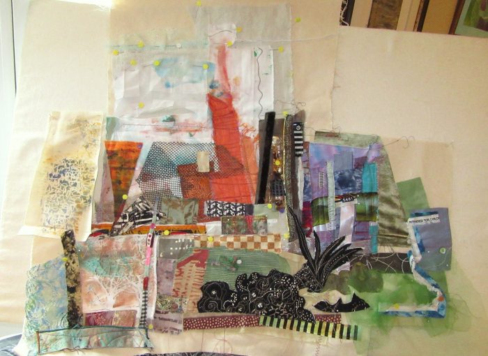
Standing alongside my design wall in Deborah Fell’s class.
See that sprawling assemblage to the left of my hip? It started as a small abstract composition…abstraction being something I aspire to. But I can’t help myself; my work invariably calls to mind some object or scene, and I’m off to flesh out figurative or landscape designs.
This held true here: I saw buildings and began to recreate my current hometown of Philadelphia. I had a few recognizable buildings, some vague representations, the Schuylkill River on the left, the Delaware River on the right. It came together in stages, and I placed sturdy pieces of canvas or upholstery weight fabric under the expanding areas as foundations for a large, odd-shaped wall hanging.
City between two rivers…
A few months later, I read about a SAQA (Studio Art Quilters Association) call for entry: Forced to Flee. The theme resonated. As a volunteer, I’ve long advocated for compassionate immigration reform and protested against Muslim bans, the Wall, family separations, and inhumane detention centers. I decided to finish my cityscape to express pride that Philadelphia is one among hundreds of sanctuary cities in the U.S. My “city of brotherly love” (sisterly love is implied!) accepts its moral obligation to protect immigrants and refugees. City leaders and activists alike fight against detentions, deportations, family separations, and discrimination. We rise to welcome the stranger, give shelter, secure safe haven for those “forced to flee.”
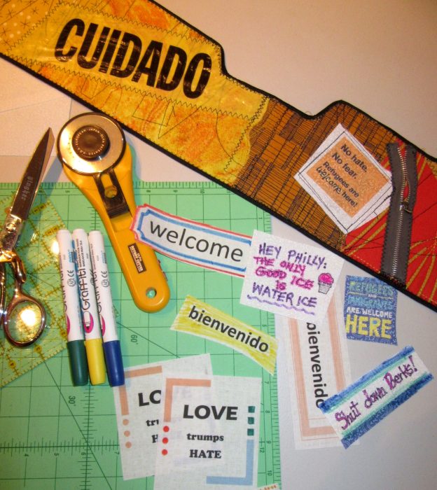
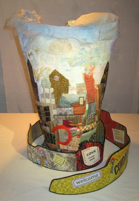
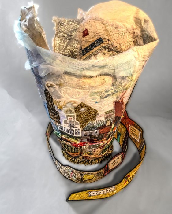
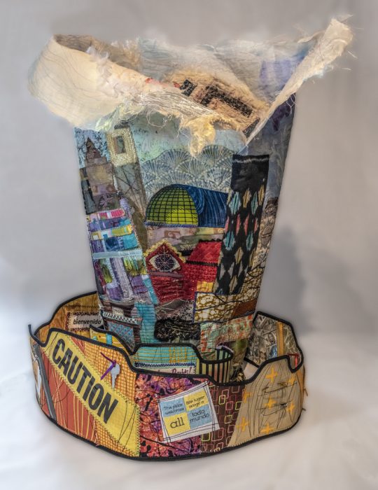
Knowing the caliber of work submitted to a SAQA show, I thought I’d have less competition for a 3-D piece, and be more likely to get in. So, I traced around an oval trashcan for a pattern — cuz what better to give me elegance than a trashcan? I continued to build my city over thick Pel-tex stabilizer so the vessel would be an upstanding example. Alternately, I worked on the inside surface, using a vintage quilt fragment for its soft, comforting associations, plus emergency mylar thermal blankets of the sort that are given to detainees. I cannot express how much struggling, how much cursing, how many broken needles went into assembling this beast. It stands 28” high. To ensure steadiness without adding weights, I fashioned a spiral pathway with signs and symbols of concern and welcome: bi-lingual expressions, caution tape, keys and safety pins and zippers.
There were further frustrations as I hand-stitched the elements together. Then I had to photograph it to try and meet the demands for pixels, clarity, background, and appropriate depth of field. I managed to submit my information and images 45 minutes before the deadline.
I didn’t get in to the Forced to Flee show. I get it. Jurors receive hundreds of submissions and usually curate down to under 50 — for a cohesive, high-quality exhibit at venues with limited spaces. Perhaps my piece was too discombobulated and did not appeal to the judge. Perhaps there were no other 3-D pieces and this would have been odd man out. And perhaps my photos weren’t up to what SAQA demands for not only the judging, but also the catalog.
Rejection gave me several advantages: I really wasn’t satisfied with the piece, and was now free to make significant changes. Another SAQA call for entry beckoned: 3-D expressions. I had time to revise and polish the composition from all sides and the inside. New construction and embellishment strengthened the overall aesthetic and referenced more Philly iconography. I added more vintage mini-blocks and doilies to the inside, and crocheted an oval rug to cozy up the “inner sanctum.” I want those who see the piece to take time to walk around it and peer inside. And yeah, I’m tempted to throw in little stuffed heart-shaped pillows, additional keys, and poems of welcome…but mostly because I don’t know when to stop. What do you think? More secrets and treasures? Or enough already?!?
Happier with the piece, I took the time to hire an expert photographer — Gary Grissom — and set it up in a better-lit niche. Now I felt more confident submitting it to the other show.
More time and attention to detail and good workmanship, along with professional shots, did the trick. I got in!
Icing on this cake is the impressive decision-maker, an art professor and gallery director who is one of the finest modern fiber curators in the world. (Oh, and he’s a Philadelphian.!) SAQA’s website states, “The wide variety of pieces selected by juror Bruce Hoffman include vessels, wearables, wall-pieces, and sculptural artworks. This cutting-edge exhibition shows how textile art can expand both into the third dimension and into the future.”
This exhibition, 3-D Expression, will premiere at the Gerald R. Ford Presidential Museum in Grand Rapids, Michigan in September 2019. I am angling to see while it’s there. Aside from the honor of having my work included, I would be thrilled to study all the other works in the only way they can truly be appreciated: by walking around them and checking them out from every angle.
Meanwhile, I’m back to making essentially 2-D art quilts for a while. Oh, and shopping for a workhorse of a sewing machine that may allow for thick, sculptural work in the months to come.
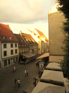
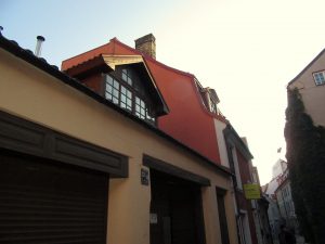
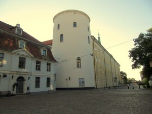
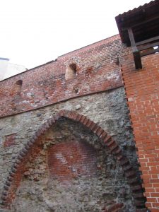
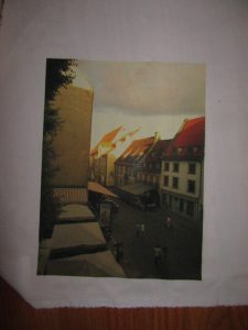
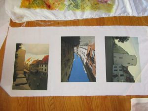
Two weeks before the Disperse Dyeing on synthetics workshop at Lisa “Dippy Dyes” Reber’s house, I was invited to send in photos for transferring. So I went through recent vacation photos, architectural landscapes I’d shot in Riga, Latvia. I wanted my fabric transfers to be correctly displayed, so I flipped them to the mirror image and sent them in as Lisa requested.
Lisa directed us to send our images right to Fine Balance Imaging Studios–which is located in Langley, on Whidbey Island. I have fond memories of vacationing on this charming island, a short boat ride away from Seattle, WA. Kudos for this top quality firm locating in a place where quality of life is so high. Anyhoo, their site says:
If your files are anywhere up to 20MB or so, please send us an email at theprintstudio@gmail.com your file as an attachment and instructions for your job. We’ll follow up with you within 24 hours to verify your request and provide a timeline and estimate.
Gmail user? You can send any size file through email – it will automatically upload to Google Drive and send us a link!
Alternately, Dropbox is a great free service we highly recommend that is easy to use. Upload your file and send us a link via email. [Maybe box.net will also work!]
Please do email us and let us know you’ve sent a file, and specify what you would like for your order.
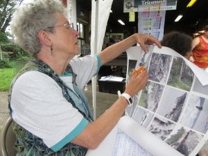
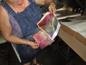
At the workshop, Lisa passed out the large sheets of paper that were imprinted with pigments made for synthetic fabrics. Presumably, you could ask FBI Studios to use the pigment that was right for natural fabrics, too. Here’s Kerry, my classmate, cutting her pictures into individual transfer sheets.
Photos were placed on fabrics, with right sides together, within the hot press. I began, using a poly-cotton broadcloth supplied by Lisa. Excellent saturation and detail!
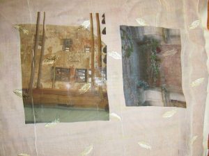
Next, I experimented with my own unusual fabrics. Below, two photos transferred onto a piece of polyester chiffon that is embroidered with little leaves or feathers. Under that, two photos transferred onto a peach polyester moire.
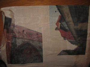
Here are transfers to a sheer pinkish polyester.
I think these will make ethereal overlays to abstract compositions which allude to the ghosts of my family members who lived in Riga and walked the same streets I did. Some were tradesmen, involved in manufacturing of paints and turpentine, so I believe they would approve.
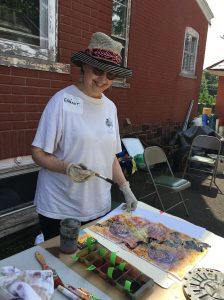
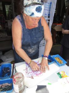
Brushing on “cool black” dye over painted and crayoned paper. Check out my last two posts here and here to find out why. My choice of dyes were squirted into ice cube tray compartments, because you only need a little. Each dye is identified with a green masking-tape tag, because really, the look of the dye is rarely telling.
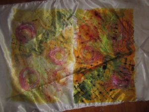
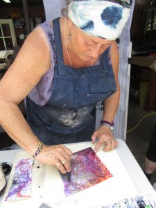
The right half is the transfer of my workings onto satin polyester fabric. Then I printed a second time, resulting in the quieter colors of the left half.
I preferred the poly cotton–more like the natural fabrics I use in my art quilts and craft pieces (table runners, pillow covers, tote bags, etc.). Here are two printings from one crayon-and-dye sketch, but with extra dye brushed on to bridge the gap between them.
I was big into circles, and printing twice, with the second aligned. Inadvertently, I made myself a bodacious bra, huh?!
Last one shows a lapse back into traditional territory–a landscape. But even like the scribblings of the other experiments, this will probably be cut up and used as components of an abstract art quilt. Although, with all my circles, I can’t help but think toward Drunkard’s Path patchwork. In any case, I found these sips and gulps of disperse dyeing quite intoxicating.
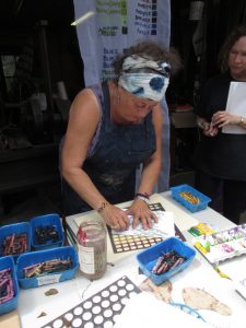
A mind-blowing bevy of techniques filled a two day workshop I took last weekend. Disperse Dyes on Synthetic Fabrics was going to be taught by two accomplished specialists, each with her own extensive repertoire. Held at the home of Lisa “Dippy-Dyes” Reber in quaint little Red Hill, PA, Lisa shared her methods for mottling, sun-printing, salt sprinkling, chain- and tube-wrapping, scrunching, photo-transfer and more. She shared her supplies–tools and liquid dyes which we could choose, referencing her thoughtfully painted chart of colors, tints, and hues.
At the same venue, Miriam Jacobs–formerly known as Mert, or Mertle the Turtle Fabric Arts, won over our attention to how she creates complex cloth, packing on a myriad of techniques including crayon drawing and rubbing, dye-painting, dye scraping, paper scrunching, heat-pressing, ghost-printing, and juxtaposing.
Glorious, jaw-dropping gorgeousness. In the next post, I’ll show you what my talented classmates did…and the wealth of surface designs on various fabrics that will doubtless fill my fall with quilting projects. Stay tuned.
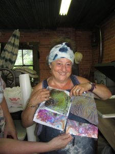
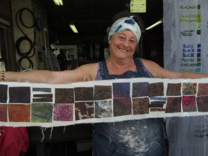
Took a class with Deborah Fell from Monday to Friday last week at Quilt & Surface Design Symposium (QSDS) at the Columbus College of Art and Design. It was divine. A return to a community of artists who get off on fabric, who are passionate about purposeful creativity, generous in sharing what they know and what they have in their stash.
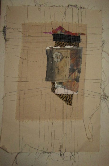
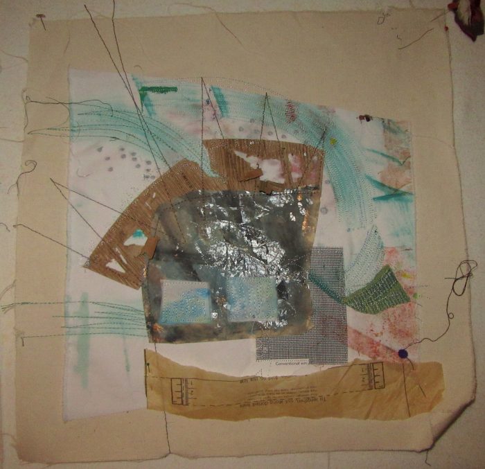
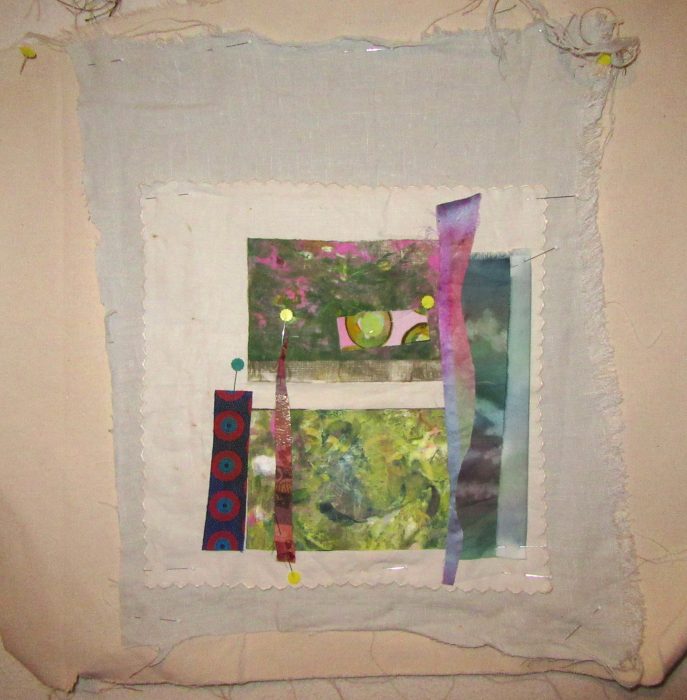
Deborah calls this 5-day class “Three Sisters”–Raw edge applique, foundation piecing (which isn’t piecing at all, it’s collage on a foundation fabric), and mark-making, i.e., slow, hand-stitching or quilting. My goals were to get away from the large opus magna I’ve been laboring over, and free myself up with a less is more approach. I also sought freedom from high concept, but aspired to put ambiguity into my work, so viewers might enjoy interpreting my work as they wish.
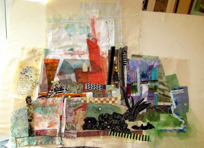
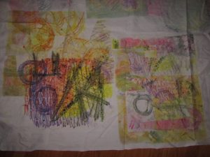
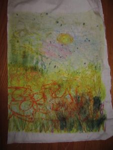
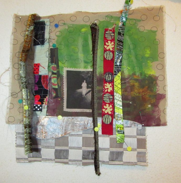
Above was my board by the end of the day Monday. Below, that’s me showing my work on Friday…as you may be able to tell, I had worked on each “textile sketch” with varying degrees of success.
No matter. I stretched, I grew, I stayed up late working in the classroom, I met my goals…some of the time, at least. Oh, and I had so much fun, with the best broads, who gave me support, interesting scraps, the loan of key tools, and unbelievably rewarding friendship, sharing their life and art stories.
Here are some of the pearls of wisdom Deborah Fell dispensed:
Embrace imperfiction.
I can quilt 10 stitches to the inch, but I don’t want to.
I was normal once. I didn’t like it.
Doubt is part of the creative process.
Think outside the block.
Plus, favorite quotes she included:
Learn the rules like a pro, so you can break them like an artist.–Pablo Picasso
Textiles have been a form of art, communication, survival, seduction, spirituality, expression, and community throughout history for all humankind on Planet Earth. — Elaine Lipson
Now for some close-ups of my work. Each one is still in process, and most vary from 15″-20″ on the longest side:
Hope to complete them all this summer, in among more pressing demands. Criticism always welcome!
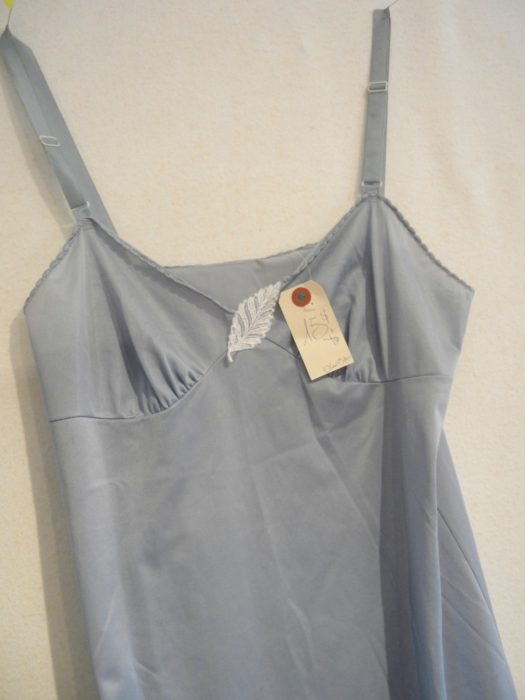
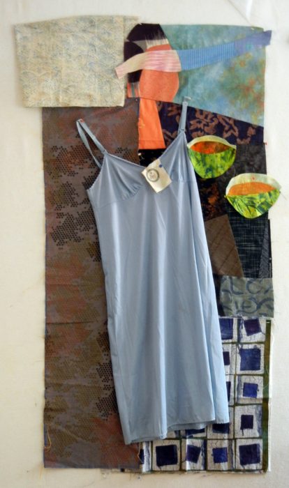
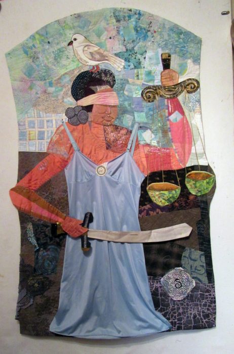
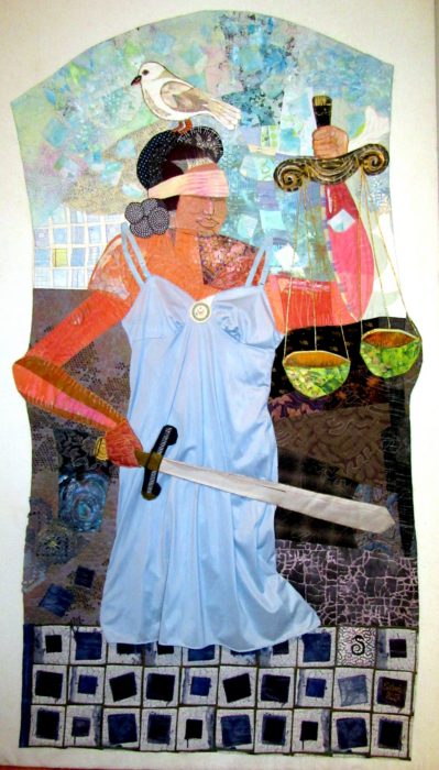
Not many people I know are aware of the “blue slip process,” a 100-year-old tradition in which home-state senators can indicate approval or disapproval, on a form printed on blue paper, of a President’s nominee for a lifetime seat on the federal courts, and advance or halt the nomination from moving forward. So I wanted to make a fabric illustration. But not with lingerie…that is, until my friend Carole queried, “Why not lingerie?”
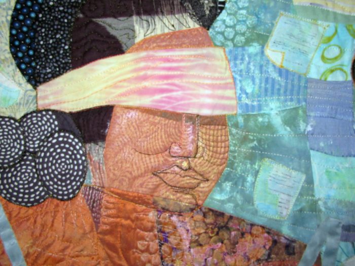
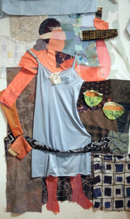
So when I found a blue slip in a Montreal vintage clothing store, and the price was right, I had my beginning. Was about to combine it in a patchwork of blue rectangles, but the outcome would have lacked color contrast and aesthetic interest. I couldn’t reconcile the actual undergarment with a geometric abstract. Next Eureka moment happened when my friend Barbara said, “Why not have Lady Liberty wearing the blue slip?” Which coalesced with my subject matter as my friend Sammie remarked that, “If anyone would wear a blue slip, it would be Lady Justice.” Bingo. I happened to have made a figurative block, and I sliced into the face to insert a blind-fold, and made the bowls for her scales of justice.
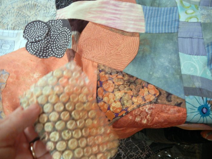
I probably could have (should have?) stopped there, but I felt the viewer would need some more visual clues. To integrate various areas into the piece, I did some painting, dabbing, and printing on vintage doilies and lace. I used applique and piecing to collage various fabrics into a cohesive background.
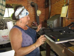
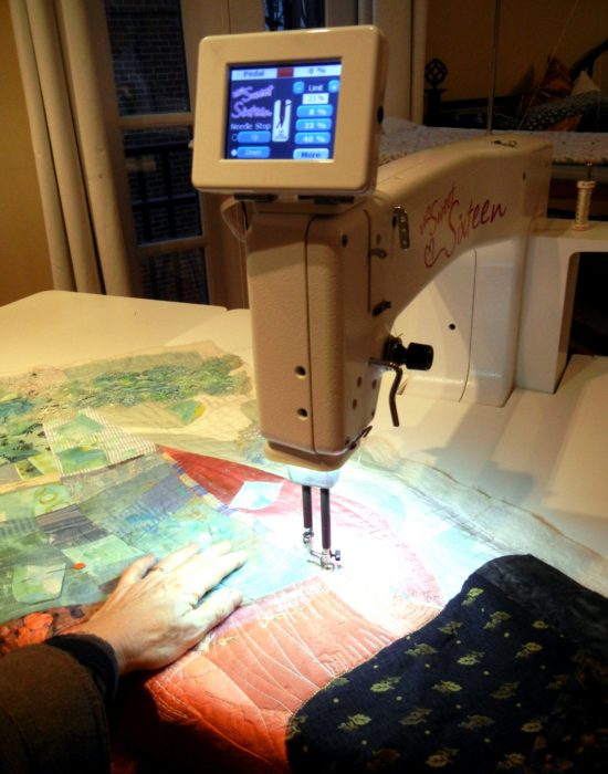
Next, I got to work with my new midarm machine, quilting each area down. That was a steep, but enriching learning curve…with days spent futzing with the machine, adjusting the tension with each new thread, and coming up with different quilting patterns for each section.
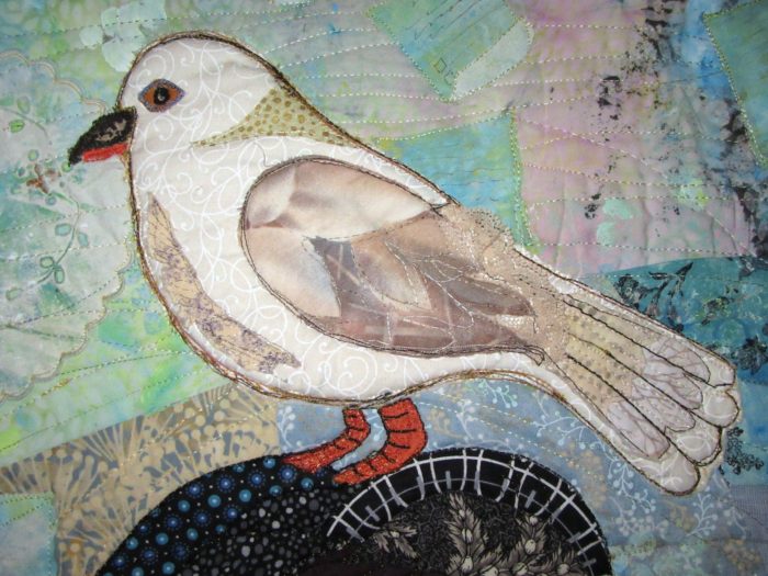
Note the blue slips swirling in the background. I intended to crop the top of the quilt, but couldn’t bear to do that, so I filled the extra space with a bird, like so many that perch on statues. It’s a mourning dove, which symbolizes both the desired peace of a fair, bipartisan process, and also the grieving that came when judiciary committee chairman Grassley abandoned the blue slip process, to move ahead with the nomination of two men who were unacceptable to their home-state senators.
Another vintage item, a sliver of a silver tie that my grandfather wore, became Lady Justice’s sword.
I expected the piece to end at the hem of the slip, but the effect was truncated, off-balance. Earlier, I had auditioned feet emerging from the slip, but they just didn’t stand up to the rest.
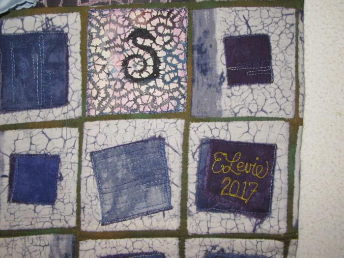
I wanted to suggest a pedestal base, and after auditioning multiple fabrics, I settled on an early choice–see my first draft second photo from the top. I altered this batik look-alike, quilting suggestive lines of type on all squares except for two: One sports a doily, it’s S-shape center motif alluding to the serpent at Justice’s heels. And one provides a space for my signature and date.
The finished piece is larger than I intended…As tall as I am.
And less expressionistic than I wanted. Yup, that actual blue slip gave abstraction the slip.
But it’s done!…which is always better than perfect.
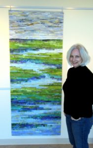
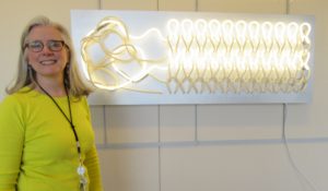
That’s the title of an exhibit Kevan Lunney put together at the Capital Health Medical Center in Pennington, NJ. This line-up of “rejuvenating work made of fiber and cloth” was sponsored by the hospital’s Art and Healing Committee plus Hopewell Valley Arts Council. And as the show just ended, I’m proud to share the fiber art pieces that rejuvenated my spirits with you here. Kevan is shown with her ground-breaking sculpture of neon and fiber, titled Repair.
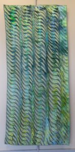
Mary Schwarzenberger’s Sunrise, left, and Wavelength, right, feature sumptuous texture that presents the softest side of fiber. Mary manipulates ice-dyed silk in a process she found positi
vely meditative during a recent catastrophic illness.
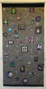
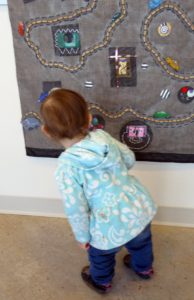
Kathy Velis Turan calls her 1 by 6-feet-long piece The Long Road. It represents “the journey we all take from childhood to adulthood, in good and not-so-good health.” I love the tactile qualities of window screen encasing burlap, painted fabric, rope and more, with shrink-art-plastic vehicles along the way. Little Sophia, daughter of weaver Joli Martinez, couldn’t stay away, and was hard pressed not to touch.
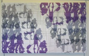
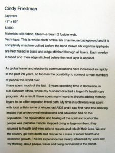
I work in the shadows of the art quilting world, but Cindy Friedman works with shadows. It’s worth reading her artist’s statement for this piece.
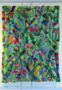
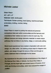
Michele Lasker combined lots of materials and techniques for her mixed media extravaganza:
Elena Stokes stands in front of her art quilt, Tranquil Marsh–Wild Iris. Her statement is a poem:
golden light
breaks the chill of gray…
blinking open
lush violet
blooms in a tranquil marsh…
wild iris
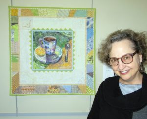
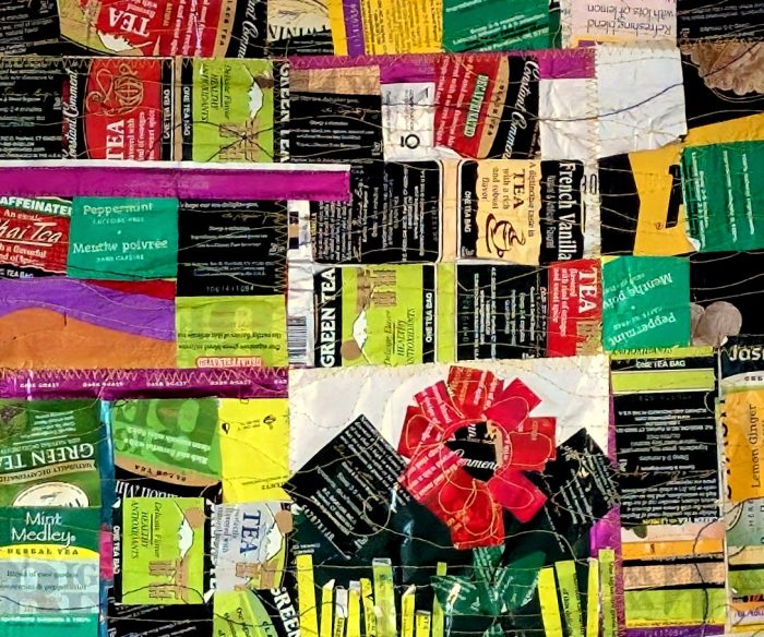
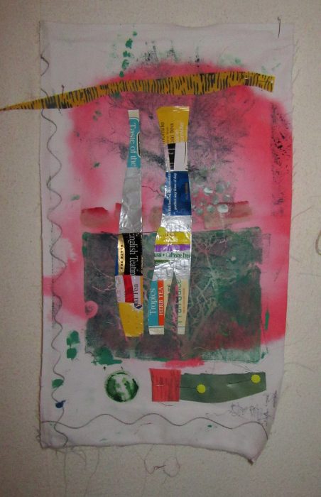
My piece is about tranquility too–or rather, Tranquili-Tea, since the center pictorial is made with the foil-lined envelopes that encase snazzy tea bags, and the border is made with my grandmother’s tea towels. My statement is a poem, too.
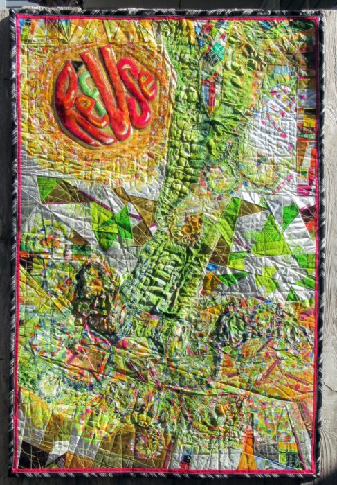
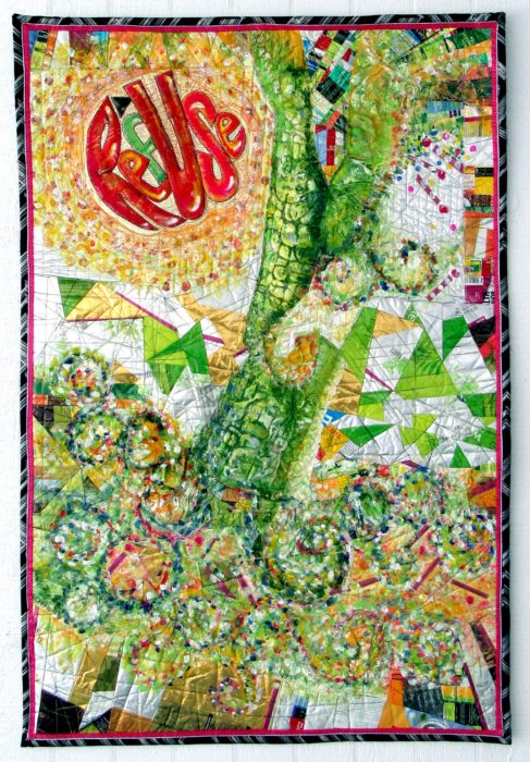
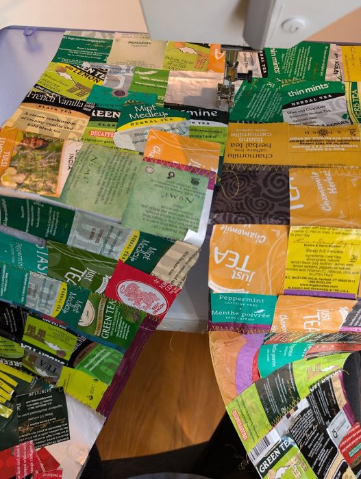
Here’s my finished piece, ReUSe/REFuse. 32″ x 48″ Photographed in harsh, side-lit natural light.
Certainly a learning experience. So grateful for all the wonderful advice I got from you blog-commenters: I emphasized the message text as well as I could, repeated the look of its circular shape, sought to add layers of paint to some areas, like posters peeling away, and to keep the color contrast, using pointistic dabs to lead the eye around the piece.
Just in time to enter it in the Mancuso Tri-State Quilt Show (March), and in the much more selective SAQA Textile Posters show…Here’s hoping it will be chosen by either or both, and have someplace to be seen in the flesh, er…cloth, er… mixed media of the trash kind.
Another photo, this time with indirect sunlight. Doesn’t show up the bubbling, but hies to the evenly-lit image requirements–all this amateur photog can handle with her little automatic Canon Powershot, no photo studios, reflective umbrellas, etc. etc. I’m always jammed right up to the entry deadlines, story of my life, so no time (or money) to hire a pro to shoot my piece.
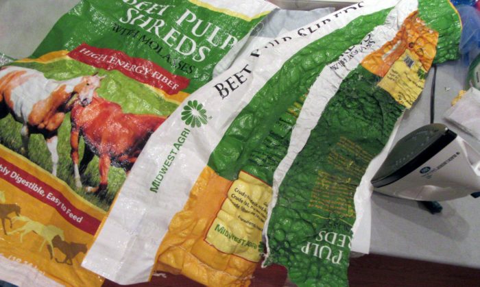
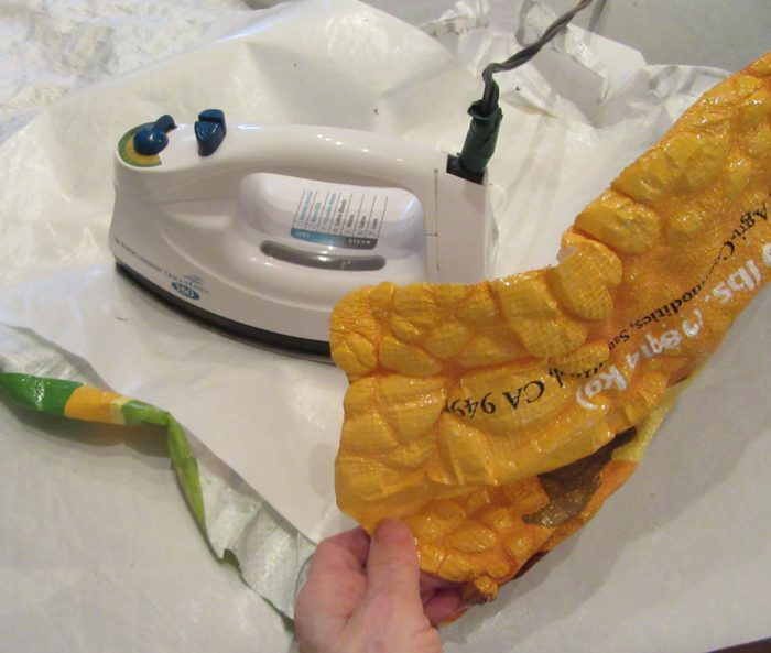
Having fun with my trash stash again. Who knew that ironing those woven, plastic, printed feed bags would produce such a yummy texture? Good buddy Linda Vola, whose horses and mule enjoyed what came in this bag, figured, as I did, that this would become a sturdy, colorful tote bag. Nope!
If you try this, be sure to protect your iron and ironing surface with quality Teflon pressing sheets.
I surmise from reading about classes taught by Linda Schmidt, that call for Tyvek and heat guns, that she demos similar techniques. Love the name of her website AND of this class:
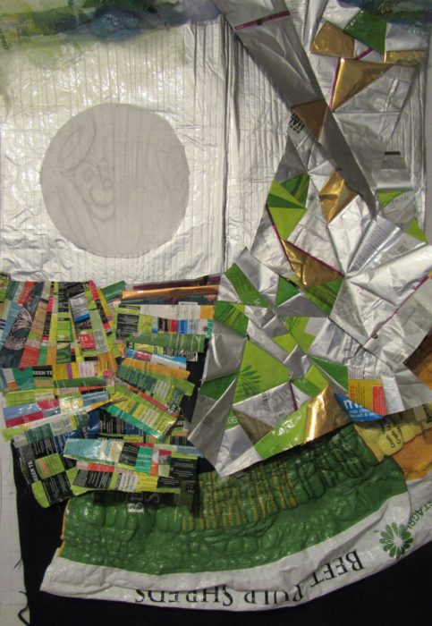
Wish I could take it, and learn from all her trial and error and success. Hoping one of her disciples will clue me in a bit until I do get a chance. In the meantime, I plod on, burning some spots, and falling back to piecing with other trash–er, foil-lined or plasticized packaging. Here’s a very early draft of what’s in the works, incorporating way too much, and not enough:


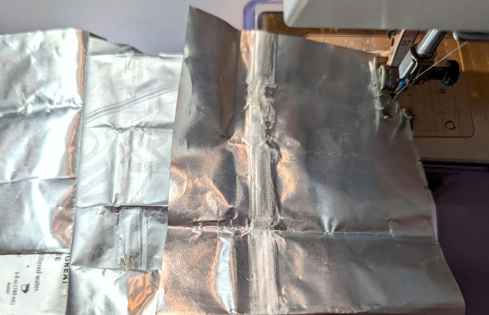
 The right half is the transfer of my workings onto satin polyester fabric. Then I printed a second time, resulting in the quieter colors of the left half.
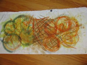 I preferred the poly cotton–more like the natural fabrics I use in my art quilts and craft pieces (table runners, pillow covers, tote bags, etc.). Here are two printings from one crayon-and-dye sketch, but with extra dye brushed on to bridge the gap between them.
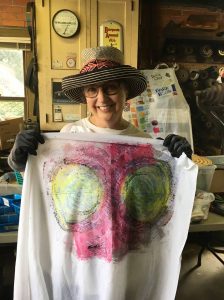 I was big into circles, and printing twice, with the second aligned. Inadvertently, I made myself a bodacious bra, huh?!
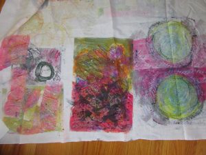

 That’s the title of an exhibit Kevan Lunney put together at the Capital Health Medical Center in Pennington, NJ. This line-up of “rejuvenating work made of fiber and cloth” was sponsored by the hospital’s Art and Healing Committee plus Hopewell Valley Arts Council. And as the show just ended, I’m proud to share the fiber art pieces that rejuvenated my spirits with you here. Kevan is shown with her ground-breaking sculpture of neon and fiber, titled Repair.