

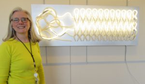
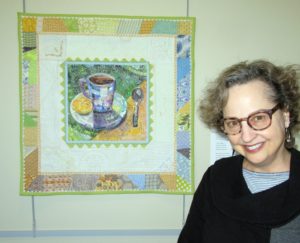
 That’s the title of an exhibit Kevan Lunney put together at the Capital Health Medical Center in Pennington, NJ. This line-up of “rejuvenating work made of fiber and cloth” was sponsored by the hospital’s Art and Healing Committee plus Hopewell Valley Arts Council. And as the show just ended, I’m proud to share the fiber art pieces that rejuvenated my spirits with you here. Kevan is shown with her ground-breaking sculpture of neon and fiber, titled Repair.
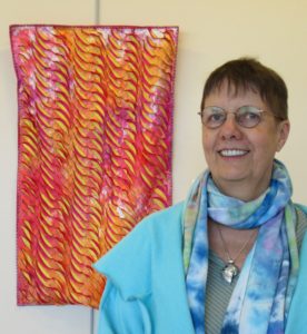
Mary Schwarzenberger’s Sunrise, left, and Wavelength, right, feature sumptuous texture that presents the softest side of fiber. Mary manipulates ice-dyed silk in a process she found positi
vely meditative during a recent catastrophic illness.
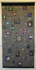
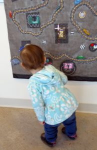
Kathy Velis Turan calls her 1 by 6-feet-long piece The Long Road. It represents “the journey we all take from childhood to adulthood, in good and not-so-good health.” I love the tactile qualities of window screen encasing burlap, painted fabric, rope and more, with shrink-art-plastic vehicles along the way. Little Sophia, daughter of weaver Joli Martinez, couldn’t stay away, and was hard pressed not to touch.
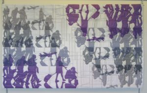
I work in the shadows of the art quilting world, but Cindy Friedman works with shadows. It’s worth reading her artist’s statement for this piece.

Michele Lasker combined lots of materials and techniques for her mixed media extravaganza:

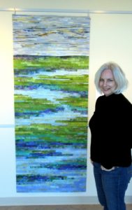
Elena Stokes stands in front of her art quilt, Tranquil Marsh–Wild Iris. Her statement is a poem:
golden light
breaks the chill of gray…
blinking open
lush violet
blooms in a tranquil marsh…
wild iris
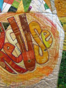
My piece is about tranquility too–or rather, Tranquili-Tea, since the center pictorial is made with the foil-lined envelopes that encase snazzy tea bags, and the border is made with my grandmother’s tea towels. My statement is a poem, too.
Serenity, a remedy:
Unwind, and slow down time.
Fluidity for every sense,
Renewal so sublime.
Recall, reflect, and reminisce.
Adapt, de-stress, grow calm.
Take tender pleasures such as this
As spirit-soothing balm.
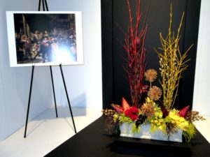
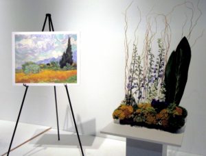
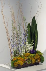
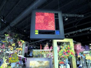 e Philadelphia Flower Show 2017 has vacated its enormous stage at the Convention Center, it is still the receiving bouquets for a master work. With Holland as the theme, classic Dutch artists were heralded with recognition of their signature styles as interpreted in flowers.
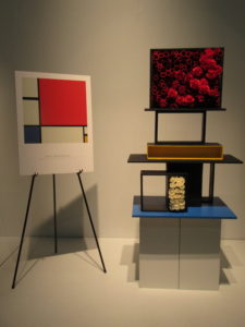
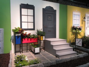 lters will see the work of Mondrian as an easy homage rendered in bright fabric, with black lattices à la stained glass appliqué. Gardeners will note that you don’t need to build vertical wall arrangements. Here, arrangers imagined the artist’s “Piet à terre” using planters that might have come straight out of Ikea, with paint added.
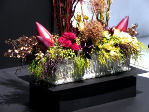
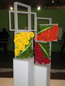
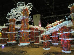
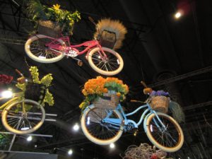
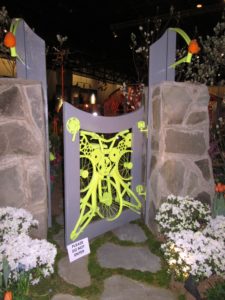
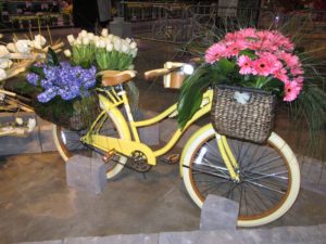
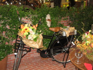
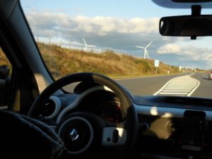
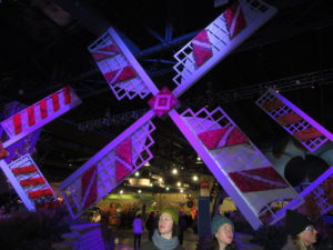 The best Flower Show ever! Which could be because it featured tulips, windmills, bicycles, wooden shoes, canals, tiles, and art. Could also be because there were NO crowds—snow, sleet, and ice kept them away.
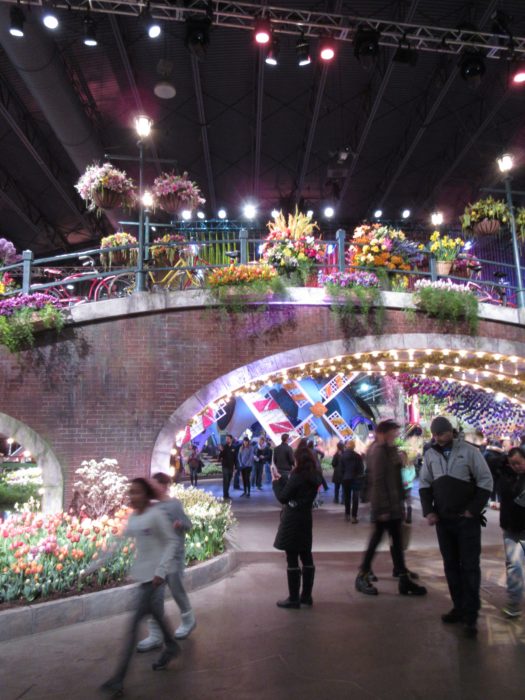
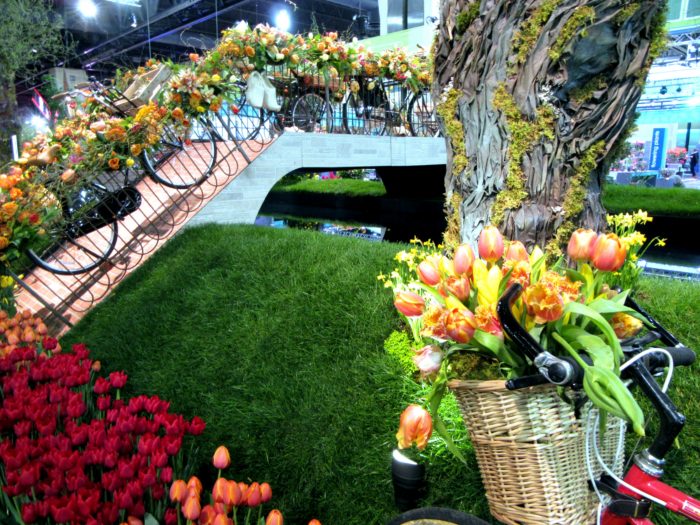
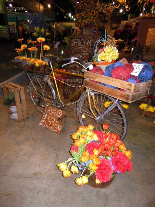 so clean. And the use of bike parts was oh-so clever.
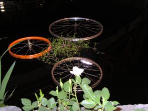
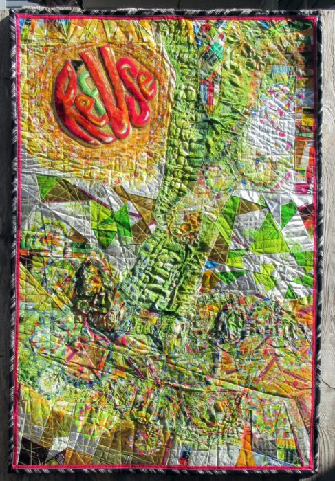
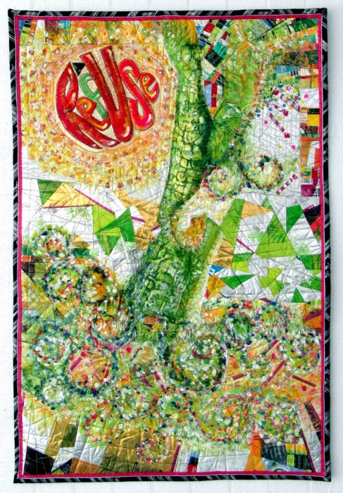
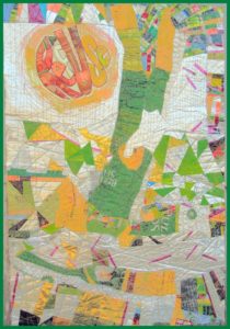
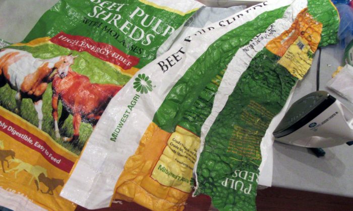
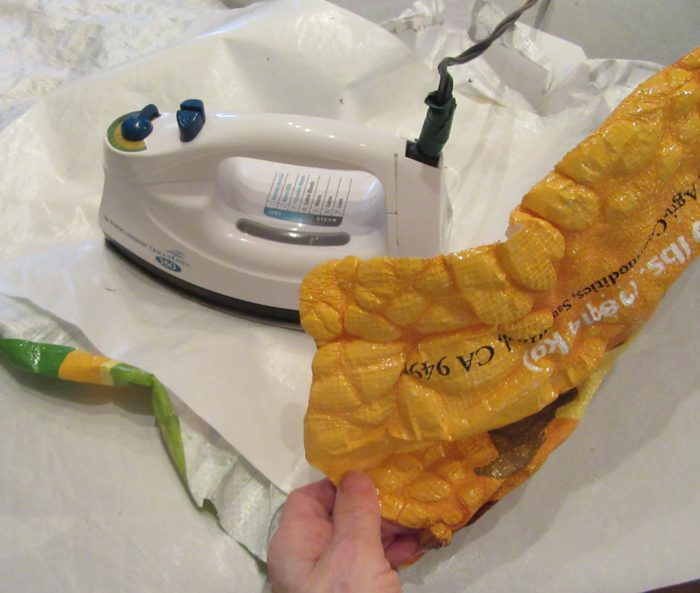
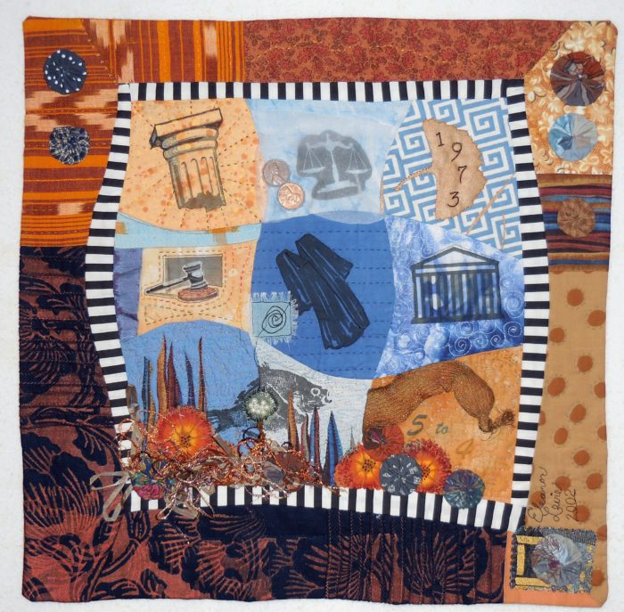
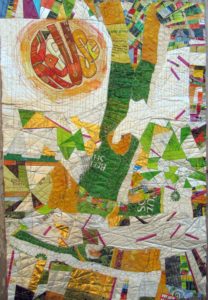 If you’ve read my last two blog posts, you’ll know that I’ve been working on a textile poster, pieced and appliqued out of trash–used packaging. A lot of the assembly came about in flip-and-stitch sections, with quilting to flatten everything down onto felt, then onto a backing.
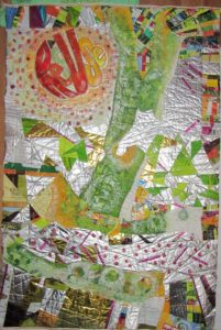
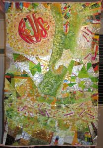

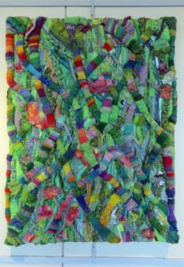
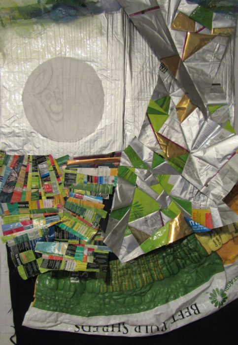
 Yep, this is part of my ReUse series, made from my stash of trash. A green quilt, to be sure. The text riffs on the word Reuse, as in recycle. Ref-use, meaning garbage. And Re: Use, referring to our use of dwindling resources. Maybe even Refuse — to be a user, a conspicuous consumer.
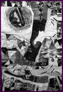
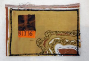
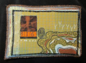
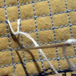
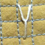
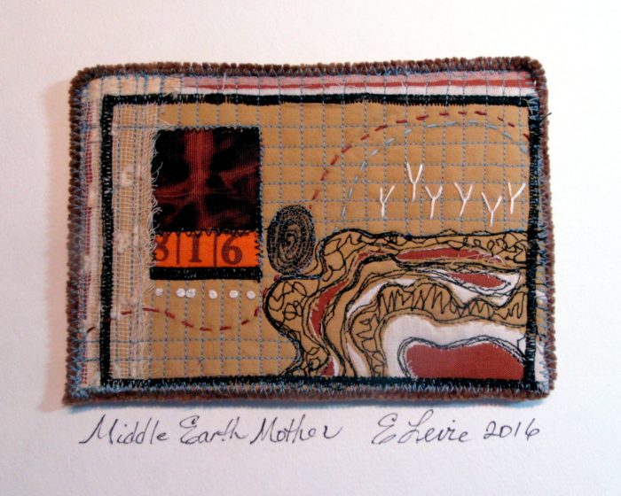
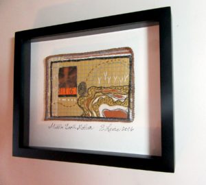
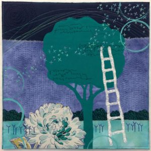 Boschert. She hasn’t been quilting forever, but she’s constantly pursuing her craft, and yet her work never looks labored. Or overly complicated. It hits you where you live: in the worlds of nature and of small, domestic comforts. I so enjoy her website: http://deborahsstudio.com/. There, you can sign up for her delicious newsletter, Three Bits of Inspiration. Additionally (a 4th bit?) I just ordered Deborah’s new book, Art Quilt Collage: A Creative Journey in Fabric, Paint & Stitch, which is sure to provide me with lots of inspiration, and as many at-home workshops as I sit down to do. Deborah uses trees, flowers, skies, circles, and ladders frequently in her work–all aspirational symbolism, right? She also returns frequently to those embroidered strokes she has called her beloved Ys.
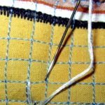
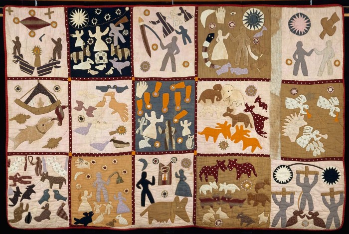
Wonderful quilts. Would loved to be able to enlarge them to see more detail!! Sally