Eleanor Levie HomeAboutEditorial ServicesBooksGallerySpeaker TopicsWorkshopsPast BookingsFree StuffLInks Contact Me

Inspiring Quilting: Elly's blog to boost your creative IQ

Archive for the ‘Inspiration’ Category

Cut-Ups for Quilt-Art

Monday, August 22nd, 2016

Here’s one piece of fabric from the painting play-date I described last month:

DSCN7806


I hated the result. But that doesn’t mean certain areas didn’t have potential. I cut up sections I liked, and fused them to Peltex–thick interfacing. The kind I had featured fusible on both sides, but I only adhered to one side, protecting my ironing surface from the other side with a Teflon pressing sheet.

Then, I mined for gold: went through my scrap stash of mostly silks and silky fabrics for collage candidates in warm colors and light, medium, and dark accents. When I found a piece that played well with my painted background, I pressed fusible web to the back, and without measuring, I scissors-cut strips and rectangles. Auditioned some arrangements. Fused the scraps in place. Quilted to make the compositions more cohesive. Couched cord or chenille yarn around the edges for a finish.

Center-of-Gravity

               Center of Gravity, 13″x 7″

galactic-donuts

Galactic Donuts, 6″x 4″

Those painted backgrounds are pretty well covered up, I confess. Can you find the areas of the painted fabric at the top that I used for each piece?

Painting Play-Date

Thursday, August 4th, 2016

DSCN7799

After winning, at a charity auction, a week at a large, lake-side house in Delaware, I invited a bunch of friends to come and play. On one of those mornings, three women answered the call to make art. I brought fabric, paints, brushes, a couple of brayers,  a Gelli art printing plate, and a mess of empty plastic containers, jars, and lids. I demo’ed what I’d learned about monoprinting:

Dab bits or globs of of acrylic paint on the Gelli plate, and roll it out with a brayer. Brush on dots or drag lines with the tip of the brush handle as the spirit moves you. Then, flip the plate onto fabric (I started with an orange print), and roll over it with a second, clean brayer.

DSCN7802

DSCN7803

Lift it up, and see what you’ve got. Add more monoprints alongside or on top. Add dots and dashes and lines of paint.

DSCN7815


DSCN7821

Below, check out part of another piece I belabored. I really wasn’t thrilled with anything I made. No matter! For me, this is just a start…I’ll cut up painted pieces for sections of an art quilt, or make art quilt postcards, adding other scraps, plus lots of decorative stitches.

crop

What really gets me jazzed is how my buddies, all monoprinting novices, absolutely, positively surpassed me in creating much more successful art pieces. And came up with techniques of their own that I never would have discovered.

Claire dared to use the same swirly-print fabric, but with a fun, folk-arty flair:

DSCN7809

This intuitive Alaskan also used the Gelli plate to pick up excess paint from her fabric, then turned the plate 90 degrees and rolled over the brayer to deposit perpendicular patterns. Claire shows off one side, then the other. Which do you like best?

DSCN7784DSCN7788

DSCN7791

 
DSCN7790

Meanwhile, Barbara of Bucks County, PA channeled Monet. I loved how she used clear plastic containers to alternate with the Gelli plate for monoprinting.

DSCN7785  DSCN7817DSCN7789

DSCN7795

DSCN7811


Finally, Dr. Marjorie of Narberth, PA mainlined a thoroughly modern, expressionist vibe, a la Miro, or Braque:

DSCN7786DSCN7805


Again, we found that the paint that leaked onto the back of the fabric had a simpler, more compelling design. Serendipity goes a long way!

DSCN7813

dscn7810
Another Marjorie experiment with a fabric that already has a strong print.


Monoprinting can be fairly monotoned, but is never monotonous. Printing over and over with the underside of a clear plastic container leads to a powerful abstract statement.

DSCN7797DSCN7818


DSCN7804

Many thanks to Miss Peggy, for taking over the photographing, given that our hands were full of paint!

Working with paints and various tools makes for lots of trading brushes and plastic lid paint palettes…and lots of mess. All the better to find a buddy or two or three to share the setting up, cleaning up, and fun. Can’t wait for the next play-date!


Sew Resplendent!

Monday, May 30th, 2016

Visiting with the Columbine Quilters in Colorado, I got to admire the many talents of one member in particular, Pam Ballard. Pam brought her spectacularly unique sewing machine to my workshop, and I’m so glad she did…

1,PB

1

This sewing maven graciously allows me to share her method to machine embellishment:

  1. Tape over all openings to prevent paint from seeping into the machine workings.
  2. Dilute nail polish (in this case, a chartreuse color) with acetone (nail polish remover) in order to lighten it. Apply with a sponge in up and down movements.
  3. Use Sharpie Poster Paint Markers (not permanent ink) to doodle and draw.
  4. Pam just reminded me:  take your machine outside and spray with clear acrylic sealant to seal the poster paint markings. BTW, this is the reason for the poster paint markers—the permanent ink Sharpies would bleed, she found.
  5. E6000 glue is her recommendation for adhering tiny jewels and other bling.

2front,detail

3front


back

side

Nail polish in different colors applied to various presser feet makes the one Pam wants to use stand out in the drawer.

presser-ft

Pam will lend other workshop participants her tools, knowing that as they are clearly identified with her colors and glam touches, she’ll get them back. Also when traveling, Pam stores the spools and coordinating bobbins in translucent pill bottles…a clever organization system if ever I saw one.

tools

No doubt by now you’ve noticed that Pam is partial to a certain color palette. She made the Wonky Nine-Patch blocks in my workshop, and plans to combine them with her hexies in a complex master-work of an art quilt.

PB,hex


Little gators are her mascots and muses!


top

top,alligator

Is this not smashing?! Would you ever consider pimping…er, primping your machine?

Out of Africa? Wearable Art

Saturday, May 28th, 2016

Stunning fashion at the Philadelphia Museum of Art stirs up passions…and questions. Those who know global fabrics have long recognized that the colorful fabrics long associated with Africa come from Europe, particularly the Netherlands. Which begs for an understanding of colonialism and economic exploitation. In any case, Africans as well as Europeans have embraced the fabrics, combining them in ways wild but wearable, even for large ladies.

safe_image

From its website (http://www.philamuseum.org/exhibitions/845.html):
Vlisco: African Fashion on a Global Stage, April 30, 2016 – January 22, 2017

Explore how the Dutch company Vlisco became one of the most influential textile brands in West and Central African fashion and a design inspiration around the world. Known for its bold and colorful patterns, Vlisco creates fabrics that marry tradition with luxury. This exhibition highlights the company’s classic and new designs, follows the creation of a textile, and showcases a selection of contemporary fashions by African and European makers as well as Vlisco’s in-house design team.
The wax printed textiles associated with Central and West Africa have a surprising history. Although consumers in Africa and the diaspora embrace them as African, the fabrics have long been designed and manufactured in Europe, and now in China and India. The most luxurious are the wax prints designed and made in the Netherlands by Vlisco. Shortly after its founding in 1846, the company began exporting imitation batiks to the Dutch East Indies (Indonesia). Three decades later, Vlisco found a new market in West Africa. This exhibition is offered in conjunction with Creative Africa, a season devoted to African art and design.”
Have a look!

DSCN6588

DSCN6599

DSCN6589

DSCN6590

DSCN6605

DSCN6606


DSCN6594

DSCN6595

DSCN6596

DSCN6597

DSCN6598


DSCN6600

DSCN6601

d1

DSCN6603

DSCN6602

DSCN6604


DSCN6607

DSCN6593

Sumptuous, right? Would you wear any of these wow’ems?


Diaspora in 3-D

Sunday, April 24th, 2016

It took a phenomenal exhibit to move me back to blogging mode–after months of merely Facebooking (sigh).

DSCN6351

Out of Africa: Primal Diaspora, by Buff McAllister; Crossings II, by Sandy Gregg; and Generation 2500, by Barbara Schneider


Stories of Migration is a joint venture by SAQA–Studio Art Quilters Assoc. and the Textile Museum, now housed at GW University in DC.  It takes the concept of diaspora, and moves it far beyond the traditional dispersal of Jews following the destruction of the Temple. From the Greek–a scattering or sowing of seeds, it now covers any body of people living outside their homeland. Psychological and evocative reactions and political ramifications are powerful. But because movement and geography, or space, are inherent to this theme, I am moved to share with you just a few pieces that go beyond the art quilt on the wall and take less usual positions.

Above, that big ball is a rolled up strip, 300 yards long, with overlapping hand-prints to depict the people and the journey of homo sapiens over 2500 generations.

Below are three shots of an installation piece by Sara P. Rockinger. She is interested in how “global social issues intersect, overlap, and become stitched together through shared human experience.” Handmade clothing from different cultures are molded and stiffened. Video projections allow the viewer (i.e., me) to become part of the experience, called In/Visible.

DSCN6356


DSCN6324

DSCN6353


Jane Dunnewold is a favorite artist of mine, working in fabric, paper, and lots of surface treatments. Taking a vintage quilt and handmade and vintage papers, she has used collage and weaving, added spackle and gold leaf to rework the idea of a soft covering for a bed into a symbol of transition and paradox. The title, “Receptacles of Memory,” can be applied to a great number of the pieces in this exhibit.

DSCN6337

DSCN6338


DSCN6350


I’ve also followed the evolution of Susan Else from quilter of bed quilts to art quilts to fabric sculpture. Above and below is her “Crossing Points.” She explains that decades of injury and counter-injury and outside interests catch people up in a web where they have nothing to lose by leaving.

This piece sits beneath a site-specific installation by Consuelo Jimenez Underwood, called “Undocumented Border Flowers.” Underwood was invited to submit work, as were other celebrated artists (Faith Ringgold is another one). The rest of the artists were juried in.
DSCN6332


More human-scaled, and perhaps more accessible, is this wonderful evocation of what it is to be an urban nomad. Kristin La Flamme has made a shopping cart over into a village, using fabrics from army uniforms, yarn, floss, and bungie cords. It’s called, “Home is Where the Army Sends Us.”

LaFlamme

Hoping this blog post sends YOU to see this exhibit before it closes Sept. 4. And, if you’re still reading, I have a copy of the exhibit catalog to send to someone. Share your personal migration story in the comment box below. Not much room, I know, so try to use fewer than 50 words.  I’ll pick one that particularly inspires me and mail you out this full-color collection showing all the pieces in the exhibit.

Give me a hand…

Friday, July 31st, 2015

KitchenHamsa (2)

Seems I have a hamsa series going. Often called the Hand of Miriam by Jews, or the Hand of Fatimah by Muslims, this middle-eastern symbol features three fingers and two thumbs. Don’t ask me why. A good luck charm, it’s said to ward off the evil eye…cast by those who would be envious of what good fortune you may have. Lots of folks wear a hamsa as a talisman around their necks. But since bad luck can occur right at home, frequently in the form of cooking disasters, I recommend a household hamsa —especially in the kitchen. Done in foil-lined, plasticized packaging like coffee bags and tea bag envelopes, the resulting art can be wiped clean of cooking grease, sprays from spills, dust and grime. I teach this class as a workshop for trash-stash quilting, using the sample shown above, or for a westernized version, the hand-in-heart motif below.

Hand-in-heart-1

Hand-in-Heart folk art, by Eleanor Levie, 2015, approx. 8″ x 10″


First time I ventured into hamsa territory was for a 2011 Quilt Alliance challenge; lots of shiny packaging made it impossible for this amateur photographer to capture a good representation.

2

Tahrir Square, by Eleanor Levie, 2011, 16″ x 16″

Recently, I answered another challenge with Eyes Wide Open as the theme. Right away, I thought of a hamsa with an eye, done out off coffee and tea bag packaging to reference the caffeine that literally opens my eyes, and the need to reduce and recycle that informs my trash stash quilting. Two other inspirations guided my creative pathway. First was  an article in the Summer SAQA (Studio Art Quilt Associates, Inc.) Journal referencing the keynote speaker at the SAQA annual conference. Namita Gupta Wiggers is an art historian, and director and co-founder of Critical Craft Forum. She pushed for art quilts to take a place of power. Art in and of itself, instead of simply as a reference to the older, more traditional form of a bed covering. To do that, she encouraged breaking out of the rectilinear picture plane, and redefining the medium through the use of materials other than cloth. Hmmmm.

Another inspiration from a few years back was Pamela Allen’s Black-Eyed Susan art quilt, where plastic doll eyes peeped out from the centers of a bouquet of blooms.

Thus was born my Black-Eyed Susan Hamsa!

DSCN1008

Securing top layers to bottom layer of black felt.


DSCN1013

Couching satin cord over felt edges.


IMG_20150730_190649560

Black-Eyed Susan Hamsa, by Eleanor Levie, 2015, 14″ x 24″ ?


DSCN1031

Photo by Carl Harrington, who is angling to get out of the photo business!

Best in Show

Wednesday, July 15th, 2015

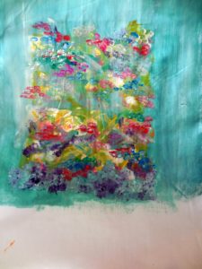
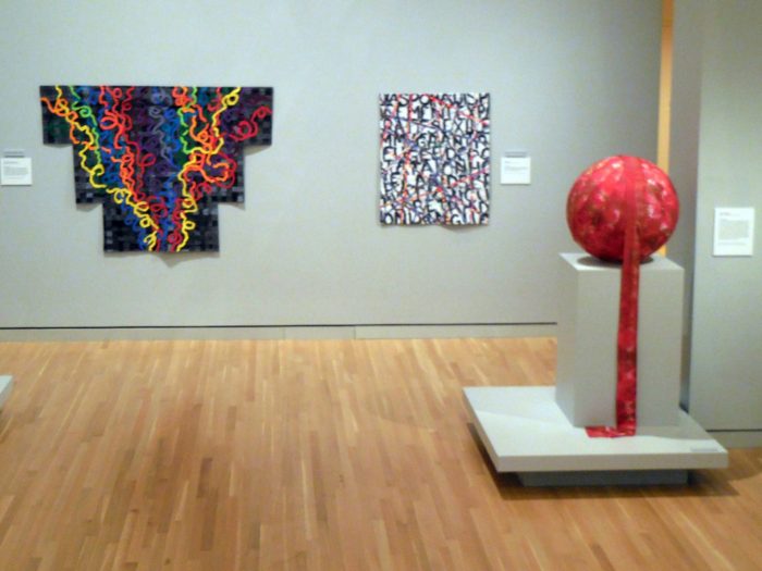
Can’t make it to the Dairy Barn in Athens, OH, where the incomparable juried venue for art quilts, Quilt National 2015, is on view. (dairybarn.org)  But got the catalog, and immediately fell in love with the quilt on the cover.

Picture2-400x400

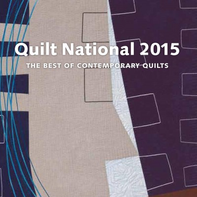
I’ve got extraordinarily good taste: the piece, shown below in its entirety,  justifiably won the Best in Show award.

Schulz_GirlintheCitywithBlueHair_32x51

Girl in the City with Blue Hair, by Karen Schulz 32″ x 59″

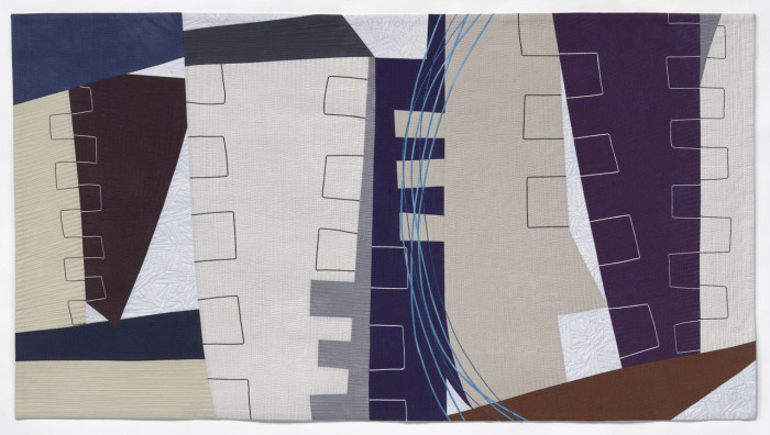
As any quilt lover will tell you, an image is a far-distant second to seeing a piece in the cloth, aka up close and personal. So I was thrilled to take a road trip to the Black Rock Art Center in Germantown, MD (near Rockville and Gaithersburg), where I could see several pieces by Karen Schulz. This one commands the space:

DSCN0893

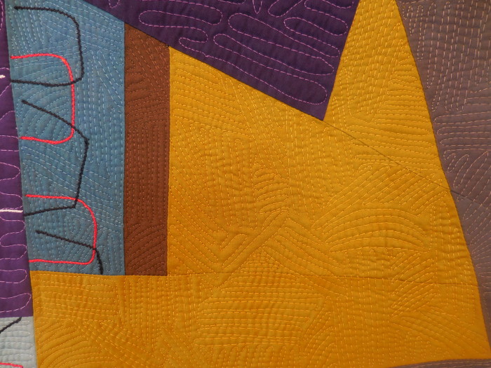
Out the In Door, by Karen Schulz 58″ x 66″


DSCN0896

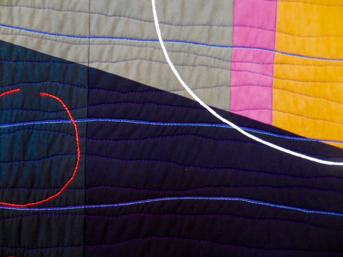
Out the In Door (detail), by Karen Schulz

Also from Karen’s Schapes—er, Shapes series, are these somewhat smaller pieces:

DSCN0883

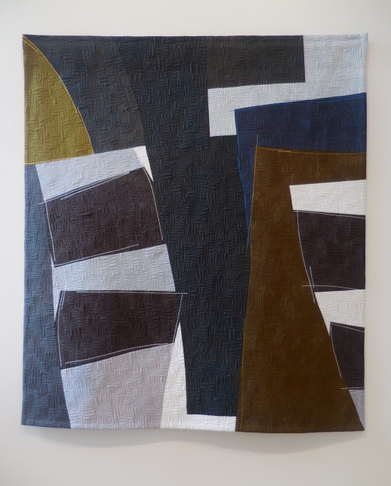
Beckoning 1, by Karen Schulz 50″ x 40″


DSCN0880

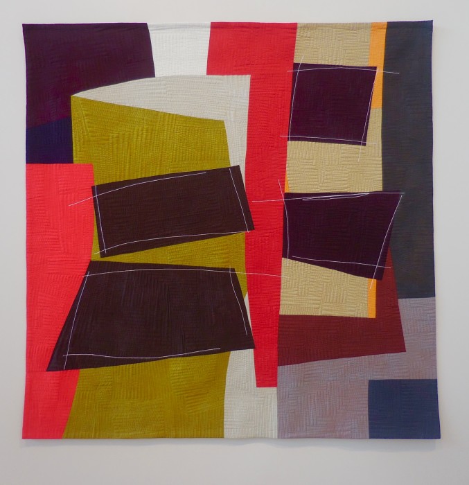
Beckoning 2, by Karen Schulz 47″ x 47″

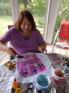
Sorry if the spacing is crazy in this post–I’m struggling with technology here! Derry of Gloderworks will no doubt come to my rescue.

Getting back to the important spaces: Notice how vibrant color blocking in one work is followed with subtle, sophisticated hues in the next. No matter the color palette, the hand-dyed fabrics are warm and rich. The shapes are monumental, angular, powerful. Quilting patterns—whether thin lines or free-motion zigzags alternately on the horizontal and on the vertical, deliver  smart, modern textures that perfectly complement the shapes. And taking the minimalist work to another level entirely:  A counterpoint of comparatively delicate, sketchy lines–couched, embroidered, or quilted. A lyrical dance on a stage of massive columns and platforms. Or, as Karen describes her her process on her website, “I am drawn to the tension created by the simultaneous holding of opposites. Circles and squares, stasis and movement, light and dark, the flat plane and three dimensional space; each is needed to highlight the other.”

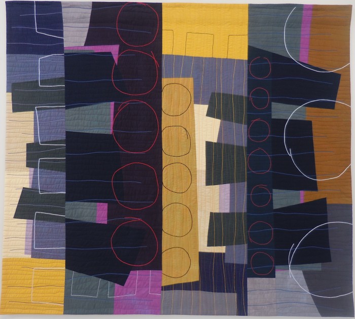
Here’s the third one of the series, all of which certainly beckon my attention:

DSCN0897

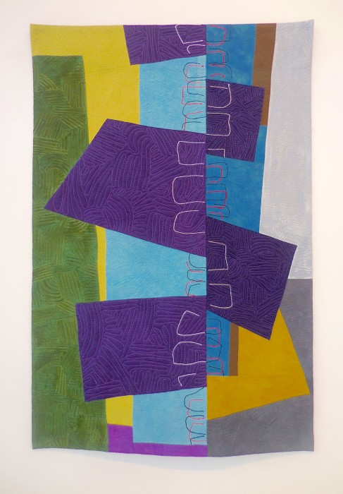
Beckoning 3, by Karen Schulz 40″ x 27″


Beckoning 3 (detail), Karen Schulz

Beckoning 3 (detail), by Karen Schulz [The blue shown in this photo is really off!]

Smaller pieces that rock my core:

DSCN0901

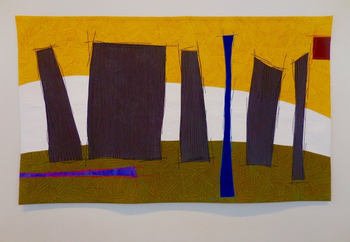
Stonehengeish, by Karen Schulz 28″ x 48″


DSCN0889

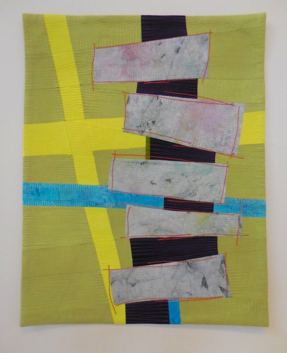
Stacked, by Karen Schulz 26″ x 20″


DSCN0891

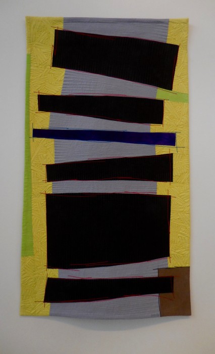
Bend, by Karen Schulz 45″ x 25″

The title of this last piece aligns with the fact that the artist is a clinical social worker who only recently gave up her private psychotherapy practice treating children, families and adults to devote full time to her art. Bend, as in, stay flexible, be willing to change and grow. Or, as in, that Eleanor Levie is really ’round the bend. Just kidding.  No really. Well, I am crazy about Karen Schulz’s current body of work. If you are, too, mark my words:  Given recent awards, this art quilter’s prices should surely be on the rise. Art collectors, this is the finest in contemporary art… in the medium of quilting. In my book, that means all the rich color of painting, and all the rich texture of sculpture, plus all the rich associative evocations conjured up by fabric, thread, and quilt history. Would one of these works by Karen Schulz look good in your home?

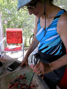
Yup, Karen Schulz is my new favorite artist. And that’s before I saw her picture on her website, www.karen-schulz.com. Wait: I know this person! She was in a Sue Benner class with me at QSDS many years ago. She was warm, composed, quick to laugh, yet determined to apply what she learned to composition with expert crafts(w0)manship. And clearly, in the intervening time and with the same deep integrity, she has learned to bend shape and line into extraordinary, masterful compositions. I’m proud to know her, and to have this opportunity to rave about her art quilts!

Woven Water

Wednesday, July 1st, 2015

Getting right down to it. Here’s today’s progress:

DSCN0754

Warp laid out


DSCN0788

Plain weave—over one, under one, with the lighter values of fabric and ribbons

DSCN0787

Medium tones woven in a basketweave or twill pattern, passing over 2 strips and staggering the next


DSCN0790

Getting ready to weave the darker section.

What? Not looking like water? Will wash away intensity with sheer fabrics, and balance the angles with curvy quilting lines…That’s the plan, anyway. Not that I ever stick to a plan!

Letting Concepts Flow

Monday, June 29th, 2015

No matter what the crisis or social issue, there’s a warm and multi-layered response from the quilt world. As a quilter who’s passionate about advocacy and fabric-play, I am salivating and drooling to participate in a challenge by Quilts for Change. The theme this year is:

Water is Life: Clean Water and its Impact on the Lives of Women and Girls around the World

A challenge quilt exhibit to debut at United Nations headquarters in Geneva, Switzerland in March 2016 to commemorate UN World Water Day. Organized by the United States Mission to the United Nations in Geneva in partnership with American Exchange Rome and Quilt for Change.

Quilters are invited to create and submit art quilts that address the issue of clean water and its impact on the lives of women and girls. Participating quilters can highlight any aspect of water – for example, how access to clean water can effect women’s daily lives, health, safety, the environment, mobility, income and development or any other aspect related to the theme, including women’s relationship to water, such as fishing, acquaculture and even transport.

The call for entries is here:

http://quiltforchange.org/quilt-for-change-exhibits/water-is-life/, and the deadline is Nov. 1, 2015.

Planning this work has meant 3 stages so far:

Idea collecting:

*Images of women with water containers on heads and yokes…which has been done so much, and to which I have no personal connection.

*Vessels–a symbol for women, bulbous or with sinuopus curves, vases or urns with handles that mimic the uterus with fallopian tubes, and vessels that call up containment in the sense of being held, of safety and security…and again, presume the womb!  I return to this image again and again in my work:

WeddingQ-M+M

Wedding gift for Archaeologist Marcie Handler and Classics Instructor Mark Atwood


for my mother

Gift for my mother, a wonderful potter, upon her 80th birthday

the vessel-detail-vase (2)

Detail of The Vessel

Vessel-ELevie1

Vessel (a completely different title, right?)


Stage 2: Panning for Gold! I read all the articles cited by the challenge orgs and more to better understand the issue. I googled images of microbes for typhus, river eye blindness, and more. Reviewed some great watery-art quilts and images used to illustrate the problems of water. Wishing well graphics would find their way into my piece…

Stage 3: Advice from the experts! Answering my calls for help, uber-advocates Janet Goldner and Sammie Moshenberg pointed me toward insightful articles on the subject, focusing on sub-Saharan Africa and Colombia.These readings illuminated the bigger problems, above those of purification, draught and pollution and access and climate change. It’s not just about good, scientific solutions to the problems of purification and access. That’s solvable. It’s corruption at the top, a lack of good governance. Funding for local wells, well-kept-up pipelines, and the technology for safe water and sanitation practices rarely reach those in poverty who need them most.

No question about it, WATER is a complex, many-layered problem, with interwoven aspects. Think I’ll do a woven piece and let it evolve…

PB090087

Waking Up, Down the Shore in process


detail1(2)

Surprise Party of Color, detail


Text is the only way I can think of to get across the sophisticated concepts. So I’ll layer areas of organdy, printed with words or phrases. Try to express the GAP of Governance, Access, and Policy. The importance of Power and Justice, Funding streams and the Full-on Flow of Wealth, rather than trickle-down realities. I’ve been pooling together other expressions: Pollution and Poison,  Poverty and Powerlessness—but these are all polarizing negatives. No one wants to see a PO (pissed off) attitude displayed, but a clear POV (point of view) seems essential.

What other words or phrases concisely speak to this issue? Could a top-down ordering of concepts in text be used to show the hierarchy of problems? Or differences in font size? And apart from using curves, spirals, teardrop shapes, and vessels, how to communicate the role of women in all of this? I’m struggling in the water…who wants to throw me a lifeline? Comments extremely welcome!


Tea Rex

Saturday, March 28th, 2015

TeaRex, detail

Word play is often a part of my art quilting, so my riff on T-Rex shouldn’t come as a surprise. And like other pieces in my ReUse, trash-stash series, this piece is made of tea bag envelopes, coffee bags, and other foil-lined packaging. And yeah, it’s a “green quilt,” as in the term coined by Susan “Lucky” Shie, representing an effort to use what’s on hand and upcycle, to do our part for the planet. Of course, the citrus net bags, vintage fabrics and trims, buttons, beads, and rickrack are here partly because, as my hubby bemoans, I never throw anything away.

Yes, I began with an appealing pun, a Barney-like dino and an Alice-in-Wonderland tea party set up, with a funky vase made from my grandmother’s well-worn, embroidered neck wrap, and the vase is filled with—what else?—tea roses.

TeaRex-detail-ELevie

Here’s where the word play wandered into sword play, quickly and quilterly lunging into the more politicized rooms of my mind. Didja notice the space ship and volcano out that window?

window

How about the tsunami rushing in, the blazing sun, the meteor hurtling towards earth? It seems our titan of leisure is cluelessly indulging in conspicuous consumption. Our Tea-Rex is denying inconvenient truths, such as global warming and waning resources for those lower on the food chain. Instead, the arriving guest invents wild fabrications…and invites extinction. A cautionary tale? A parable for our time? Obviously, this Tea-Partier is way out of date.

Tea Rex, by Eleanor Levie, 32″ x 57″, March, 2015