Why inspiration?
Inspiration is food for the soul. And everyone has her own personal tastes in what appeals and satisfies.
We quilters go to guild meetings, quilt shows, and look at books and magazines for inspiration.
We art quilters are often inspired by the work of other quilters.
I confess, I am so NOT inspired by art quilts that are jaw-dropping stunning, and look like they took hundreds of hours. I gaze lovingly at those but they just make me want to “close up shop” and get back to guaranteed productivity like weeding and scouring bathrooms.
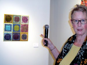
Nope, I’m inspired by work that simply charms. I feel very lucky when I find such a maker who teaches and thereby generously shares her ideas and techniques.
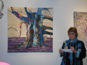
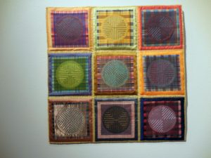
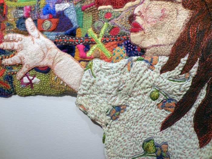
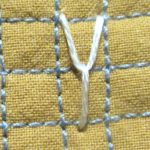
Like Deborah 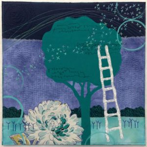 Boschert. She hasn’t been quilting forever, but she’s constantly pursuing her craft, and yet her work never looks labored. Or overly complicated. It hits you where you live: in the worlds of nature and of small, domestic comforts. I so enjoy her website: http://deborahsstudio.com/. There, you can sign up for her delicious newsletter, Three Bits of Inspiration. Additionally (a 4th bit?) I just ordered Deborah’s new book, Art Quilt Collage: A Creative Journey in Fabric, Paint & Stitch, which is sure to provide me with lots of inspiration, and as many at-home workshops as I sit down to do. Deborah uses trees, flowers, skies, circles, and ladders frequently in her work–all aspirational symbolism, right? She also returns frequently to those embroidered strokes she has called her beloved Ys.
As I traveled through Europe last month, I kept recalling her art quilts. Why do you think that is?
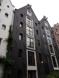
A very old building in Amsterdam, in the Netherlands.
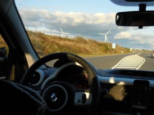
Wind turbines in Jutland, in Denmark
I really don’t understand why the Y element resonates. Maybe it calls to mind Yearnings. Or, on the bright side, Yes, Yaaay, Yipee, Yummy, and Young-at heart. And I don’t really get just why a multiplicity of Ys, wisely positioned, add texture and balance so enchantingly. But they do!
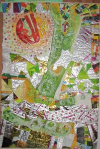
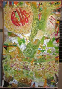
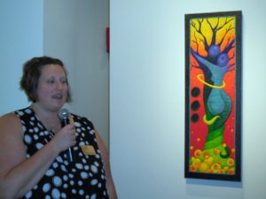
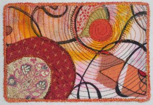
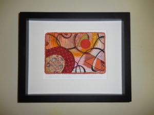
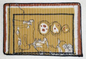
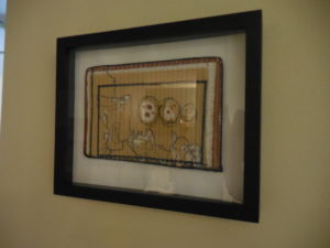
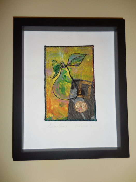
Under the influence, I found myself borrowing Deborah’s motif to the current work, a little quilt art postcard:
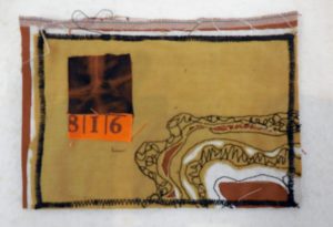
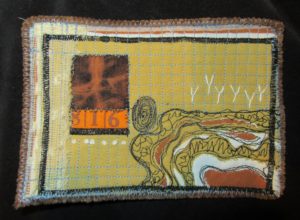
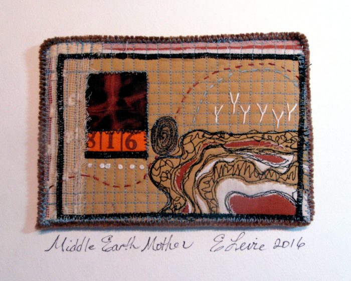
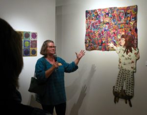
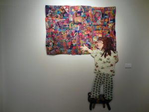
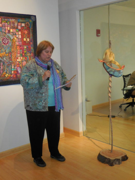
Here’s the piece, called Middle Earth Mother, in a shadowbox frame, for a show called Understory, opening at the Da Vinci Art Alliance, in South Philly tomorrow.
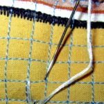
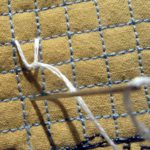
Pssst— Here’s a link to my free how-to’s for mounting art quilt postcards.
Here’s my artist’s statement:
Fingerprint, X-ray, and strata–cutwork through quilted layers: we are in, of, and on the earth to do good.
Which brings me back to the why–and the importance of inspiration. Because it goes hand in hand with aspiration. The wish to be better, to do better, to create better. Yes? What inspires YOU? How does such inspiration transpire into your work? Do leave a comment before I expire!


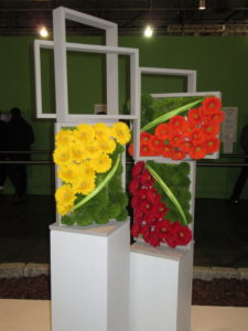
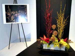
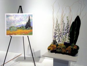
 e Philadelphia Flower Show 2017 has vacated its enormous stage at the Convention Center, it is still the receiving bouquets for a master work. With Holland as the theme, classic Dutch artists were heralded with recognition of their signature styles as interpreted in flowers.
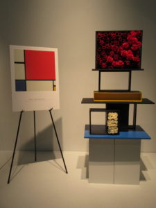
 lters will see the work of Mondrian as an easy homage rendered in bright fabric, with black lattices à la stained glass appliqué. Gardeners will note that you don’t need to build vertical wall arrangements. Here, arrangers imagined the artist’s “Piet à terre” using planters that might have come straight out of Ikea, with paint added.
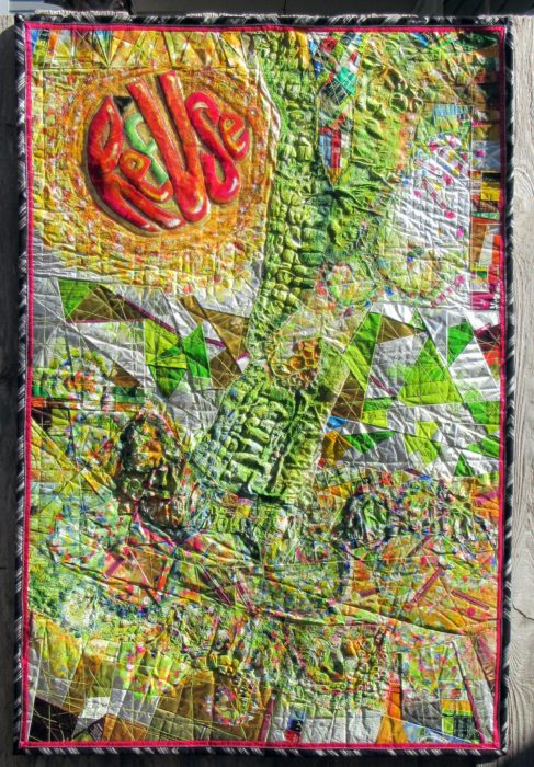
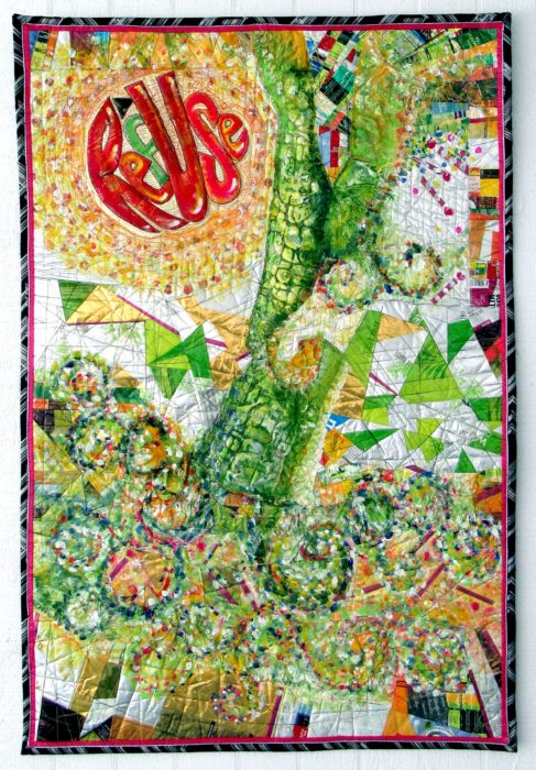
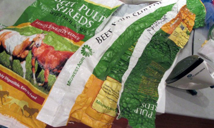
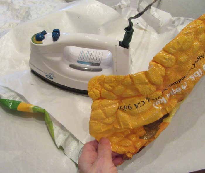
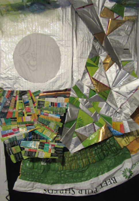
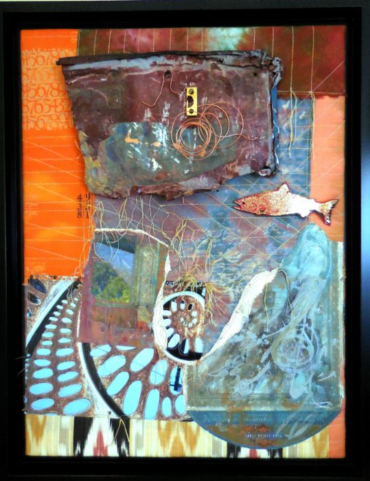
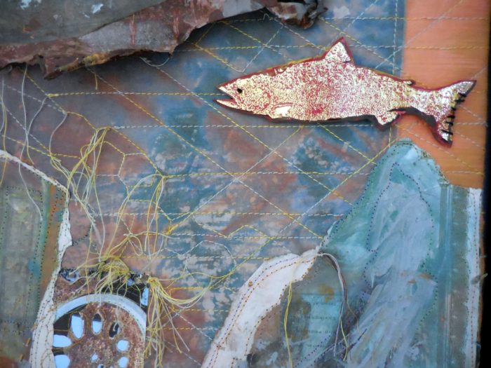
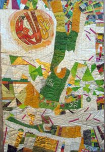 If you’ve read my last two blog posts, you’ll know that I’ve been working on a textile poster, pieced and appliqued out of trash–used packaging. A lot of the assembly came about in flip-and-stitch sections, with quilting to flatten everything down onto felt, then onto a backing.