Eleanor Levie HomeAboutEditorial ServicesBooksGallerySpeaker TopicsWorkshopsPast BookingsFree StuffLInks Contact Me

Inspiring Quilting: Elly's blog to boost your creative IQ

Archive for the ‘Color’ Category

Tradition with a (Muley) Twist

Saturday, June 10th, 2017

Just when I least expected it, a most relaxing, wonderful haven that is the Muley Twist Inn gave me an unexpected quilt fix.

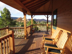
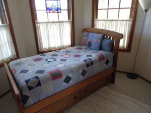
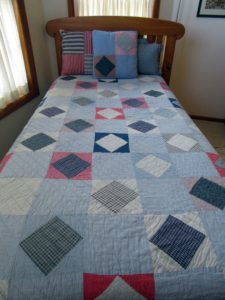
The husband and I arrived here after a long day hiking in Capitol Reef National Park. The inn Carl picked out is off the beaten track, outside Teasdale, Utah. The vistas are better than the guide books promise, and I began writing this post on the front porch overlooking a stunning view of low mountains and Ponderosa pines, the natural colors I’d been seeing for days. Innkeeper Penny, upon learning of my interest in quilts, let me into an adjacent bedroom where quilts were spread and stacked.

I was instantly charmed by this simple Square-in-Square, with alternating plain blocks:


Nine Patch may be the quintessential plain patchwork pattern, but the bubble-gum pink lattice and jazzy prints provide kicky refreshment.


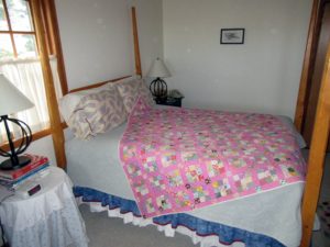
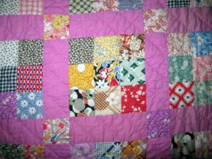
Experts will look at those prints and help me date this charmer…1950s?

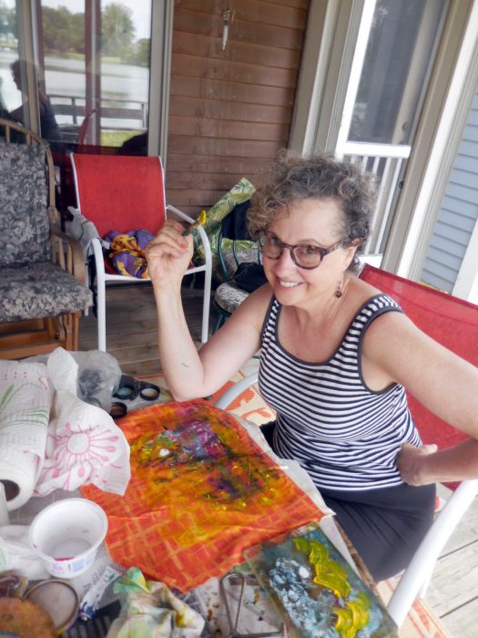
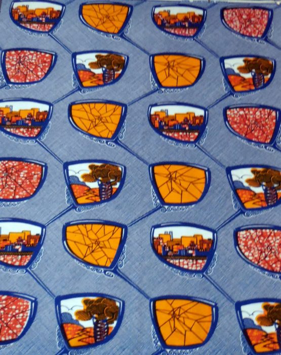
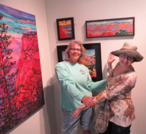
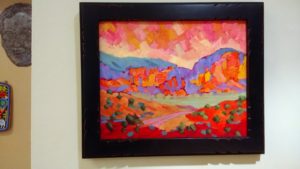
Made me think of how Southwest artists translate the landscape into vibrant vistas. Like my favorite local artist, Paula Swain. Ran into her at Gallery 24, in Torrey, UT–right after I’d purchased one of her works. The husband and I had a really hard time picking the one we wanted! Here it is hanging on our wall so I can enjoy “Capitol Reefs Color” as I eat breakfast. Paula told me that she was raised in a family that went out to do plein air painting at every opportunity. Her father pushed her to use a realistic palette, and she resisted. It’s only since he passed away that she’s felt liberated to take artistic license and go wild with color, putting her own twist on the tradition of landscape painting.


Repair and Connect

Wednesday, March 29th, 2017

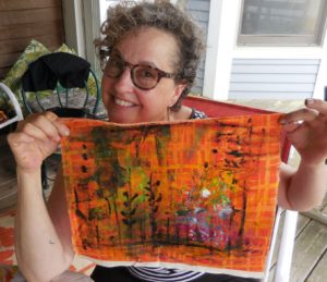
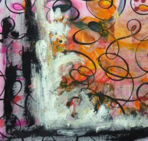
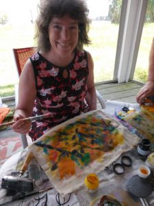
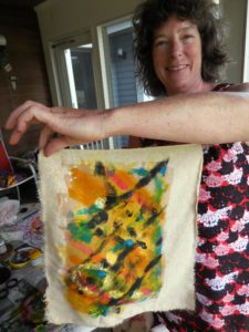
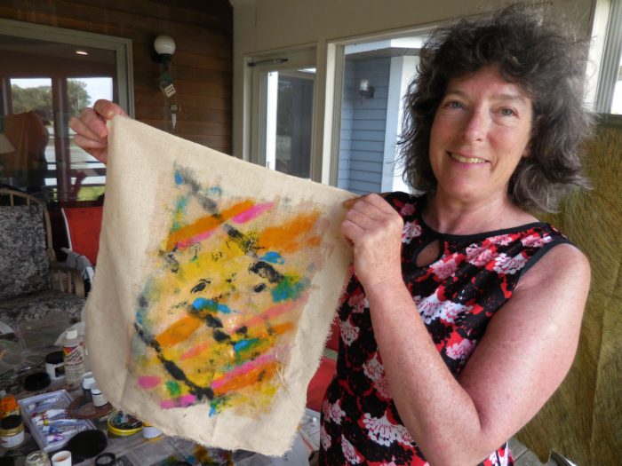
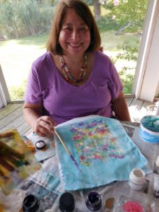
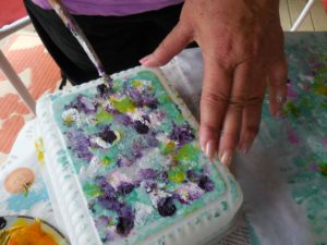
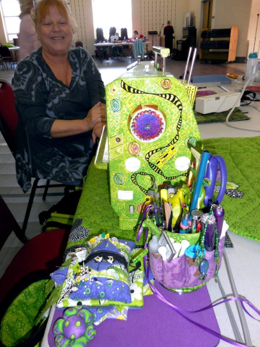
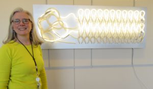
That’s the title of an exhibit Kevan Lunney put together at the Capital Health Medical Center in Pennington, NJ.  This line-up of “rejuvenating work made of fiber and cloth” was sponsored by the hospital’s Art and Healing Committee plus Hopewell Valley Arts Council. And as the show just ended, I’m proud to share the fiber art pieces that rejuvenated my spirits with you here. Kevan is shown with her ground-breaking sculpture of neon and fiber, titled Repair.

Mary Schwarzenberger’s Sunrise, left, and Wavelength, right, feature sumptuous texture that presents the softest side of fiber. Mary manipulates ice-dyed silk in a process she found positi
vely meditative during a recent catastrophic illness.

Kathy Velis Turan calls her 1 by 6-feet-long piece The Long Road. It represents “the journey we all take from childhood to adulthood, in good and not-so-good health.” I love the tactile qualities of window screen encasing burlap, painted fabric, rope and more, with shrink-art-plastic vehicles along the way. Little Sophia, daughter of weaver Joli Martinez, couldn’t stay away, and was hard pressed not to touch.

I work in the shadows of the art quilting world, but Cindy Friedman works with shadows. It’s worth reading her artist’s statement for this piece.


Michele Lasker combined lots of materials and techniques for her mixed media extravaganza:


Elena Stokes stands in front of her art quilt, Tranquil Marsh–Wild Iris. Her statement is a poem:

golden light

breaks the chill of gray…

blinking open

lush violet

blooms in a tranquil marsh…

wild iris

My piece is about tranquility too–or rather, Tranquili-Tea, since the center pictorial is made with the foil-lined envelopes that encase snazzy tea bags, and the border is made with my grandmother’s tea towels. My statement is a poem, too.

Serenity, a remedy:

Unwind, and slow down time.

Fluidity for every sense,

Renewal so sublime.


Recall, reflect, and reminisce.

Adapt, de-stress, grow calm.

Take tender pleasures such as this

As spirit-soothing balm.


Art in Flowers, the Phila. Flower Show, Part 2

Thursday, March 23rd, 2017

Although th
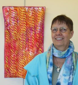
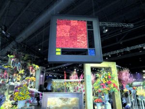
e Philadelphia Flower Show 2017 has vacated its enormous stage at the Convention Center, it is still the receiving bouquets for a master work. With Holland as the theme, classic Dutch artists were heralded with recognition of their signature styles as interpreted in flowers.

Piet Mondrian was everywhere. Especially in floral arrangements that echoed his structured compositions and primary colors.


Qui
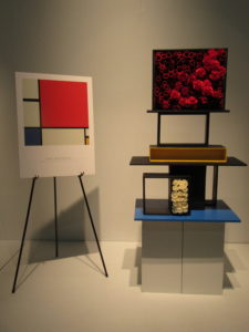
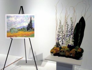
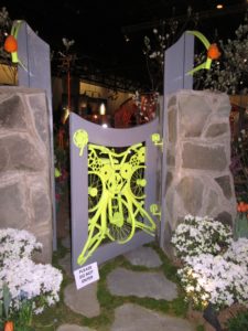
lters will see the work of Mondrian as an easy homage rendered in bright fabric, with black lattices à la stained glass appliqué. Gardeners will note that you don’t need to build vertical wall arrangements. Here, arrangers imagined the artist’s “Piet à terre” using planters that might have come straight out of Ikea, with paint added.

I LOVE it when quilters or floral designers use great art as inspiration. Check out these renditions of famous masterpieces by Rembrandt and Van Gogh:

Note to self: Pursue interesting scale and proportion in fabric and gardening compositions!

Hope you enjoyed this vicarious trip to the Flower Show!

Holland! aka Philadelphia Flower Show ’17 (Part 1)

Tuesday, March 14th, 2017

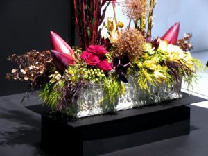
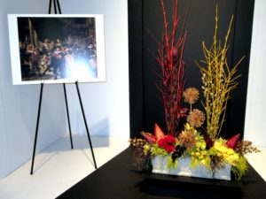
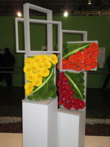
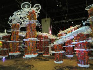
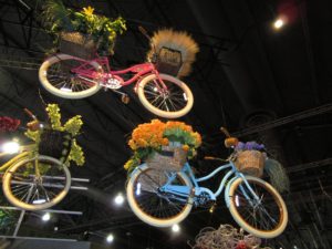
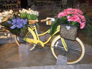
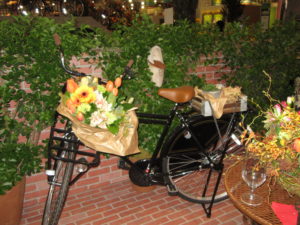
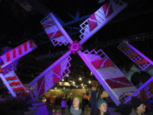
The best Flower Show ever! Which could be because it featured tulips, windmills, bicycles, wooden shoes, canals, tiles, and art. Could also be because there were NO crowds—snow, sleet, and ice kept them away.

Here’s the entranceway:

Bikes were EVERYWHERE, as they are in the Netherlands. We learned on a recent trip that in Amsterdam, if not all of Holland, there are 1.8 bikes to every human. They are so eco-smart. And the air is  oh-
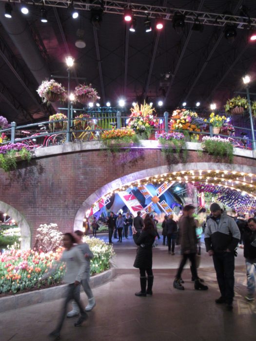
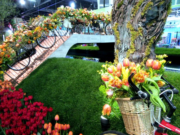
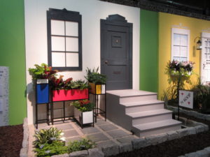
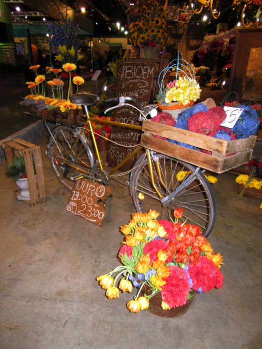
so clean. And the use of bike parts was oh-so clever.

Overdressing!

Saturday, January 28th, 2017

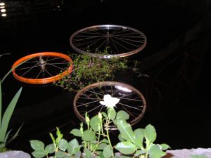
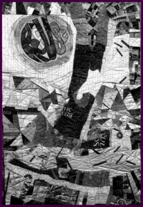
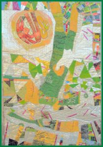
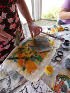
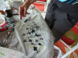
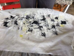
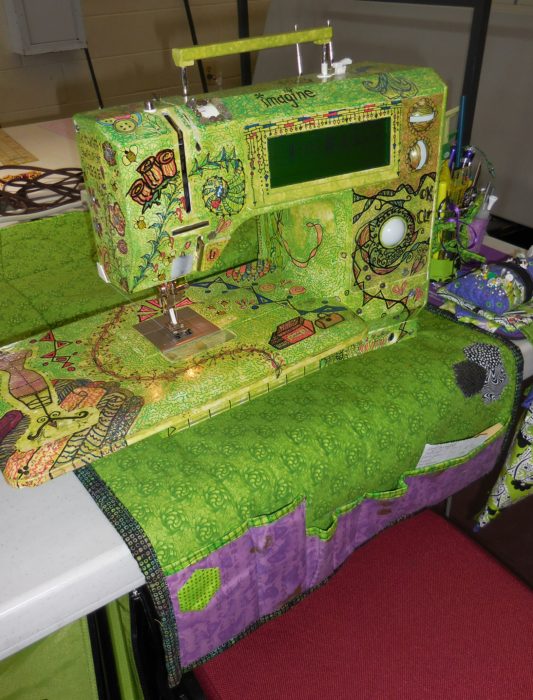
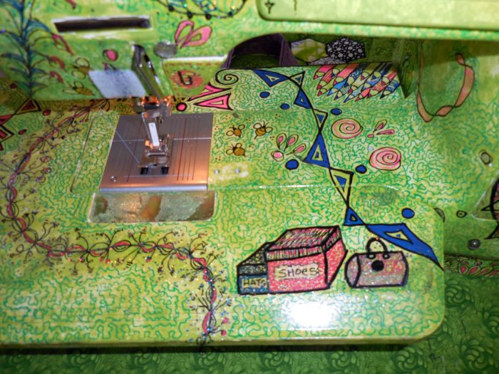
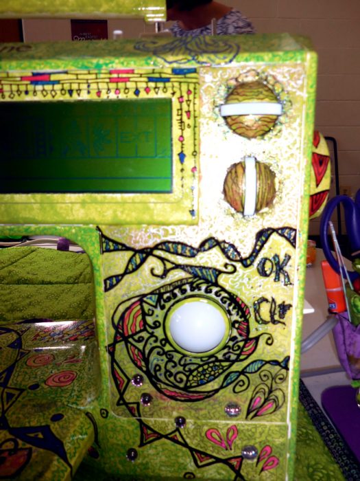
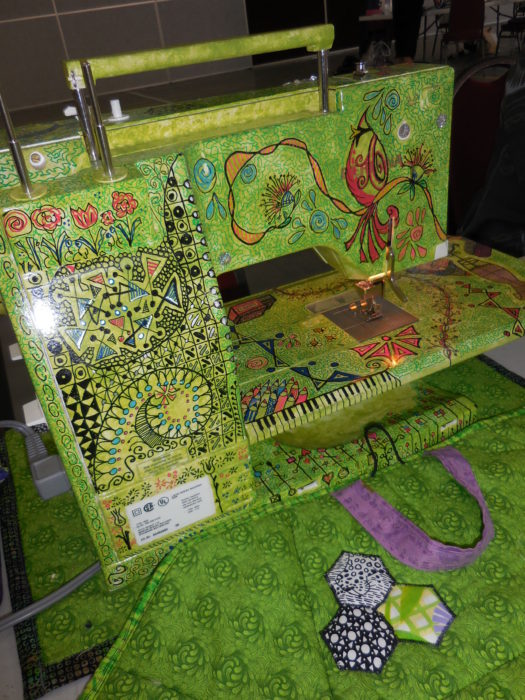
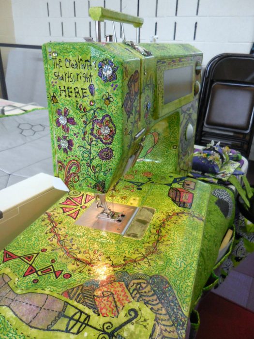
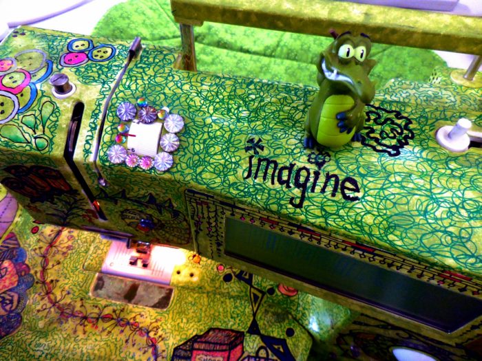
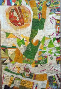
If you’ve read my last two blog posts, you’ll know that I’ve been working on a textile poster, pieced and appliqued out of trash–used packaging. A lot of the assembly came about in flip-and-stitch sections, with quilting to flatten everything down onto felt, then onto a backing.

The problems I saw were a jumble of clutter and a lack of cohesiveness. Many thanks to everyone who left a comment with a suggestion. I considered every single one. And I was determined to move on to address the problem, to redress and resolve those issues, and others brought to my attention, with paint.


Paint day 1–Brushwork, dabbing, sponging, dotting the fuchsia matchsticks—! or i?, adding a soft color to the f in RefUSe:

Better. But still, not half as cohesive as I’d like. On to Paint Day 2, now armed with my favorite paint tool, the Gelli Gel Plate–for mono-printing, and a few high quality tubes of acrylic. Continued to daub, sponge, and brush.


Getting there, now, I think. It’s a lot more impressionistic, which helps to blend the sections for the cohesion I’m after. A lot more yellow, yellow-green, and orange tones, for warmth and sunniness. I’m thinking most of what Joan had to say: “I would use paint so it would have the look of a wall that multiple posters have been ripped from and covered with more posters. I would soften some, completely paint over areas and leave some bright…”

I’ve darkened the S in RefUSe, and the outer edges of the second e–which seems to need a bit more darkening to be readable…Not that ReUS doesn’t have some merit as a message. It’s about “us” doing our part. And hopefully, this message won’t be interpreted as a plea for nationalism over globalism, cuz this citizen really doesn’t cotton to the America First slogan we keep hearing over and over…

OK, focus on your art, Eleanor. We’re not trying to be controversial this time. Honest.

Addressing, Redressing

Wednesday, January 25th, 2017

Composed. Meaning that I’ve put all the elements together for my latest work in progress, and the composition is complete. Brother — or should I say, Bernina, did I have a time quilting those bubbled, melted woven plastic pieces, which was a bag of beet pulp for horse feed (thank you Ms. Vola). See my last post, Bubble, Bubble, Melt & Muddle. Went through a lot of needles, needless to say. Packaging from other used products–coffee bags (thank you Emmetts and local coffee shop), tea bag envelopes (thank you Carl, Barb, Lesley, and Liz),  and foil enclosures for items like smoked salmon and Alka Seltzer tablets, constitute the rest of the surface. Oh, and I threw in some plastic mesh citrus bags.

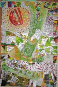
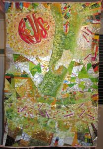
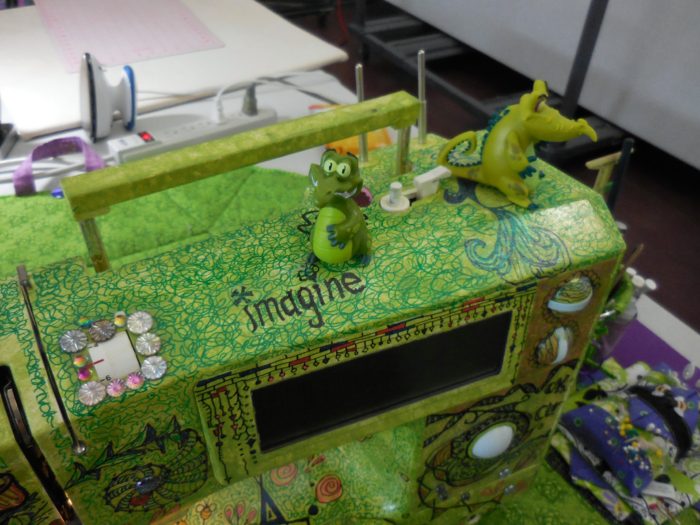
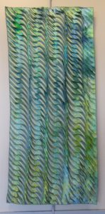
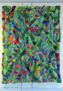
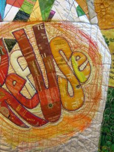
Yep, this is part of my ReUse series, made from my stash of trash. A green quilt, to be sure. The text riffs on the word Reuse, as in recycle. Ref-use, meaning garbage. And Re: Use, referring to our use of dwindling resources. Maybe even Refuse — to be a user, a conspicuous consumer.

So here I am. Piece needs some work in straightening and finishing the edges.

Considering crossing some of those fuchsia dashes. More is more??

Nuh-uh. What this piece REALLY needs is what my sewing studio needs: some serious decluttering.

See, I’m not showing off. Or fishing for compliments. Quite the contrary, I’m at a hypercritical stage, and fairly desperate for ideas and direction.

Let me interject here that this piece answers a call for entering 32″ x 48″ textile posters from Studio Art Quilters Association (SAQA). So, much as I’d like to severely crop it–which would be in service to the art, that would be a big capitulation of this opportunity for exposure.

Trial by computer: I translate the image to black and white, to view the contrasts and overall composition in a simplified way. I also added a border, to represent a binding all around:

Which tells me that there is just too much variance of contrast–too much piecing, making it jumpy and jarring.

I’ve decided to use paint to reduce the patterning. Excited about using a brayer to capitalize on the bubbled and quilted textures, for an effect resembling crackling. With hopes that the paint doesn’t crack off or flake…Will I need a primer? A sealant? I’m thinking of a whitewashing effect. Not necessarily white, but swathes of a single shaded color to blend areas of random piecing. [Note to self: Next time, keep crazy quilt patchwork to blocks, to contain and restrain the craziness. And make me less crazy.]

I’m no wiz at photo-editing to preview how this might look, but I have an “add flash” feature to show how lightening the whole thing might look, and I’ve added a light green border to stand in for binding:

Better, I think. Paint will also cover up any exposed brand names or logos of companies whose legal departments have nothing better to do than threaten artists and exhibitors.

The good news is, with this shiny, plasticized surface, I can easily sponge off newly-applied paint that doesn’t do it for me.

Friends, when I say I welcome comments, that is an understatement. Very grateful to get your artistic perspective. What do you think I should do?

Swimming Upstream

Sunday, October 23rd, 2016

swimgupstreamel

I am a bottom feeder who cannot pass up a slab of rusted metal in the street, the cardboard wrapper for some fancy smoked salmon, texture and patina. I have a box of such hard found pieces. I also have an accordion folder and loose piles of fancy papers, tear sheets, beautiful calendar pages…thank you, Sammie Moshenberg! Thank you, Barbara Adler for that glittery packaging from smoked salmon! From the time I was a girl, I collected my father’s lithography samples from when he worked for a printing company.

The obvious thing to my mind is to combine papers and metals into a collage. But I challenged myself to make unrelated materials play together. One way to do that was to use color—salmon and it’s color complement, light blue—as a way to breed the hard with the soft. Some of the papers had been given  a wash of paint, obliterating a clutter of text and integrating them into a cohesive grouping.

I thought the rusted metal held secrets, and history, and I looked to fabrics with not just color coordination but also unfathomable text and visual texture, to continue that narrative of mystery. Thank you, Lonni Rossi! I quilted them to provide a more stable background, and connected by stitch the ephemera, the old and new papers, with the cotton fabrics. Unsure of where I was going, I arranged and rearranged the composition, and when I thought I was close, I still had challenges of mounting the disparate pieces for durability of display, deciding to pull it over stretcher strips, screw spacer strips to support and elevate the metal piece, and camouflaging the screws with spirals of copper wire.

I was definitely swimming upstream, my title for the piece…. like the salmon, expecting only to get screwed by the all difficulties, and die in the end, that is, to have this project end up in the trash.

But on the other hand, I wasn’t floundering. The work had a nice flow to it, and I never felt I was fighting the current. Maybe that’s because my art quilting has not followed a single direction, despite my deep respect for artists who work in a series. I’m not a serious artist, and I can’t take my work or myself all that seriously. But I have to say, finding connections of line, and a balance of shapes is a very satisfying exercise for me. Perhaps, after all, this mixed media piece may not be a one-off; I just may return to the river where hard and soft textures and disparate elements combine. I’m not fishing for compliments, but I sure welcome feedback!

swimups-detail


Painting Play-Date

Thursday, August 4th, 2016

DSCN7799

After winning, at a charity auction, a week at a large, lake-side house in Delaware, I invited a bunch of friends to come and play. On one of those mornings, three women answered the call to make art. I brought fabric, paints, brushes, a couple of brayers,  a Gelli art printing plate, and a mess of empty plastic containers, jars, and lids. I demo’ed what I’d learned about monoprinting:

Dab bits or globs of of acrylic paint on the Gelli plate, and roll it out with a brayer. Brush on dots or drag lines with the tip of the brush handle as the spirit moves you. Then, flip the plate onto fabric (I started with an orange print), and roll over it with a second, clean brayer.

DSCN7802

DSCN7803

Lift it up, and see what you’ve got. Add more monoprints alongside or on top. Add dots and dashes and lines of paint.

DSCN7815


DSCN7821

Below, check out part of another piece I belabored. I really wasn’t thrilled with anything I made. No matter! For me, this is just a start…I’ll cut up painted pieces for sections of an art quilt, or make art quilt postcards, adding other scraps, plus lots of decorative stitches.

crop

What really gets me jazzed is how my buddies, all monoprinting novices, absolutely, positively surpassed me in creating much more successful art pieces. And came up with techniques of their own that I never would have discovered.

Claire dared to use the same swirly-print fabric, but with a fun, folk-arty flair:

DSCN7809

This intuitive Alaskan also used the Gelli plate to pick up excess paint from her fabric, then turned the plate 90 degrees and rolled over the brayer to deposit perpendicular patterns. Claire shows off one side, then the other. Which do you like best?

DSCN7784DSCN7788

DSCN7791

 
DSCN7790

Meanwhile, Barbara of Bucks County, PA channeled Monet. I loved how she used clear plastic containers to alternate with the Gelli plate for monoprinting.

DSCN7785  DSCN7817DSCN7789

DSCN7795

DSCN7811


Finally, Dr. Marjorie of Narberth, PA mainlined a thoroughly modern, expressionist vibe, a la Miro, or Braque:

DSCN7786DSCN7805


Again, we found that the paint that leaked onto the back of the fabric had a simpler, more compelling design. Serendipity goes a long way!

DSCN7813

dscn7810
Another Marjorie experiment with a fabric that already has a strong print.


Monoprinting can be fairly monotoned, but is never monotonous. Printing over and over with the underside of a clear plastic container leads to a powerful abstract statement.

DSCN7797DSCN7818


DSCN7804

Many thanks to Miss Peggy, for taking over the photographing, given that our hands were full of paint!

Working with paints and various tools makes for lots of trading brushes and plastic lid paint palettes…and lots of mess. All the better to find a buddy or two or three to share the setting up, cleaning up, and fun. Can’t wait for the next play-date!


LOUD Conversation prints!–Love ’em!

Wednesday, June 1st, 2016

DSCN6623

Contemporary wax printed textiles stretched onto frames—I’m guessing 24″ x 36″— like art: as stunning as the fashions in the Creative Africa exhibit currently at the Philadelphia Museum of Art’s Perlman annex. Did you catch my blog post about that? you can look at it here.

The comments are really interesting, as comments always are! The print below, though it seems to belittle conversation and communication, nonetheless speaks to the way all us quilters silently express ourselves through cloth:

DSCN6614

Although most people think of them as African, the fabrics are designed by Dutch designers and made in the Netherlands by Vlisco. Still, they are inspired by African motifs and symbols, and made into clothing and worn mostly by Africans. Here’s a photo from the collection of African architect Francis Kéré, also shown in the PMA exhibit:

DSCN6657

Clearly, the fabric you wear is an important way of expressing who you are. And your position in society. Here, the reference is to bolts of fabric included in an African woman’s dowry.

DSCN6616

I naturally gravitated toward other motifs related to cutting and stitching:


DSCN6633

DSCN6632

Symbols of upwardly mobile wealth, especially for women in the market and on the go, also take the forms of fancy shoes, wheels, and cars.

DSCN6631

DSCN6624

On the grill of a luxury car, the Vlisco logo takes over for Mercedes Benz.

DSCN6639

DSCN6640

Think those cracks in the side mirrors of a Mercedes refer to our warped perceptions of where we’ve come from, i.e., our humble beginnings? Or literally to the batik process of breaking up the wax painted on the fabric so dyes can seep into the cracks?

Another traffic-related print poses the question, are you heading towards love or money?

DSCN6646

Perhaps the most “out-there” fabric from 1953 features a traditional patchwork design around a sort of fertility mandala, shall I say? It’s named after an African proverb that translates to “children are better than money.”

DSCN6648

Stay tuned. My next post will show some distinctly African-made fabrics. In the meantime, how do YOU use conversation prints in your work?

Sew Resplendent!

Monday, May 30th, 2016

Visiting with the Columbine Quilters in Colorado, I got to admire the many talents of one member in particular, Pam Ballard. Pam brought her spectacularly unique sewing machine to my workshop, and I’m so glad she did…

1,PB

1

This sewing maven graciously allows me to share her method to machine embellishment:

  1. Tape over all openings to prevent paint from seeping into the machine workings.
  2. Dilute nail polish (in this case, a chartreuse color) with acetone (nail polish remover) in order to lighten it. Apply with a sponge in up and down movements.
  3. Use Sharpie Poster Paint Markers (not permanent ink) to doodle and draw.
  4. Pam just reminded me:  take your machine outside and spray with clear acrylic sealant to seal the poster paint markings. BTW, this is the reason for the poster paint markers—the permanent ink Sharpies would bleed, she found.
  5. E6000 glue is her recommendation for adhering tiny jewels and other bling.

2front,detail

3front


back

side

Nail polish in different colors applied to various presser feet makes the one Pam wants to use stand out in the drawer.

presser-ft

Pam will lend other workshop participants her tools, knowing that as they are clearly identified with her colors and glam touches, she’ll get them back. Also when traveling, Pam stores the spools and coordinating bobbins in translucent pill bottles…a clever organization system if ever I saw one.

tools

No doubt by now you’ve noticed that Pam is partial to a certain color palette. She made the Wonky Nine-Patch blocks in my workshop, and plans to combine them with her hexies in a complex master-work of an art quilt.

PB,hex


Little gators are her mascots and muses!


top

top,alligator

Is this not smashing?! Would you ever consider pimping…er, primping your machine?