

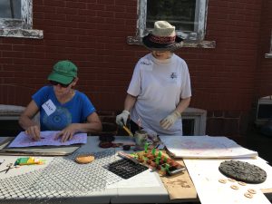
 A fascinating exhibit opened this week at the Da Vinci Art Alliance here in Philly, and it i. a collaborative exhibition with Philadelphia Sculptors. Sculpture–or at least 3-D media of any kind was the requirement, addressing the theme of “shelter.” The theme of refugees and immigration resonated with many of the artists, and a number of them used their work to present a shared desire to create a safe haven for people fleeing unsafe environments. Perfectly appropriate for a show in Philadelphia, a sanctuary city with an ongoing battle against Immigration and Customs Enforcers, or ICE.
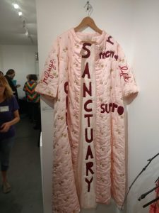
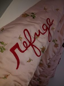
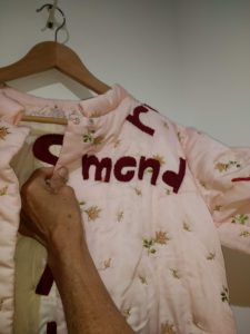
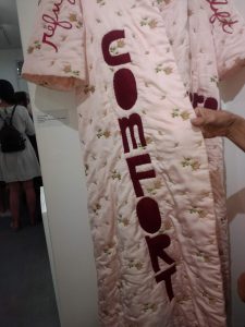
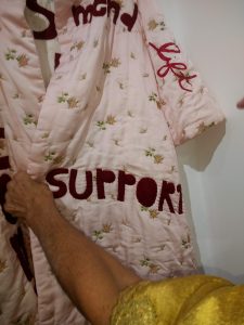
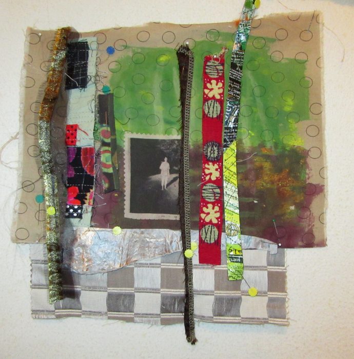
Nothing in the show was quilted in the traditional sense, but there was a lot of soft sculpture as homey, enveloping, forgiving, resilient. Well, then again, there was this quilted bathrobe, a vintage piece augmented with text in felt, thread, and paint by Carole Loeffler.
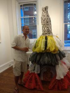
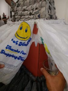
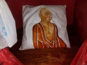
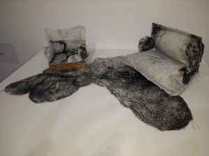
The largest piece was “Buddha’s Sustainable Shelter” by Chanthaphone Rajavong, who stands beside his tower. He gave me a peek into the underlying structure–all recycled cardboard. Can I say how much I covet a dress with a woven newsprint bodice and tiers of plastic bags? But I only committed to getting on my hands and knees to photograph the painted pillow inside this shelter.
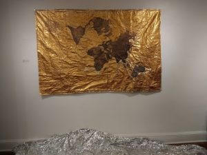
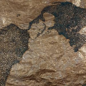
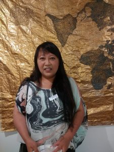
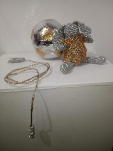
Artist Cindy Lu also used recyclables for her pieces: emergency mylar blankets. She poses in front of her very large beaded map, called, simply, “Home.” Opposite that work is an intimate patchwork and crochet grouping, called “Play.”
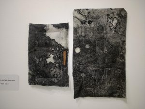
On the very small-scale front were two groupings by Chelsea Nader. They are intaglio prints on linen. ” Where she told me” features a miniature living room vignette, and “Open your doors and take down your walls” has two doors.
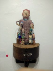
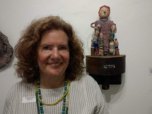
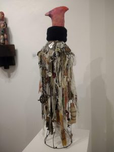
Gotta admit, my favorite pieces–and the hubby’s as well, were by Dumpster Diver Ellen Benson. Her “Friendship Circle Divas” (at the top of this post and below, with Benson) and her “For Every Bird a Nest” take the idea of shelter straight to the personal and endearing.
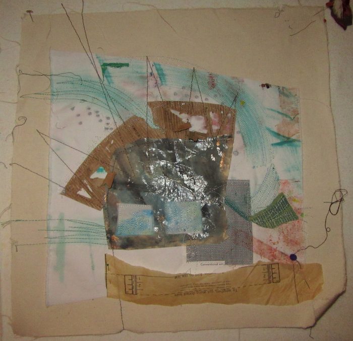
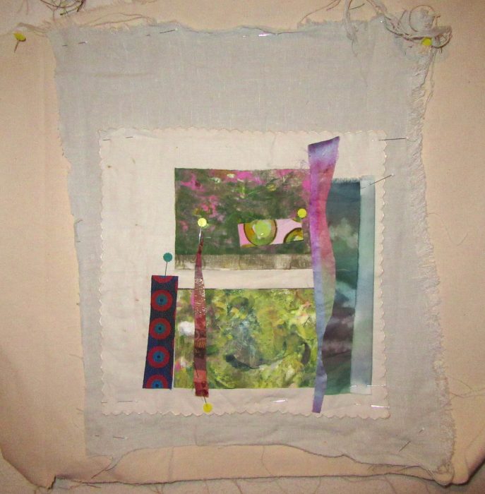
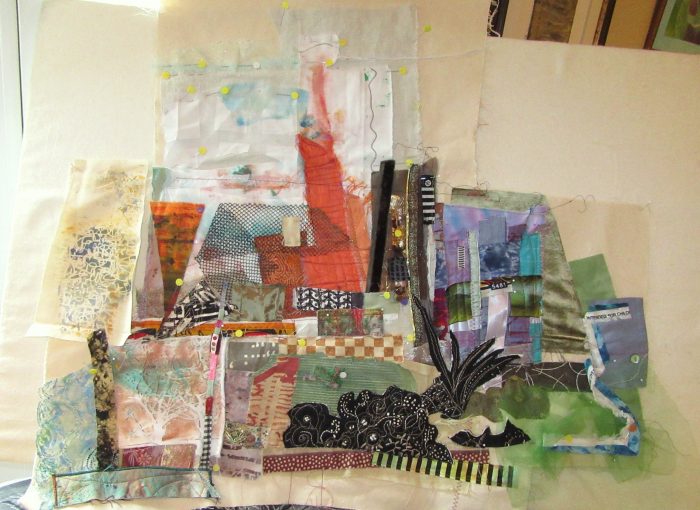
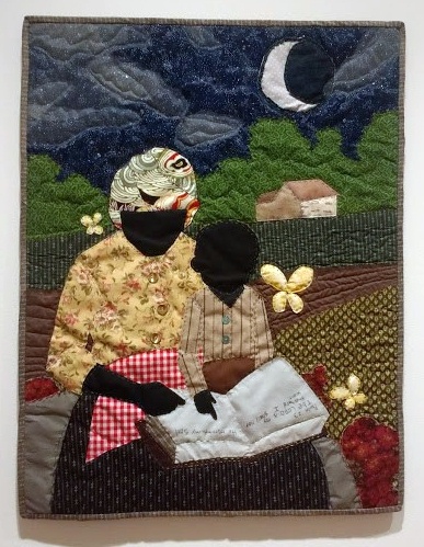
As I mentioned, none of these works are quilts in any traditional sense. Nevertheless, the use of fabric and thread, of layers and soft, tactile textures and dimensionality does hie back to quilts as a part of our heritage and legacy as bedcovers, as security blankets, as protection against the cold. How does your work fit the theme shelter?


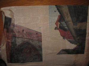
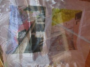
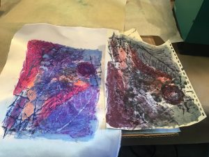
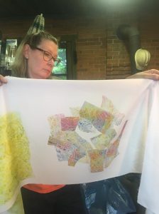
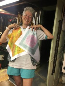
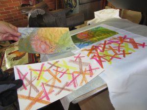
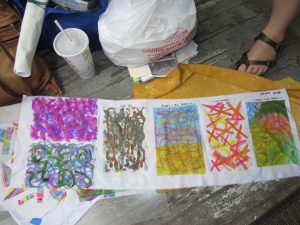
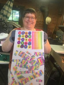
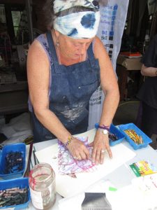
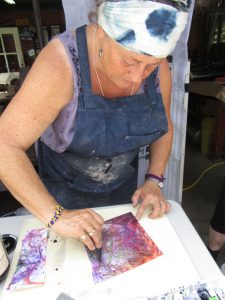
 The right half is the transfer of my workings onto satin polyester fabric. Then I printed a second time, resulting in the quieter colors of the left half.
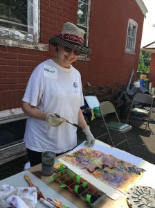
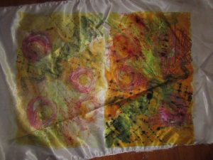
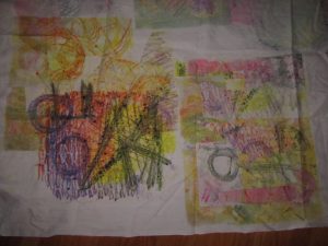
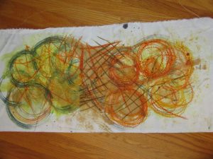 I preferred the poly cotton–more like the natural fabrics I use in my art quilts and craft pieces (table runners, pillow covers, tote bags, etc.). Here are two printings from one crayon-and-dye sketch, but with extra dye brushed on to bridge the gap between them.
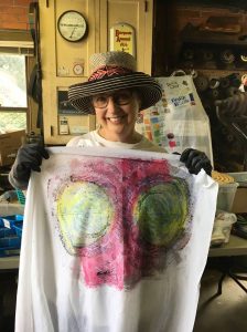 I was big into circles, and printing twice, with the second aligned. Inadvertently, I made myself a bodacious bra, huh?!
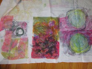
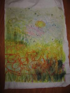

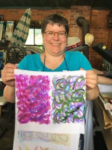
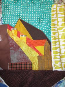
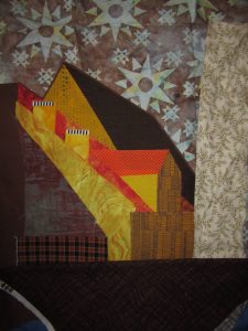
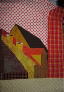
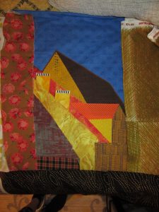
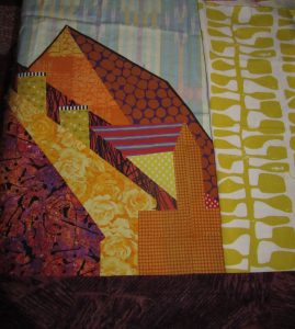
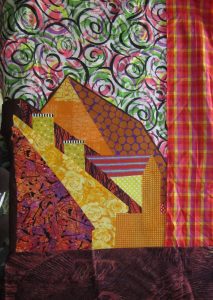
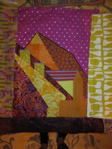
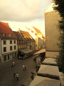
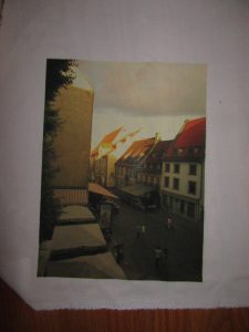
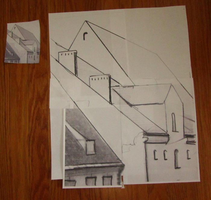
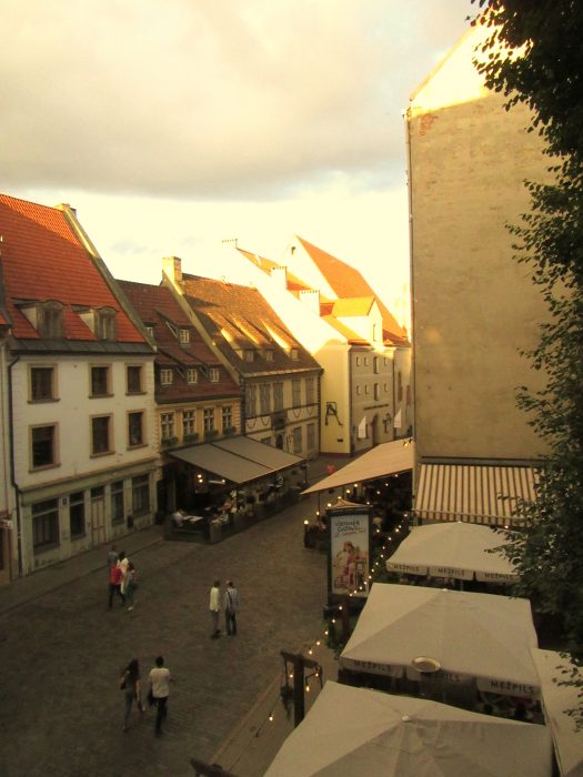
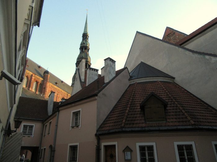
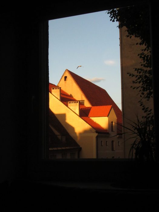 You voted, so I devoted myself to working from this photo, the view around 9:30 p.m. outside our apartment in Riga’s Old Town. First, I gotta get my left brain in gear. Yup, at this point, I’ll try to stay true to the photo…And then, we’ll see what happens…
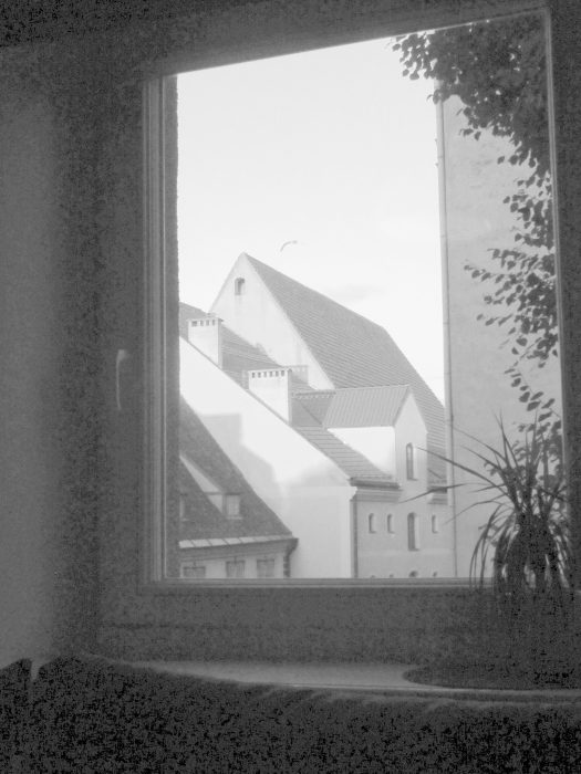


Hi Eleanor! Thanks so much for the lovely write-ups! It was wonderful experimenting with and on you, that is, teaching!
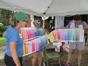
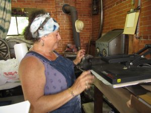
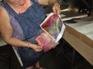
Just to clarify, the inks used at Fine Balance Imaging are only for synthetic fabrics. For natural fabrics, try Spoonflower!
Besides recuperating, Miriam and I are in touch several times a week, planning the next adventures with disperse dyes!