

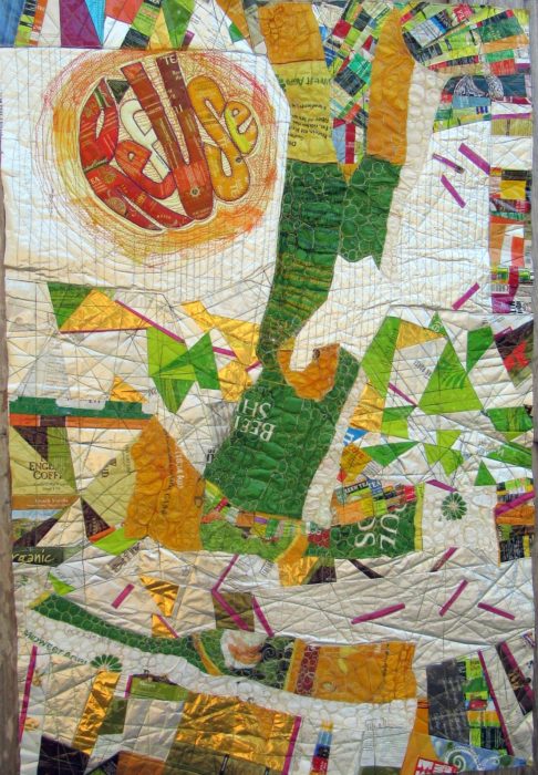
Composed. Meaning that I’ve put all the elements together for my latest work in progress, and the composition is complete. Brother — or should I say, Bernina, did I have a time quilting those bubbled, melted woven plastic pieces, which was a bag of beet pulp for horse feed (thank you Ms. Vola). See my last post, Bubble, Bubble, Melt & Muddle. Went through a lot of needles, needless to say. Packaging from other used products–coffee bags (thank you Emmetts and local coffee shop), tea bag envelopes (thank you Carl, Barb, Lesley, and Liz), and foil enclosures for items like smoked salmon and Alka Seltzer tablets, constitute the rest of the surface. Oh, and I threw in some plastic mesh citrus bags.
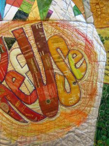 Yep, this is part of my ReUse series, made from my stash of trash. A green quilt, to be sure. The text riffs on the word Reuse, as in recycle. Ref-use, meaning garbage. And Re: Use, referring to our use of dwindling resources. Maybe even Refuse — to be a user, a conspicuous consumer.
So here I am. Piece needs some work in straightening and finishing the edges.
Considering crossing some of those fuchsia dashes. More is more??
Nuh-uh. What this piece REALLY needs is what my sewing studio needs: some serious decluttering.
See, I’m not showing off. Or fishing for compliments. Quite the contrary, I’m at a hypercritical stage, and fairly desperate for ideas and direction.
Let me interject here that this piece answers a call for entering 32″ x 48″ textile posters from Studio Art Quilters Association (SAQA). So, much as I’d like to severely crop it–which would be in service to the art, that would be a big capitulation of this opportunity for exposure.
Trial by computer: I translate the image to black and white, to view the contrasts and overall composition in a simplified way. I also added a border, to represent a binding all around:
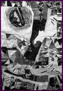
Which tells me that there is just too much variance of contrast–too much piecing, making it jumpy and jarring.
I’ve decided to use paint to reduce the patterning. Excited about using a brayer to capitalize on the bubbled and quilted textures, for an effect resembling crackling. With hopes that the paint doesn’t crack off or flake…Will I need a primer? A sealant? I’m thinking of a whitewashing effect. Not necessarily white, but swathes of a single shaded color to blend areas of random piecing. [Note to self: Next time, keep crazy quilt patchwork to blocks, to contain and restrain the craziness. And make me less crazy.]
I’m no wiz at photo-editing to preview how this might look, but I have an “add flash” feature to show how lightening the whole thing might look, and I’ve added a light green border to stand in for binding:
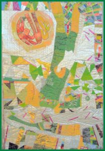
Better, I think. Paint will also cover up any exposed brand names or logos of companies whose legal departments have nothing better to do than threaten artists and exhibitors.
The good news is, with this shiny, plasticized surface, I can easily sponge off newly-applied paint that doesn’t do it for me.
Friends, when I say I welcome comments, that is an understatement. Very grateful to get your artistic perspective. What do you think I should do?
I would use paint so it would have the look of a wall that multiple posters have bern ripped from and covered with more posters. I would soften some, completely paint over areas and leave some as bright posters. I hope this makes sense!
Whatta great idea! I love this!
Great, so glad it made sense!
I love the idea of paint. But with the lightening of the piece you have lost all but a bit of you mid range and dark tones. Try to unify with some shapes. You need to repeat some overall shapes, circles, rectangles. Use color for direction to lead your eye around the piece
Totally agree, but my photo editing abilities was limited to lightening everything. But I will try your idea of over-painting to reveal large shapes…and yes, lead the eye. Thank you.
Ellie, I honestly love it the way it is. I love the fuschia matchsticks, they don’t need to be crossed. Painting over it would reduce the delicious jumble and contrast. Maybe my only suggestion – given that it’s for a “poster” challenge” = would be to make the word “refuse” a little larger and a little more legible? Maybe you could cover it with a slightly bigger, looser version? The characteristic thing about posters is large easy-to-read lettering, no? And while I’m in a lettering mood, you might have an opportunity to add a (fun) subtitle along the bottom, or in the white horizontal area above the bottom.
But seriously, it’s so great as is.
Jumbled is right, or, as one would say in gefilte-blog-speak, ungepachke!!
You’re also right about a poster having an easy-to-read message…which is why I still want to tone down parts.
Suggest you tilt the added words to the right some to contrast with the top words and draw the eye to the message.
As a non artist, I agree with Cathy. Love the bold colors. If RefUse was bigger OR repeated larger at the center a little lower to the right, it would improve the poster look.
If you must use paint, consider using it only where a product name appears without a copyright mark. Although today it’s all about product placement. They may pay you if you win the poster contest!
Tilt the words to the right some to contrast with the top words and draw the eye to the message.
Suggest you tilt the added words to the right some to contrast with the top words and draw the eye to the message.
on the contrary, i may get sued for using a logo or brand name w/o permission!
Can you add a darker element (paint/darker collage elements) to the left side? My first instinct was to say “Cut it down!” but I can understand why you don’t want to do that.
Interesting idea. I will contemplate that possibility. Thanks, Diane!
I can’t comment on the use of paint…that’s beyond what I can contribute and more up your creative genius alley! But I would suggest other larger shapes with messages, or reinforcing the message. One could be just Re-use to go with Ref-use instead of depending on people to see them both in one. Maybe another could be Re-cycle. Another could be Re-duce. Re-furbish. Or if you didn’t care about the “re-” theme, could include freecycle or other. These could also be combined with the “posters” suggestion where the posters are the other larger shapes. I don’t know if this would work or not, but you would so I’m throwing it out there. Will be eagerly waiting to see what you do! I’m sure it will be wonderful.
Love your thinking re emphasizing the concept. That’s YOUR genius. Hoping my next phase will do that by making the text stand out more.