Eleanor Levie HomeAboutEditorial ServicesBooksGallerySpeaker TopicsWorkshopsPast BookingsFree StuffLInks Contact Me

Inspiring Quilting: Elly's blog to boost your creative IQ

Archive for the ‘Recycled Art’ Category

My Sanctuary City

Friday, April 26th, 2019
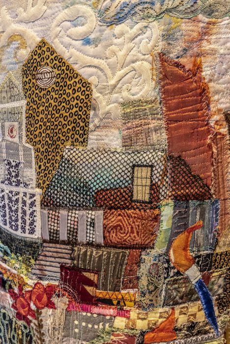
Sanctuary City, detail

Last summer, I took a collage class at QSDS–Quilt & Surface Design–from Deborah Fell.
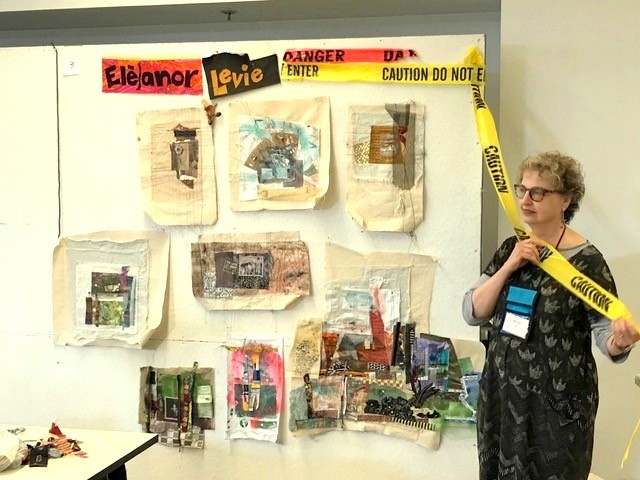
Standing alongside my design wall in Deborah Fell’s class.

See that sprawling assemblage to the left of my hip? It started as a small abstract composition…abstraction being something I aspire to. But I can’t help myself; my work invariably calls to mind some object or scene, and I’m off to flesh out figurative or landscape designs.

This held true here: I saw buildings and began to recreate my current hometown of Philadelphia. I had a few recognizable buildings, some vague representations, the Schuylkill River on the left, the Delaware River on the right. It came together in stages, and I placed sturdy pieces of canvas or upholstery weight fabric under the expanding areas as foundations for a large, odd-shaped wall hanging.
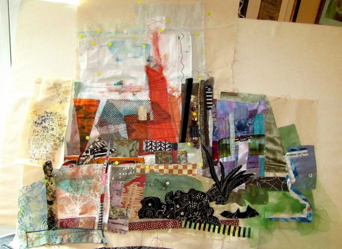
City between two rivers…

A few months later, I read about a SAQA (Studio Art Quilters Association) call for entry: Forced to Flee. The theme resonated. As a volunteer, I’ve long advocated for compassionate immigration reform and protested against Muslim bans, the Wall, family separations, and inhumane detention centers. I decided to finish my cityscape to express pride that Philadelphia is one among hundreds of sanctuary cities in the U.S. My “city of brotherly love” (sisterly love is implied!) accepts its moral obligation to protect immigrants and refugees. City leaders and activists alike fight against detentions, deportations, family separations, and discrimination. We rise to welcome the stranger, give shelter, secure safe haven for those “forced to flee.”

Knowing the caliber of work submitted to a SAQA show, I thought I’d have less competition for a 3-D piece, and be more likely to get in. So, I traced around an oval trashcan for a pattern — cuz what better to give me elegance than a trashcan? I continued to build my city over thick Pel-tex stabilizer so the vessel would be an upstanding example. Alternately, I worked on the inside surface, using a vintage quilt fragment for its soft, comforting associations, plus emergency mylar thermal blankets of the sort that are given to detainees. I cannot express how much struggling, how much cursing, how many broken needles went into assembling this beast. It stands 28” high. To ensure steadiness without adding weights, I fashioned a spiral pathway with signs and symbols of concern and welcome: bi-lingual expressions, caution tape, keys and safety pins and zippers.
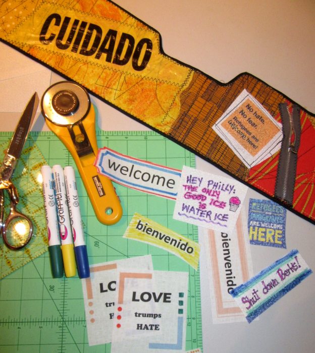
There were further frustrations as I hand-stitched the elements together. Then I had to photograph it to try and meet the demands for pixels, clarity, background, and appropriate depth of field. I managed to submit my information and images 45 minutes before the deadline.
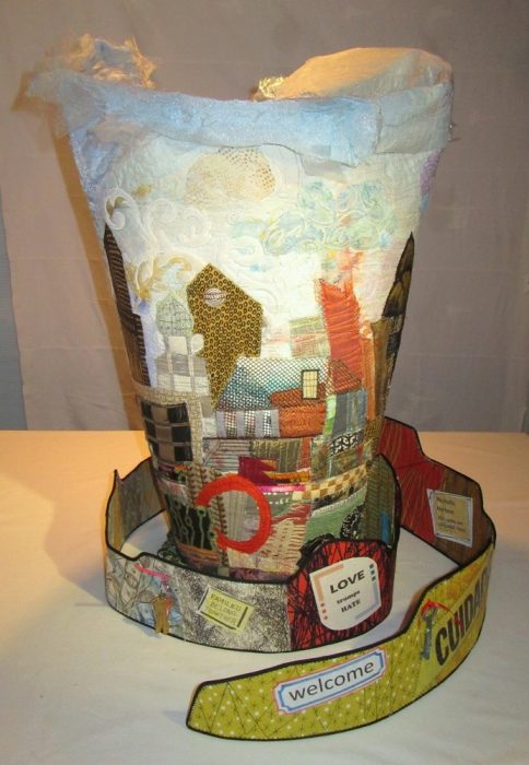
I didn’t get in to the Forced to Flee show. I get it. Jurors receive hundreds of submissions and usually curate down to under 50 — for a cohesive, high-quality exhibit at venues with limited spaces. Perhaps my piece was too discombobulated and did not appeal to the judge. Perhaps there were no other 3-D pieces and this would have been odd man out. And perhaps my photos weren’t up to what SAQA demands for not only the judging, but also the catalog.

Rejection gave me several advantages: I really wasn’t satisfied with the piece, and was now free to make significant changes. Another SAQA call for entry beckoned: 3-D expressions. I had time to revise and polish the composition from all sides and the inside. New construction and embellishment strengthened the overall aesthetic and referenced more Philly iconography. I added more vintage mini-blocks and doilies to the inside, and crocheted an oval rug to cozy up the “inner sanctum.” I want those who see the piece to take time to walk around it and peer inside. And yeah, I’m tempted to throw in little stuffed heart-shaped pillows, additional keys, and poems of welcome…but mostly because I don’t know when to stop. What do you think? More secrets and treasures? Or enough already?!?

Happier with the piece, I took the time to hire an expert photographer — Gary Grissom — and set it up in a better-lit niche. Now I felt more confident submitting it to the other show.
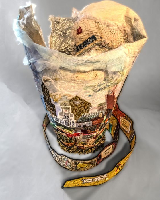
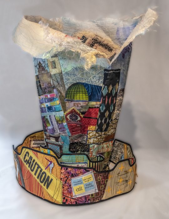
More time and attention to detail and good workmanship, along with professional shots, did the trick. I got in!

Icing on this cake is the impressive decision-maker, an art professor and gallery director who is one of the finest modern fiber curators in the world. (Oh, and he’s a Philadelphian.!) SAQA’s website states, “The wide variety of pieces selected by juror Bruce Hoffman include vessels, wearables, wall-pieces, and sculptural artworks. This cutting-edge exhibition shows how textile art can expand both into the third dimension and into the future.”

This exhibition, 3-D Expression, will premiere at the Gerald R. Ford Presidential Museum in Grand Rapids, Michigan in September 2019. I am angling to see while it’s there. Aside from the honor of having my work included, I would be thrilled to study all the other works in the only way they can truly be appreciated: by walking around them and checking them out from every angle.

Meanwhile, I’m back to making essentially 2-D art quilts for a while. Oh, and shopping for a workhorse of a sewing machine that may allow for thick, sculptural work in the months to come.

Shelter

Friday, September 7th, 2018

A fascinating exhibit opened this week at the Da Vinci Art Alliance here in Philly, and it i. a collaborative exhibition with Philadelphia Sculptors. Sculpture–or at least 3-D media of any kind was the requirement, addressing the theme of “shelter.” The theme of refugees and immigration resonated with many of the artists, and a number of them used their work to present a shared desire to create a safe haven for people fleeing unsafe environments. Perfectly appropriate for a show in Philadelphia, a sanctuary city with an ongoing battle against Immigration and Customs Enforcers, or ICE.
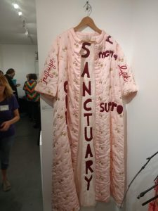
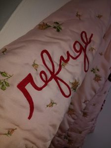
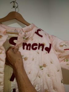
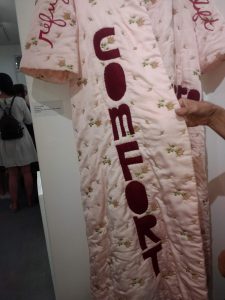
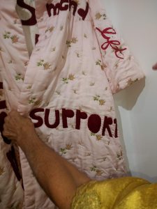
Nothing in the show was quilted in the traditional sense, but there was a lot of soft sculpture as homey, enveloping, forgiving, resilient. Well, then again, there was this quilted bathrobe, a vintage piece augmented with text in felt, thread, and paint by Carole Loeffler.


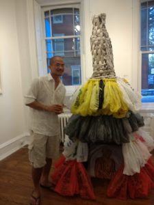
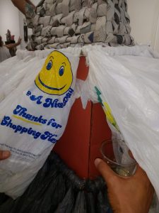
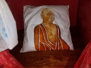
The largest piece was “Buddha’s Sustainable Shelter” by Chanthaphone Rajavong, who stands beside his tower. He gave me a peek into the underlying structure–all recycled cardboard. Can I say how much I covet a dress with a woven newsprint bodice and tiers of plastic bags? But I only committed to getting on my hands and knees to photograph the painted pillow inside this shelter.

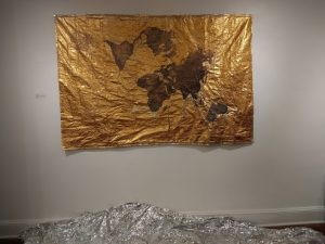
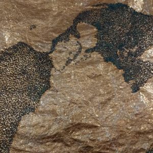
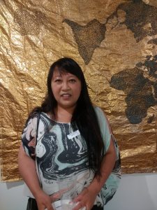
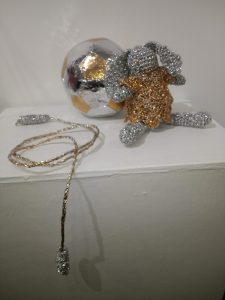
Artist Cindy Lu also used recyclables for her pieces: emergency mylar blankets. She poses in front of her very large beaded map, called, simply, “Home.” Opposite that work is an intimate patchwork and crochet grouping, called “Play.”


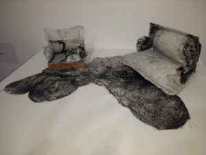
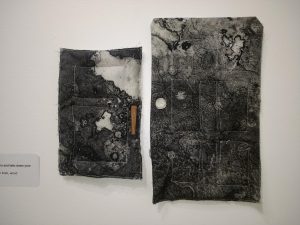
On the very small-scale front were two groupings by Chelsea Nader. They are intaglio prints on linen. ” Where she told me” features a miniature living room vignette, and “Open your doors and take down your walls” has two doors.


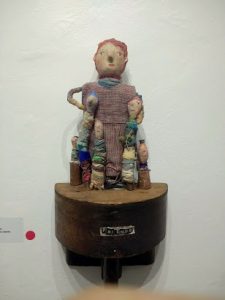
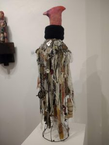
Gotta admit, my favorite pieces–and the hubby’s as well, were by Dumpster Diver Ellen Benson. Her “Friendship Circle Divas” (at the top of this post and below, with Benson) and her “For Every Bird a Nest” take the idea of shelter straight to the personal and endearing.

As I mentioned, none of these works are quilts in any traditional sense. Nevertheless, the use of fabric and thread, of layers and soft, tactile textures and dimensionality does hie back to quilts as a part of our heritage and legacy as bedcovers, as security blankets, as protection against the cold. How does your work fit the theme shelter?

Overdressing!

Saturday, January 28th, 2017

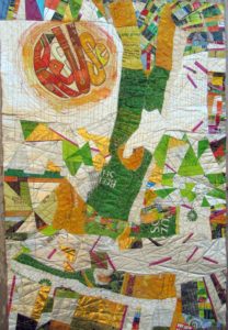
If you’ve read my last two blog posts, you’ll know that I’ve been working on a textile poster, pieced and appliqued out of trash–used packaging. A lot of the assembly came about in flip-and-stitch sections, with quilting to flatten everything down onto felt, then onto a backing.
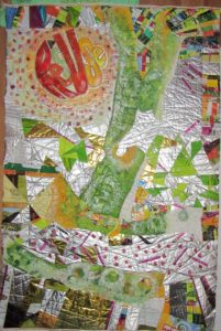
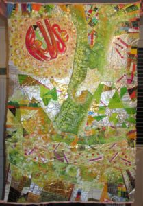
The problems I saw were a jumble of clutter and a lack of cohesiveness. Many thanks to everyone who left a comment with a suggestion. I considered every single one. And I was determined to move on to address the problem, to redress and resolve those issues, and others brought to my attention, with paint.


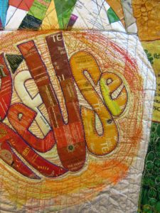
Paint day 1–Brushwork, dabbing, sponging, dotting the fuchsia matchsticks—! or i?, adding a soft color to the f in RefUSe:

Better. But still, not half as cohesive as I’d like. On to Paint Day 2, now armed with my favorite paint tool, the Gelli Gel Plate–for mono-printing, and a few high quality tubes of acrylic. Continued to daub, sponge, and brush.


Getting there, now, I think. It’s a lot more impressionistic, which helps to blend the sections for the cohesion I’m after. A lot more yellow, yellow-green, and orange tones, for warmth and sunniness. I’m thinking most of what Joan had to say: “I would use paint so it would have the look of a wall that multiple posters have been ripped from and covered with more posters. I would soften some, completely paint over areas and leave some bright…”

I’ve darkened the S in RefUSe, and the outer edges of the second e–which seems to need a bit more darkening to be readable…Not that ReUS doesn’t have some merit as a message. It’s about “us” doing our part. And hopefully, this message won’t be interpreted as a plea for nationalism over globalism, cuz this citizen really doesn’t cotton to the America First slogan we keep hearing over and over…

OK, focus on your art, Eleanor. We’re not trying to be controversial this time. Honest.

Addressing, Redressing

Wednesday, January 25th, 2017

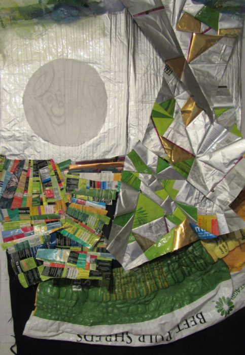
Composed. Meaning that I’ve put all the elements together for my latest work in progress, and the composition is complete. Brother — or should I say, Bernina, did I have a time quilting those bubbled, melted woven plastic pieces, which was a bag of beet pulp for horse feed (thank you Ms. Vola). See my last post, Bubble, Bubble, Melt & Muddle. Went through a lot of needles, needless to say. Packaging from other used products–coffee bags (thank you Emmetts and local coffee shop), tea bag envelopes (thank you Carl, Barb, Lesley, and Liz),  and foil enclosures for items like smoked salmon and Alka Seltzer tablets, constitute the rest of the surface. Oh, and I threw in some plastic mesh citrus bags.

Yep, this is part of my ReUse series, made from my stash of trash. A green quilt, to be sure. The text riffs on the word Reuse, as in recycle. Ref-use, meaning garbage. And Re: Use, referring to our use of dwindling resources. Maybe even Refuse — to be a user, a conspicuous consumer.
So here I am. Piece needs some work in straightening and finishing the edges.

Considering crossing some of those fuchsia dashes. More is more??

Nuh-uh. What this piece REALLY needs is what my sewing studio needs: some serious decluttering.

See, I’m not showing off. Or fishing for compliments. Quite the contrary, I’m at a hypercritical stage, and fairly desperate for ideas and direction.

Let me interject here that this piece answers a call for entering 32″ x 48″ textile posters from Studio Art Quilters Association (SAQA). So, much as I’d like to severely crop it–which would be in service to the art, that would be a big capitulation of this opportunity for exposure.

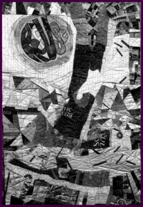
Trial by computer: I translate the image to black and white, to view the contrasts and overall composition in a simplified way. I also added a border, to represent a binding all around:

Which tells me that there is just too much variance of contrast–too much piecing, making it jumpy and jarring.

I’ve decided to use paint to reduce the patterning. Excited about using a brayer to capitalize on the bubbled and quilted textures, for an effect resembling crackling. With hopes that the paint doesn’t crack off or flake…Will I need a primer? A sealant? I’m thinking of a whitewashing effect. Not necessarily white, but swathes of a single shaded color to blend areas of random piecing. [Note to self: Next time, keep crazy quilt patchwork to blocks, to contain and restrain the craziness. And make me less crazy.]

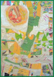
I’m no wiz at photo-editing to preview how this might look, but I have an “add flash” feature to show how lightening the whole thing might look, and I’ve added a light green border to stand in for binding:

Better, I think. Paint will also cover up any exposed brand names or logos of companies whose legal departments have nothing better to do than threaten artists and exhibitors.

The good news is, with this shiny, plasticized surface, I can easily sponge off newly-applied paint that doesn’t do it for me.

Friends, when I say I welcome comments, that is an understatement. Very grateful to get your artistic perspective. What do you think I should do?

Bubble, Bubble, Melt & Muddle

Tuesday, January 3rd, 2017

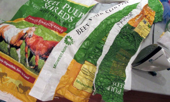
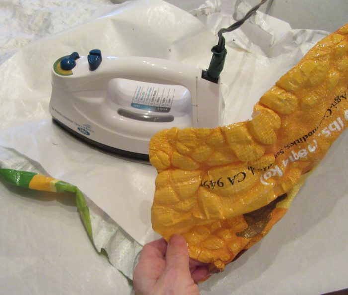
Having fun with my trash stash again. Who knew that ironing those woven, plastic, printed feed bags would produce such a yummy texture? Good buddy Linda Vola, whose horses and mule enjoyed what came in this bag, figured, as I did, that this would become a sturdy, colorful tote bag. Nope!

If you try this, be sure to protect your iron and ironing surface with quality Teflon pressing sheets.

I surmise from reading about classes taught by Linda Schmidt, that call for Tyvek and heat guns, that she demos similar techniques. Love the name of her website AND of this class:

http://www.shortattentionspanquilting.com/creating-with-cool-stuff.html

Wish I could take it, and learn from all her trial and error and success. Hoping one of her disciples will clue me in a bit until I do get a chance. In the meantime, I plod on, burning some spots, and falling back to piecing with other trash–er, foil-lined or plasticized packaging. Here’s a very early draft of what’s in the works, incorporating way too much, and not enough:

Stay tuned!

Swimming with the Big Fish

Sunday, October 23rd, 2016

I’m flummoxed but grateful that my piece, Swimming Upstream, was juried into the show, Connected by Stitch, the first Pennsylvania regional show by the international Studio Art Quilt Associates (SAQA) at The Gallery at Penn College for the next 6 weeks. And I feel privileged to be among some mighty fine fabric artists.

at-gallery2


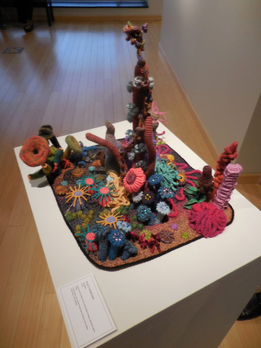
Let me share just a few of my faves in this show. I loved this little underwater paradise, a colorful, crocheted coral reef on a bed of quilting. It’s by Stacey Hortner. She’s since made this in monochromatic beiges, to express her concern over the bleaching of coral reefs, due to the massive amounts of CO2 mankind has imposed.

dscn0898

dscn0902

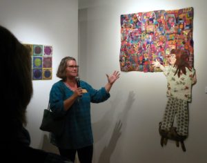
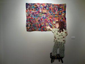
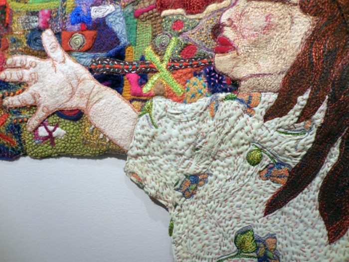
Another fun piece, with a message, is this one by Peggy Hracho. It’s got an abundance of felting, embroidery, quilting. The little girl is exhorted to “go for it,” i.e., touch the art quilt–something most quilt venues don’t allow.

dscn0879

dscn0903


dscn0906

Very exciting for departing from the usual shape and look of a quilt, is by Meredith Re Grimsley. It’s a life-size self portrait, painted and quilted, remarking on the fact that the dress no longer fits; the artist now occupies a different place in her work and in her life.

dscn0861

Finally, before I hit the sack, gotta launch one more photo, a ship by Meredith Eachus Armstrong. Fabric and wood, sculpture more than quilt. dscn0901

This Meredith, more than any other Meredith or any other person, is responsible for making this wonderful show happen. Kudos to her, from me and everyone who agrees that non-traditional contemporary quilt art really floats our boat.

Swimming Upstream

Sunday, October 23rd, 2016

swimgupstreamel

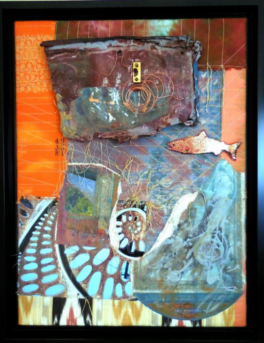
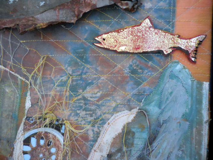
I am a bottom feeder who cannot pass up a slab of rusted metal in the street, the cardboard wrapper for some fancy smoked salmon, texture and patina. I have a box of such hard found pieces. I also have an accordion folder and loose piles of fancy papers, tear sheets, beautiful calendar pages…thank you, Sammie Moshenberg! Thank you, Barbara Adler for that glittery packaging from smoked salmon! From the time I was a girl, I collected my father’s lithography samples from when he worked for a printing company.

The obvious thing to my mind is to combine papers and metals into a collage. But I challenged myself to make unrelated materials play together. One way to do that was to use color—salmon and it’s color complement, light blue—as a way to breed the hard with the soft. Some of the papers had been given  a wash of paint, obliterating a clutter of text and integrating them into a cohesive grouping.

I thought the rusted metal held secrets, and history, and I looked to fabrics with not just color coordination but also unfathomable text and visual texture, to continue that narrative of mystery. Thank you, Lonni Rossi! I quilted them to provide a more stable background, and connected by stitch the ephemera, the old and new papers, with the cotton fabrics. Unsure of where I was going, I arranged and rearranged the composition, and when I thought I was close, I still had challenges of mounting the disparate pieces for durability of display, deciding to pull it over stretcher strips, screw spacer strips to support and elevate the metal piece, and camouflaging the screws with spirals of copper wire.

I was definitely swimming upstream, my title for the piece…. like the salmon, expecting only to get screwed by the all difficulties, and die in the end, that is, to have this project end up in the trash.

But on the other hand, I wasn’t floundering. The work had a nice flow to it, and I never felt I was fighting the current. Maybe that’s because my art quilting has not followed a single direction, despite my deep respect for artists who work in a series. I’m not a serious artist, and I can’t take my work or myself all that seriously. But I have to say, finding connections of line, and a balance of shapes is a very satisfying exercise for me. Perhaps, after all, this mixed media piece may not be a one-off; I just may return to the river where hard and soft textures and disparate elements combine. I’m not fishing for compliments, but I sure welcome feedback!

swimups-detail


Give me a hand…

Friday, July 31st, 2015

KitchenHamsa (2)

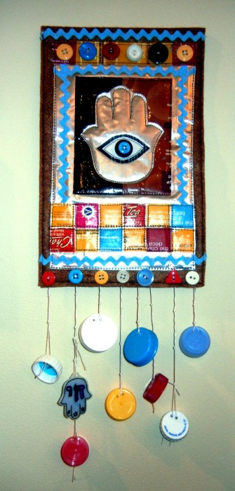
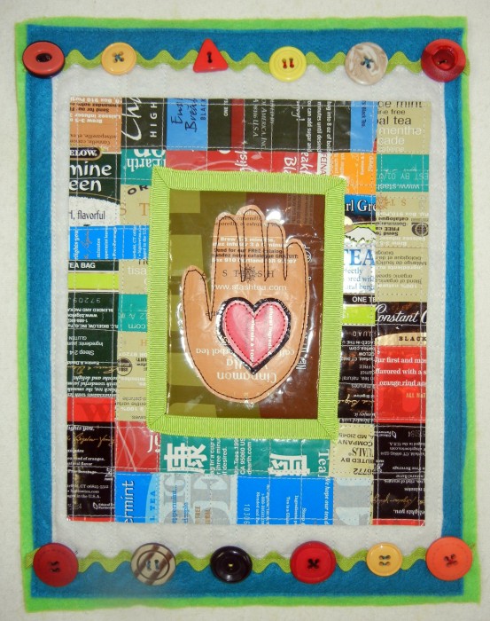
Seems I have a hamsa series going. Often called the Hand of Miriam by Jews, or the Hand of Fatimah by Muslims, this middle-eastern symbol features three fingers and two thumbs. Don’t ask me why. A good luck charm, it’s said to ward off the evil eye…cast by those who would be envious of what good fortune you may have. Lots of folks wear a hamsa as a talisman around their necks. But since bad luck can occur right at home, frequently in the form of cooking disasters, I recommend a household hamsa —especially in the kitchen. Done in foil-lined, plasticized packaging like coffee bags and tea bag envelopes, the resulting art can be wiped clean of cooking grease, sprays from spills, dust and grime. I teach this class as a workshop for trash-stash quilting, using the sample shown above, or for a westernized version, the hand-in-heart motif below.

Hand-in-heart-1

Hand-in-Heart folk art, by Eleanor Levie, 2015, approx. 8″ x 10″


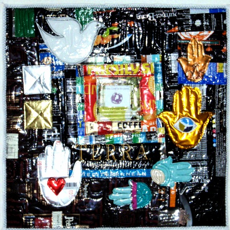
First time I ventured into hamsa territory was for a 2011 Quilt Alliance challenge; lots of shiny packaging made it impossible for this amateur photographer to capture a good representation.

2

Tahrir Square, by Eleanor Levie, 2011, 16″ x 16″

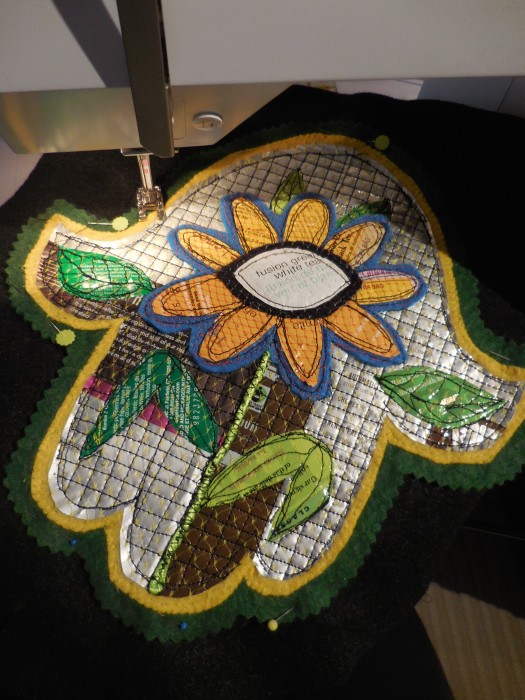
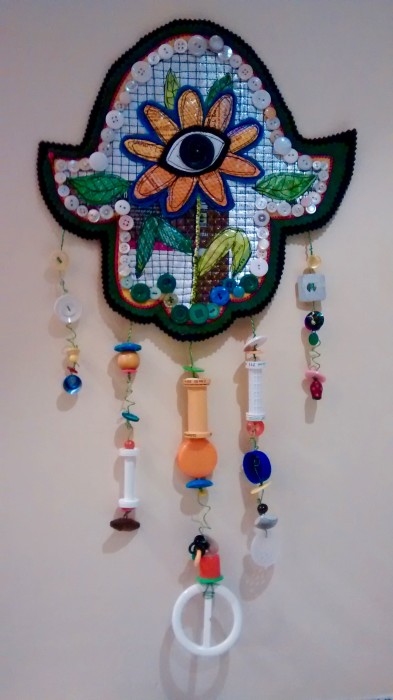
Recently, I answered another challenge with Eyes Wide Open as the theme. Right away, I thought of a hamsa with an eye, done out off coffee and tea bag packaging to reference the caffeine that literally opens my eyes, and the need to reduce and recycle that informs my trash stash quilting. Two other inspirations guided my creative pathway. First was  an article in the Summer SAQA (Studio Art Quilt Associates, Inc.) Journal referencing the keynote speaker at the SAQA annual conference. Namita Gupta Wiggers is an art historian, and director and co-founder of Critical Craft Forum. She pushed for art quilts to take a place of power. Art in and of itself, instead of simply as a reference to the older, more traditional form of a bed covering. To do that, she encouraged breaking out of the rectilinear picture plane, and redefining the medium through the use of materials other than cloth. Hmmmm.

Another inspiration from a few years back was Pamela Allen’s Black-Eyed Susan art quilt, where plastic doll eyes peeped out from the centers of a bouquet of blooms.

Thus was born my Black-Eyed Susan Hamsa!

DSCN1008

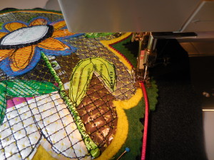
Securing top layers to bottom layer of black felt.


DSCN1013

Couching satin cord over felt edges.


IMG_20150730_190649560

Black-Eyed Susan Hamsa, by Eleanor Levie, 2015, 14″ x 24″ ?


DSCN1031

Photo by Carl Harrington, who is angling to get out of the photo business!

Tea Rex

Saturday, March 28th, 2015

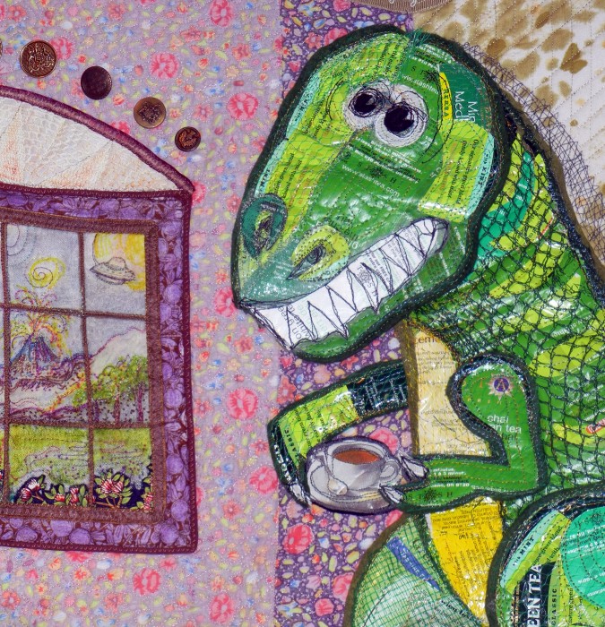
TeaRex, detail

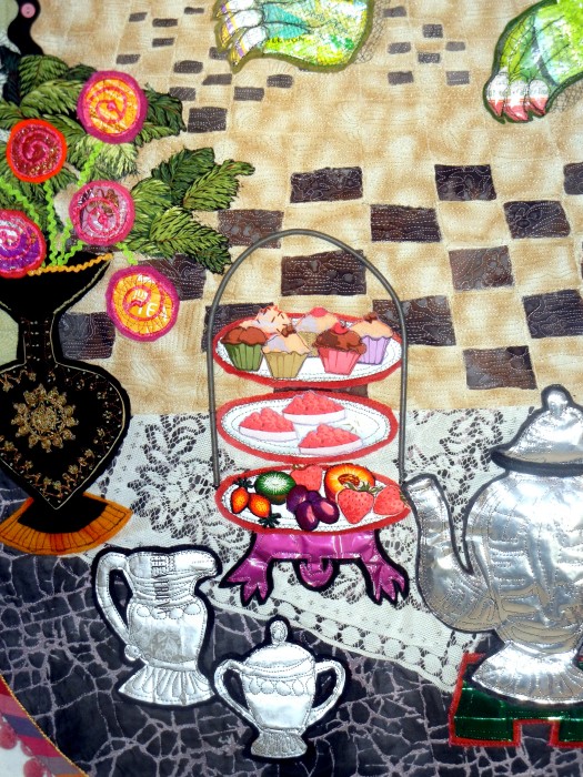
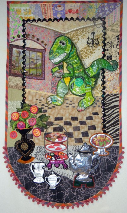
Word play is often a part of my art quilting, so my riff on T-Rex shouldn’t come as a surprise. And like other pieces in my ReUse, trash-stash series, this piece is made of tea bag envelopes, coffee bags, and other foil-lined packaging. And yeah, it’s a “green quilt,” as in the term coined by Susan “Lucky” Shie, representing an effort to use what’s on hand and upcycle, to do our part for the planet. Of course, the citrus net bags, vintage fabrics and trims, buttons, beads, and rickrack are here partly because, as my hubby bemoans, I never throw anything away.

Yes, I began with an appealing pun, a Barney-like dino and an Alice-in-Wonderland tea party set up, with a funky vase made from my grandmother’s well-worn, embroidered neck wrap, and the vase is filled with—what else?—tea roses.

TeaRex-detail-ELevie

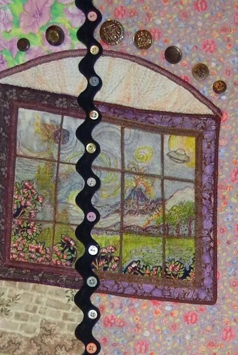
Here’s where the word play wandered into sword play, quickly and quilterly lunging into the more politicized rooms of my mind. Didja notice the space ship and volcano out that window?

window

How about the tsunami rushing in, the blazing sun, the meteor hurtling towards earth? It seems our titan of leisure is cluelessly indulging in conspicuous consumption. Our Tea-Rex is denying inconvenient truths, such as global warming and waning resources for those lower on the food chain. Instead, the arriving guest invents wild fabrications…and invites extinction. A cautionary tale? A parable for our time? Obviously, this Tea-Partier is way out of date.

Tea Rex, by Eleanor Levie, 32″ x 57″, March, 2015

Whoop-TEA-doo! It’s Earth Day!

Tuesday, April 22nd, 2014

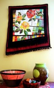
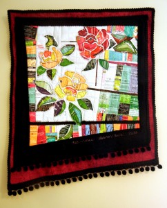
In honor of Mother Earth, I just added a new piece to my ReUSE series.


tea rose-detail


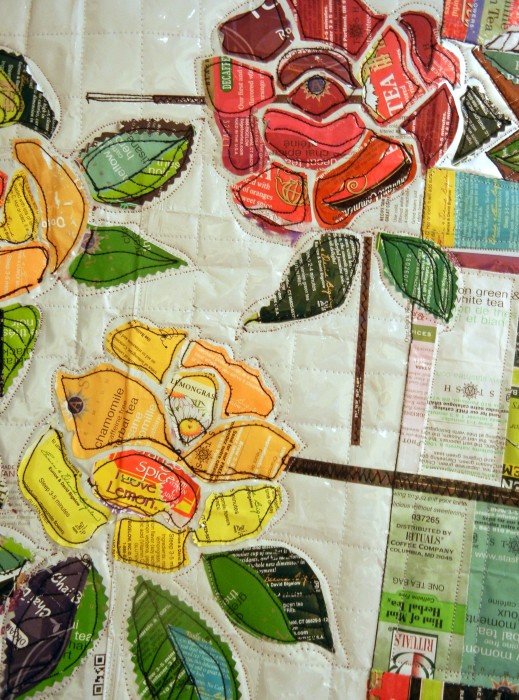
I don’t know how long I’ve been stalking the idea of a Tea Roses piece, that is, roses made out of tea bag envelopes. Last year, I took lots and lots of pictures at a rose garden in Florida. Then, meaning to get rid of one horrid picture of me, I mistakenly deleted all my shots. That’ll teach me to put on my glasses when reviewing my shots!

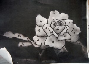
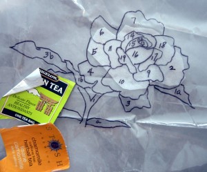
Starting again, I found a photo of a yellow rose that I cannot now find–I think it is one of Sammie Moshenberg’s lovely images. I traced the picture, numbered the pieces, and prepared to do a cut and glue sort of applique with tea bag envelopes.


photo,b-wh

tracing


The “kit” of materials I assembled sat by the TV for months. Turned out this method that was waaaay too complicated for me. I’m more of a slap-dash kind of quilter.

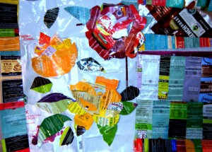
Last week, an online quilt class taught by the extraordinary Pamela Allen of Canada featured an assignment for a fantasy fabric garden. That was the impetus to go back to my Tea Rose project once again, and substitute my trash stash for fabric prints to dash off some flowers. Following the lead of my sister students, I cut petals freehand, and worked in rounds. In this series, I simply adhere shapes with glue-stick over patchwork. White bags that once held ground coffee gave me bigger pieces and a quiet background, too.  I cultivated plots of assorted tea bag and coffee packaging to sort of fence in my garden.


tea rose 1


Due to the foil-lined packaging that holds a crease, I was able to fold back some of the petals like a real flower. But even with the silver backing peeking up, the flower heads looked too dense, and the petals weren’t readable as separate shapes.

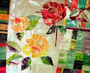
Back to the drawing board, I tried out an open design, like an arts & crafts style stencil or stained glass design.


tea rose 2


Better! Then on to layering over woolfelt (wool and rayon blend), preshrunk for a thick, sherpa-like quality.  Quick quilting and trimming with passementerie and ball fringe gets everything sown so I can reap the rewards before Earth Day ends!


styled,EL


tea rose-EL


My garden is a bit messy, and even though the bottom edge is angled, the whole thing should still hang straight and true. Not the case, not even close. But as they say, DONE is better than perfect.

Hope everything’s coming up roses for you! And that you ReUSE, RECYCLE, and REPURPOSE trash or found objects to REDUCE your carbon footprint. Oh, and RECONSIDER the many ways of creating quilted art!