

A new day, a new perspective. Up to now, grid-like horizontals and verticals have ruled—and enforced a sense of static, grounded, cityscape or Easter Island kind of construction. Now at least one errant angle provides some sense of movement. For this paradigm shift, I have to thank my resident critic—my DH. And yeah, he is also a wonderful supporter of my work. He’s been looking at the images I shove under his chin, occasionally glimpsing my design wall, and agreed, up til this point, that this art quilt-wannabee has not yet arrived.
I’m gonna keep the previous numbering system from previous blog posts. (In reality, the number of candidates I’ve arranged and photographed approach a hundred.)
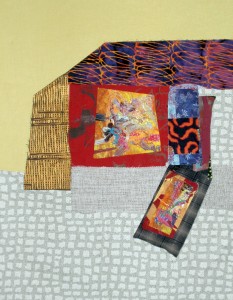
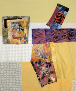
#18
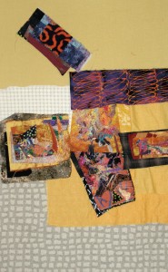
#19
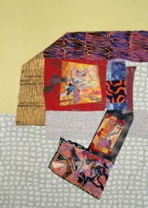
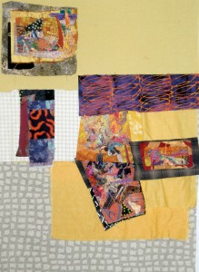
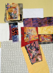
#20
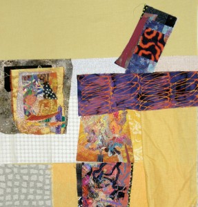
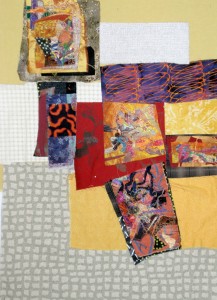
#21
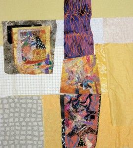
#22
The hubby just stopped in to turn his work break into a short play-date. See what resulted:
#23–See someone flailing?
#24–the start of my what IF series…
#25
C’mon now, leave a comment. I really need, if not a crowd-sourced solution, at least a vote of confidence for one of these fabric sketches, or your advice for an old or new direction! Thanks!
#26
#25, #26 or #18
Thank you, DH.
No. 25 is the one that appeals most to me. Very eye-catching.
I’ll take that as a compliment and go with it…probably. Thanks!
#25 or #26 but I’d like to see them larger so I can really tell. Frustrating not to be able to click and make full page.
I appreciate what you’re saying, but for my purposes, it’s better you not get caught up with the details…just judge the overall design. Thanks, dear friend!!
I have to agree…#25 is the most Eye-catching to me also. I like the way the negative space plays an important role in pulling this piece together. What did Your resident art critic say???
See the first comment!!
Thanks for yours, tho!
I just don’t like that medium gray. It distracts my eye from the colors you are highlighting. Sorry.
No need to apologize!! Every reaction has validity! I’m gonna try to swap that out, so thank you.
On #20, I’d replace the gingham and the solid white with solid purple. Then straighten the bottom piece to vertical, along with the piece on top of it. This would give it balance and fix the “busyness.” (in my opinion anyway.)
Carol
Interesting idea. Will try swapping that piece, if not for #20, then for a finalist. Thank you!
I was leaning towards #20, but when I studied #25 it began to grow on me. I have to take a look at yesterdays again. There was one there I really liked (but didn’t comment)
Do tell. Only wish I had YOUR flair for color, Bonnie!
I like #7, 14 or 15 . I would probably add some more blue and/or purple, pulling from the colors in the fabrics you already have. I think the white is too stark but a light contrast is needed…? Maybe a very light grey or beige? Will be interested in the final choices. Good luck!
I agree that the white is too stark…in any of the variations. Thanks for your perceptive comment!