“In the nineteenth century, quiltmaking was often the only socially acceptable way for a woman to express her political views.” With that explanation, the Rocky Mountain Quilt Museum put out a call for politically-themed quilts, for an exhibit to celebrate “the tradition of activism and awareness.” The deadline for entries was in September, and the show ran from late October through much of January. So the Presidential Election was certainly a central focus.
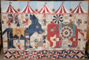
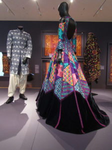
I wasn’t able to get to Golden, Colorado to see the exhibit, but several quilters and artists whose work was featured sent me their jpegs and statements, which I share with you here. For “Political Circus,” Misty Cole began with traditional 1930s mosaic of squares and half square triangles for the classic Kansas City Star patterns of democratic and republican mascots. She details her process in a blog.
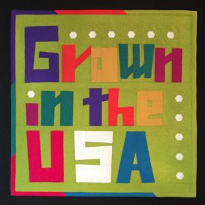
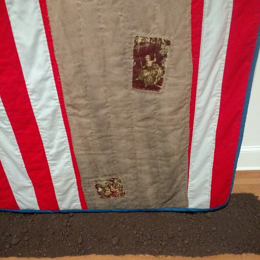
In “Cotton Grown in the USA”, a different sort of patriotism is expressed. Only 14″ square, this little piece is made entirely with cotton fabric grown and manufactured in the USA. Charlotte Noll used a grass-green background with improvisationally-pieced letters, and paper-pieced cotton bolls to punctuate her point of pride.
B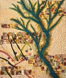 arbara Hall calls her quilt, “When the Fish Return.” She explains that the Colorado River is “the southwest’s most important source of water. Five states rely on this river to sustain cities and agriculture. But the Colorado River ends in Mexico. Our overuse has created a loss of habitat and environment in what was once a thriving river delta in Mexico. In 2014 in cooperatio
n with Mexican wildlife ecologists, water was released into the delta to try and revitalize the river’s natural habitat. The project is being studied and monitored. My quilt is a story of what might happen if the habitat reconstruction is successful.”
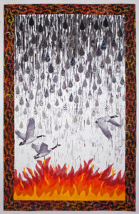
“Fleeing Drought – Is This Climate Change?” is by Sara Sharp. She explains, “Can there still be any doubt that climate change is really happening? Despite denial by some politicians, rising global temperatures are adversely affecting both humans and wildlife. Social unrest and human suffering have been caused by crop failures and lack of potable water. Both people and animals must travel far from their historic homes to compete for limited resources. This quilt symbolizes diminishing rainfall, resulting wildfires, and the altered migration patterns of birds who must travel further each year to find supplies of healthy food and water.”
“War Sucks” is a tour de force by the award-winning Kristin LaFlamme. 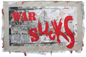 An army wife, Kristin created it “as a way of processing my feelings about war during a period when my husband was fighting more than he was home.
No matter which side you are on or whether you are a combatant or a civilian, war sucks.” She explains how the process mirrored the experiences: “The fractured aspect of crazy quilting made sense for the background, as did the hint of stitching the seams back together created by the utilitarian embroidery. I allowed for raw edges (war is nothing if not raw) and added jumbles of knotted threads ripped from my fabrics after the wash. I used stenciled, splattered, scribbled, new commercial, re-purposed, discharged, uniform, and dyed fabrics. I worked the fabrics both before and after piecing them. The quilt is backed with an old woolen blend army blanket and I left the edges open and stuffed them with fabrics and yarns that could allude to bandages and guts. The overall quilting is intersecting straight lines that could be tracer fire or bullet trajectories.”
“My 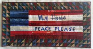 Home Peace” looks at the flip side of war in a traditional mode. This piece is by Peggy McGreary.
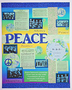
“Peace and Harmony” as shown below is also by Sara Sharp. It is dense with meaningful photo transfers: sheet music, quotes, conceptual terms that add up to a state of peace.
It is hardly controversial to posit that War is bad and Peace is good, and most quilters—and quilt lovers will come down squarely on the side of environmental protections. But I’m glad to say that the Rocky Mountain Quilt Museum did include some slightly more subversive expressions of opinion.
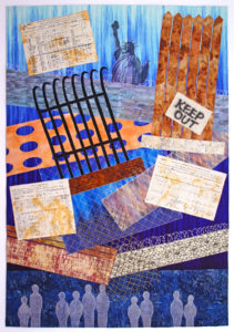
Sara Sharp is prolific! She also made “Barriers to Freedom” which was juried in as well. “Oppression, famine, and poverty cause people to flee their homelands,” she writes, “searching for a better life of opportunity and freedom. Some politicians and countries advocate building fences and walls to keep immigrants out of their countries. This quilt features passenger lists from the early 1900’s showing people, like my family’s ancestors, who were welcomed into the United States. In our time, we must again show kindness to provide bridges to safety for deserving immigrants.
This work belongs on my new website, United We Quilt: Sewing Justice. I’m hoping Sara submits it –and perhaps others–for that online gallery. The time has never been so dire for supporting immigration reform and for showing compassion to those who seek a better life.
“Bur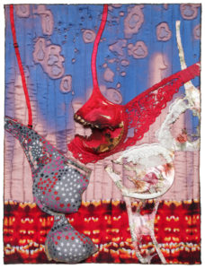 ned”(18″ x 24″) is a liberal rallying cry to throw off shackles. Regina V. Benson elaborates: In 1992 Lindsay Van Gelder stepped forward to confess that she had coined the tem “bra-burning” to describe a feminist protest during the 1968 Miss America beauty pageant in Atlantic City, New Jersey. It appears that some women during that protest did threaten to remove their bras and throw them into a communal trash bin. As a young New York Post journalist, Ms. Van Gelder’s reporting of the event came to compare the potential trashing of these bras to the burning of draft cards at Vietnam War protests. That, combined with the title of the story, seems to have been enough to start this legend. The term was immediately picked up by other reporters and writers and grew into a viral metaphor – the discarding of feminine shackles that stereotyped women in sexist and objective ways. This urban legend survives today and continues to fuel forceful imagery for daughters of the women’s liberation movement. This reporting did inspire many, actual, subsequent bra-burning events.” Benson continues, “I created this work as a triple entendre: one for the mythical legend of bra-burning; the second for the term “burned” as meaning to expose the myth itself; and the third for the actual use of burning techniques in my work to marry the medium with the message.”
Last in this review of featured quilts in Patchwork Pundits is my little 16″-square “Choice Nine-Patch.” Frankly, I was surprised that they took it, and wonder if it engendered any reactions pro or against. It’s about Roe v. Wade, the Supreme Court decision to legalize abortion. Although it was made in 2002, I think it’s still highly relevent, especially with the president’s choice of a Supreme Court pick who has shifted the majority to the right, a judge who was hand-picked to roll back rights such as worker protections, health care, religious freedom and reproductive justice. Here’s my two cents, my artist’s statement, in poetry, as it’s meant to soften the divisive wedge between the so-called Pro-Life community and the Choice community:
Respectfully, this little Nine Patch references “The Nine,”
That highest court in all the land, the real Supremes, or SCOTUS.
The one case they decided almost all can call to mind—
The case that still stirs up debates that we can’t help but notice.
Check out the sac of little pearls–fish eggs, you know, Roe.
Wade in, and then explore the depths of privacy and choice,
Should women self-determine their own fates and families?
My stance is clear, as I hereby give cloth and thread my voice.


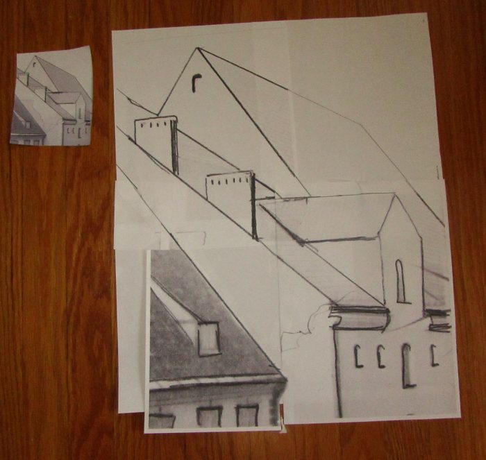
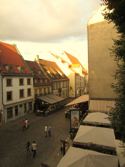
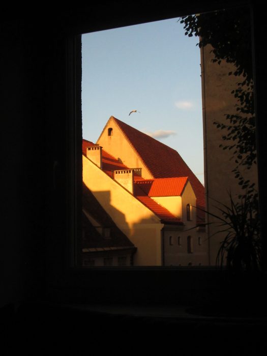 You voted, so I devoted myself to working from this photo, the view around 9:30 p.m. outside our apartment in Riga’s Old Town. First, I gotta get my left brain in gear. Yup, at this point, I’ll try to stay true to the photo…And then, we’ll see what happens…
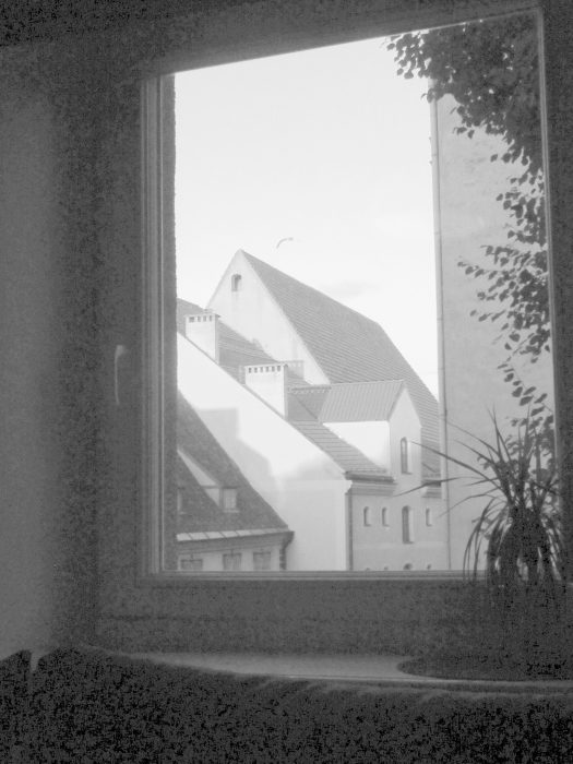


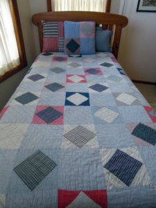
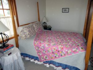
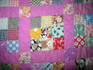
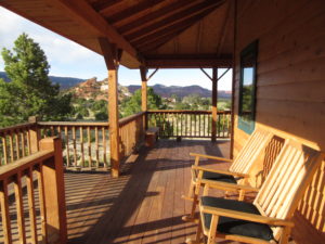 Just when I least expected it, a most relaxing, wonderful haven that is the Muley Twist Inn gave me an unexpected quilt fix.
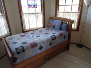
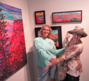
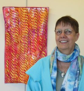
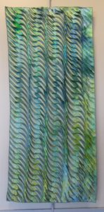
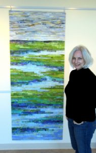
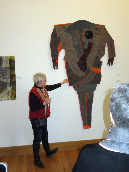
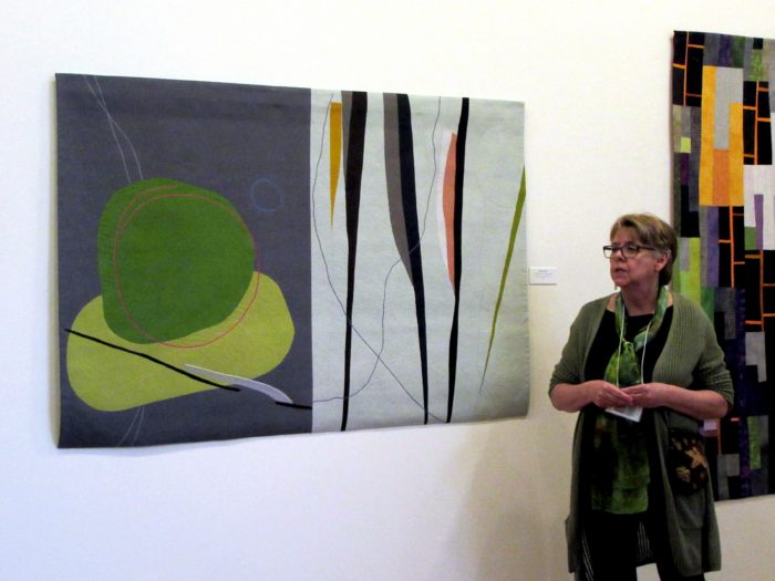
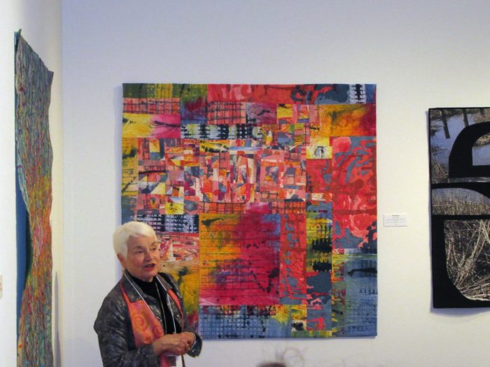
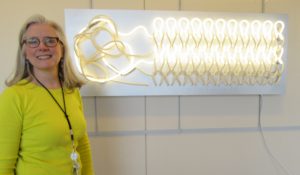 That’s the title of an exhibit Kevan Lunney put together at the Capital Health Medical Center in Pennington, NJ. This line-up of “rejuvenating work made of fiber and cloth” was sponsored by the hospital’s Art and Healing Committee plus Hopewell Valley Arts Council. And as the show just ended, I’m proud to share the fiber art pieces that rejuvenated my spirits with you here. Kevan is shown with her ground-breaking sculpture of neon and fiber, titled Repair.