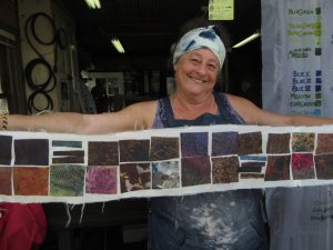
Back home in the bosom of my family for the Passover seder, I took the opportunity to see an art quilt exhibition at the Baltimore Museum of Art that’s been getting a lot of great press, which it richly deserves. It’s comprised of new work by Stephen Towns, trained as a painter, self-taught to quilt — for this body of work in particular. BTW, you can see it in the cloth if you get to the BMA before Sept. 2.
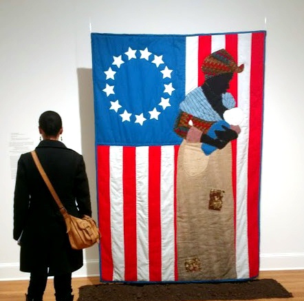
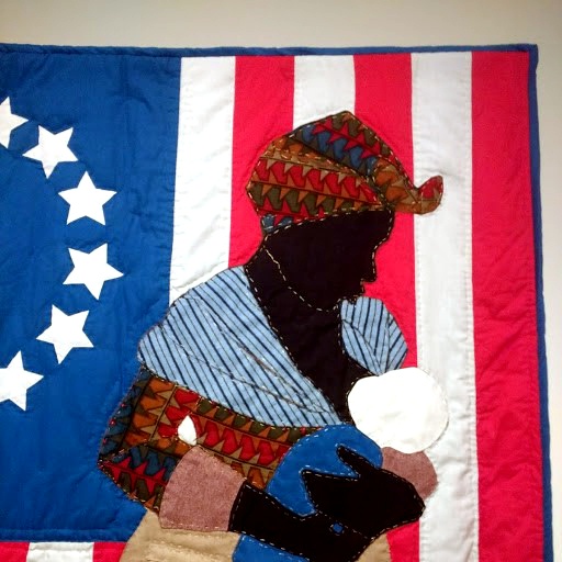
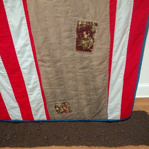
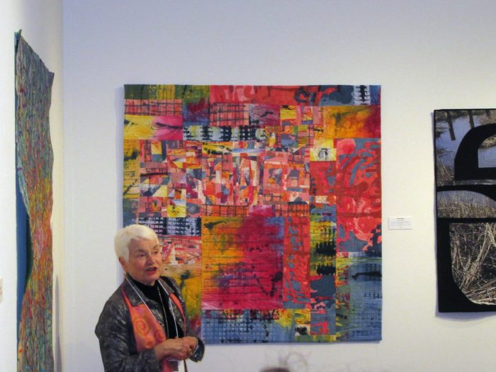
The piece above and below, titled “Birth of a Nation,” is the star of the show. A black mammy, tenderly suckling a white baby against the backdrop of an American flag of 1777, puts slavery and white supremacy in tension with each other. A coffee and tea-dyed dress, patched with toile prints and barely clearing the bed of dirt below the quilt evokes the humble status of the Madonna-like figure.
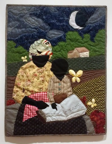
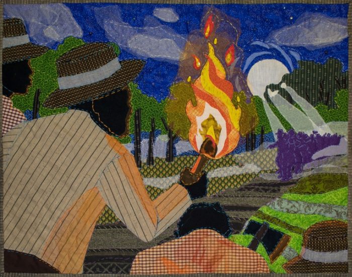
Surrounding this installation are seven smaller story quilts; whether portrait or landscape orientation, each is about a yard along its longest edges. These works depict key moments in the life of Nat Turner’s life and the rebellion he led against slavery in 1831. My favorite one featured another mother and child: Under the cover of night, when plantation work was done, Nat Turner’s mother teaches her young son to read, or schools him in gospel. The composition proves Mr. Towns’ incomparable talent as a portrait painter…just as the materials and techniques give away his seat-of-the-pants sewing and quilting skills. Fabrics are from an old stash (perhaps his mother’s?): those of us sewing and quilting in the ’60s, and ’70s will recognize the calicos, ginghams, and synthetics, and that proud feeling when you think to add translucent tulle and sparkly beads to skies, buttons to clothing.
Titled, “Special Child,” this piece is the first in the cycle, which all show what how the facts known about Nat Turner coalesced into myth and icon: slave, keenly intelligent child, preacher man, leader of an effective slave rebellion. It’s refreshing to have the story, told so often by whites such as William Styron (The Confessions of Nat Turner), reclaimed by an African-American living and working in the Black Lives Matter era.
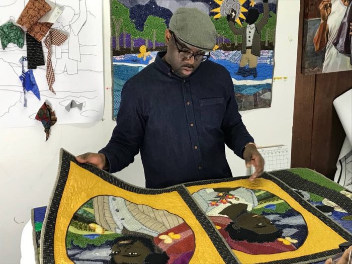
Stephen Towns assesses his “framed” portraits of Nat Turner and his wife, Cherry Turner, which accompany the exhibit.
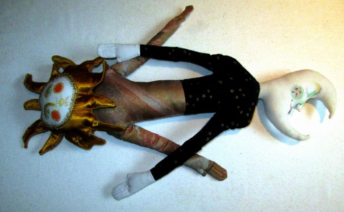
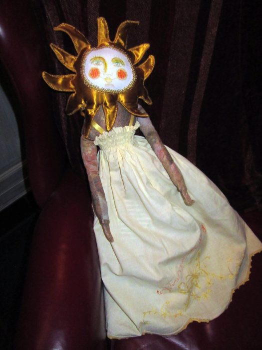
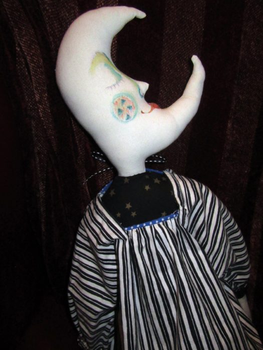
Stars, moons, or suns (plus the occasional butterfly) play a role in each work of art, connecting people with the universe, and with the spirit as creator. Celestial bodies stand in as haloes, symbolizing sainthood or martyrdom. And is the red scroll below an ecclesiastical stole, or a symbol of the bloodshed already committed and also up ahead?
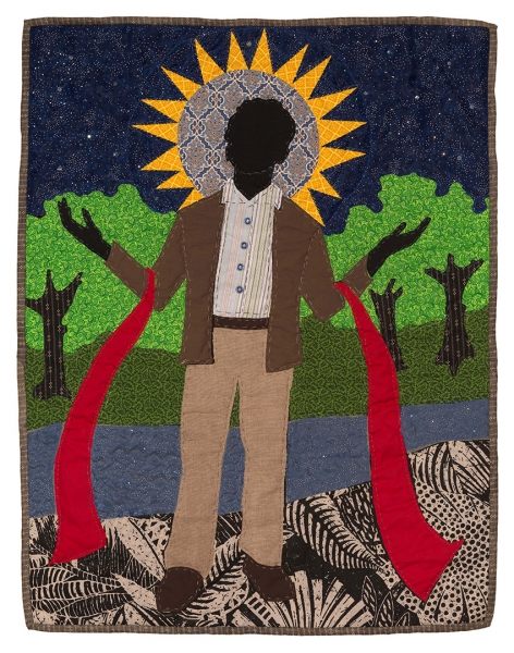
In each work of another series of paintings, the halo is a blue moon behind an enslaved rebel leader who has been caught. A hangman’s noose and a fist figure prominently. Click here to read what happened with these intensely powerful, provocative portraits.
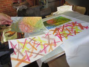
On a lighter note, quilters viewing this blog post may want to look back at the story quilts and note the minimal free-motion quilting in thread that matches the fabrics flattens the backgrounds, so they recede. In contrast, large stitches that most seasoned quilters would decry as “toe-hookers” become strong design lines in Towns’s narratives. Not only do they define important features, they add naivete, the mark of the hand.
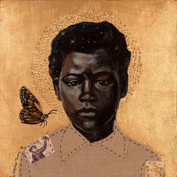
As an art-lover, I have so much respect for Towns’s cohesive works within series, for his conceptual underpinnings and iconography–sun, moon, stars, haloes, butterflies, and the gold-leaf that recalls the elaborate frames on medieval religious art (as in the “framing” on Nat and Cherry Turner’s likenesses). The piece below is from yet another series. Each work depicts a child who experienced slavery, and each work bears a title from the Lord’s Prayer.
Riveting. Heart-rending.
And yet one detail resonates most for me as a quilter. Can you guess what that is?


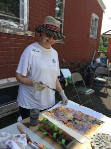
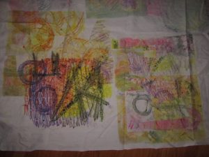
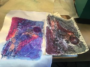
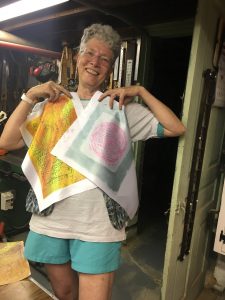
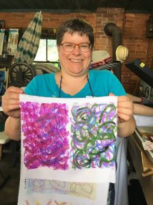
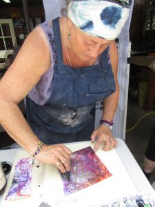
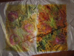 The right half is the transfer of my workings onto satin polyester fabric. Then I printed a second time, resulting in the quieter colors of the left half.
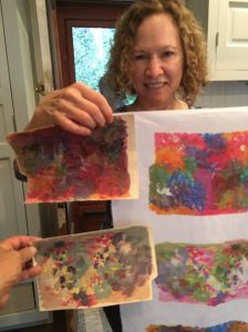
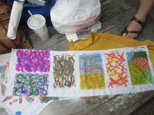
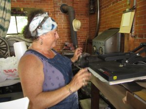
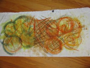 I preferred the poly cotton–more like the natural fabrics I use in my art quilts and craft pieces (table runners, pillow covers, tote bags, etc.). Here are two printings from one crayon-and-dye sketch, but with extra dye brushed on to bridge the gap between them.
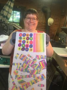
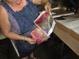
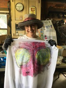 I was big into circles, and printing twice, with the second aligned. Inadvertently, I made myself a bodacious bra, huh?!
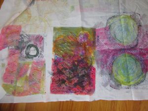
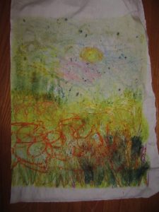

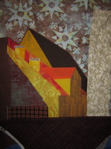
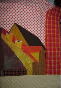
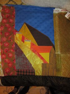
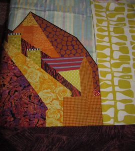
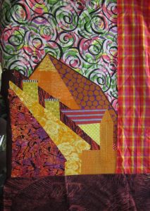
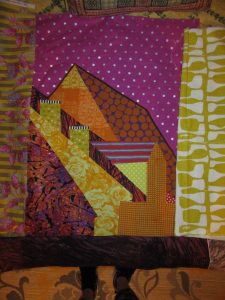
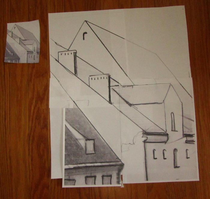
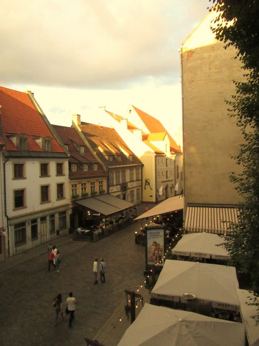
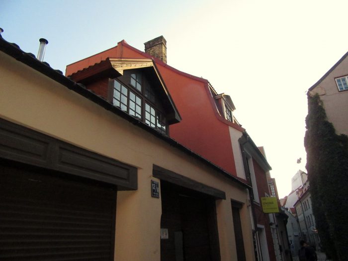
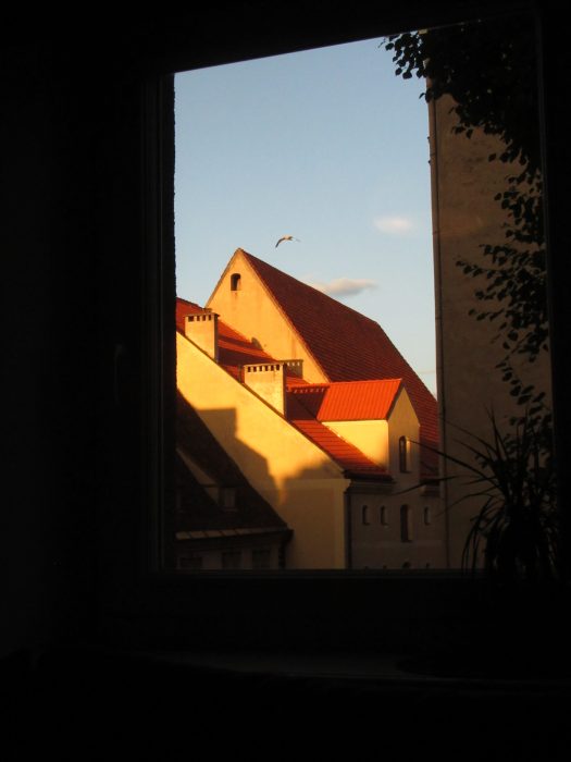 You voted, so I devoted myself to working from this photo, the view around 9:30 p.m. outside our apartment in Riga’s Old Town. First, I gotta get my left brain in gear. Yup, at this point, I’ll try to stay true to the photo…And then, we’ll see what happens…
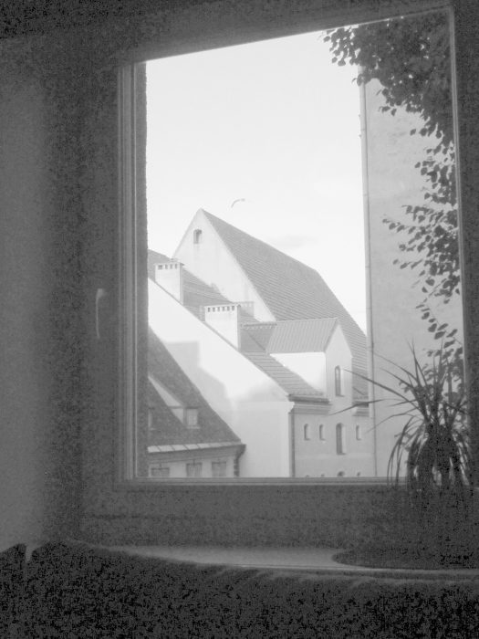


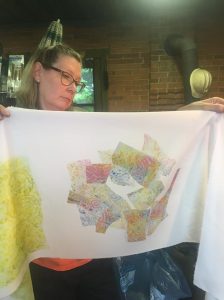
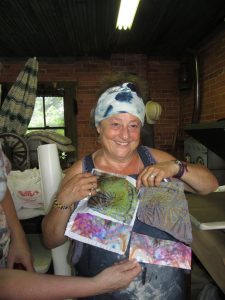
Love the bodacious bra. My husband gave me a college shirt with two giant basketballs located similarly. I only sleep in it. Aside from that, your circles are great!