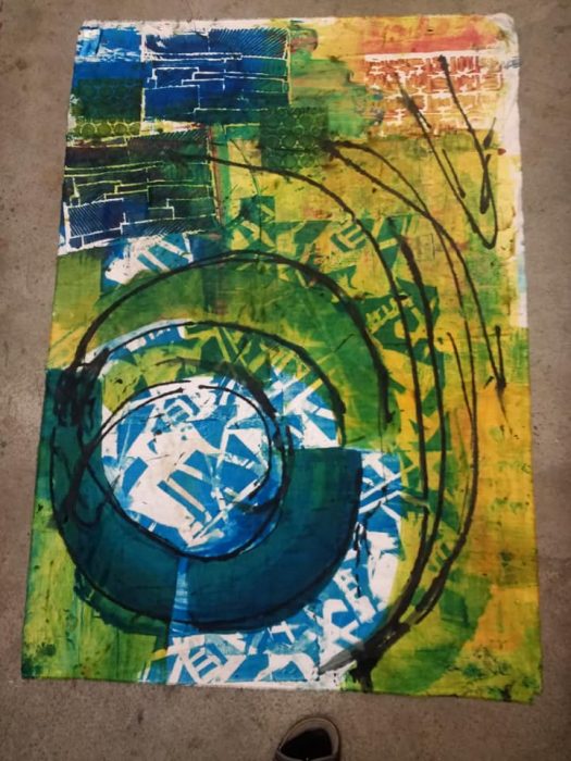
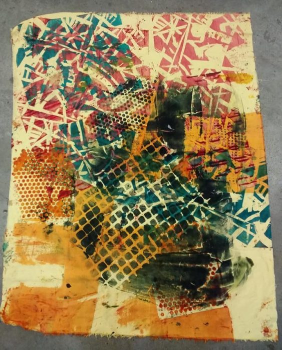
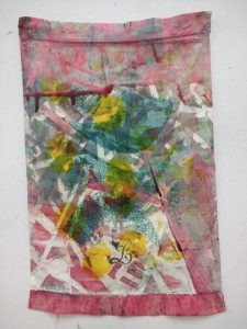
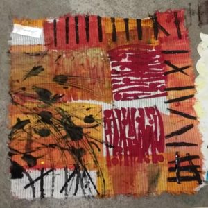
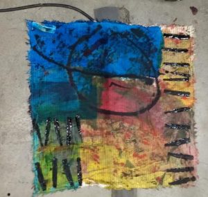
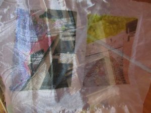
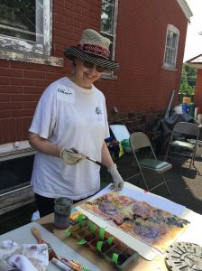
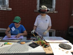
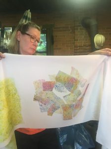
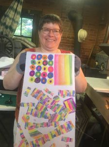
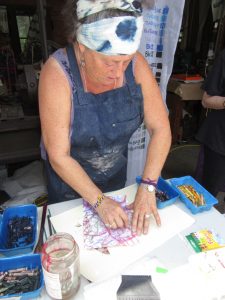
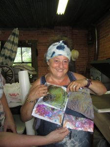
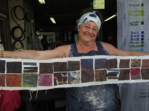
Glorious Prints is the name of a Pat Pauly class which was one of the most exciting art-making experiences of my life. See my previous blog post here. With Pat as your teacher, demo-ing her techniques twice a day over 4 1/2 glorious days, and with plenty of space to work and to spread out pieces to dry, you, too, can produce yards and yards of fabrics featuring exciting, large scale prints in the colors you love. Here are a few of the pieces I squeegeed, stenciled, spattered, dribbled, and silk-screened at Quilt & Surface Design Symposium in Columbus, OH the week of Memorial Day, 2019.
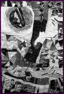
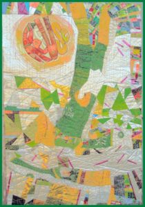
Big piece–see my foot! I’ll add a few strips at the bottom and call this an almost wholecloth art quilt!Another big piece–printed on yellow fabric. I’ll definitely cut this one up.
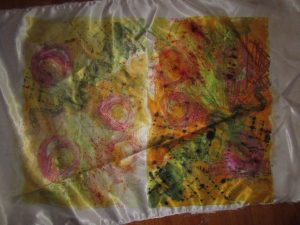
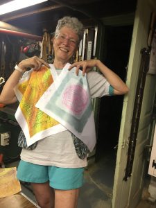
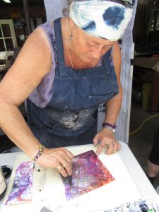
Printed on a vintage tea towel. This will be a background for applique and embellishments.
Printed on a linen napkin. Will be fun to quilt as a little work.
Also printed on a linen napkin. I love how the electrical cord on the floor flows out of the design, and I’ll be extending that line with a satin cord onto the fabric that serves as a background, border, or picture mat.
I’ll try to add more of what came out of this class, and what I do with it. Hopefully in the next few weeks…
P.S. For that to happen, first I must pray to the Creative Spirit for the power to ignore housework, chores, family and volunteer commitments, deadlines, crises… Sometimes, I think a power outage would be a nice surprise. Get me off the computer, and in front of the design wall…. Oh, but then there’s that “Be careful what you wish for” caveat… How much would I actually be able to do this August without AC or a fan?!
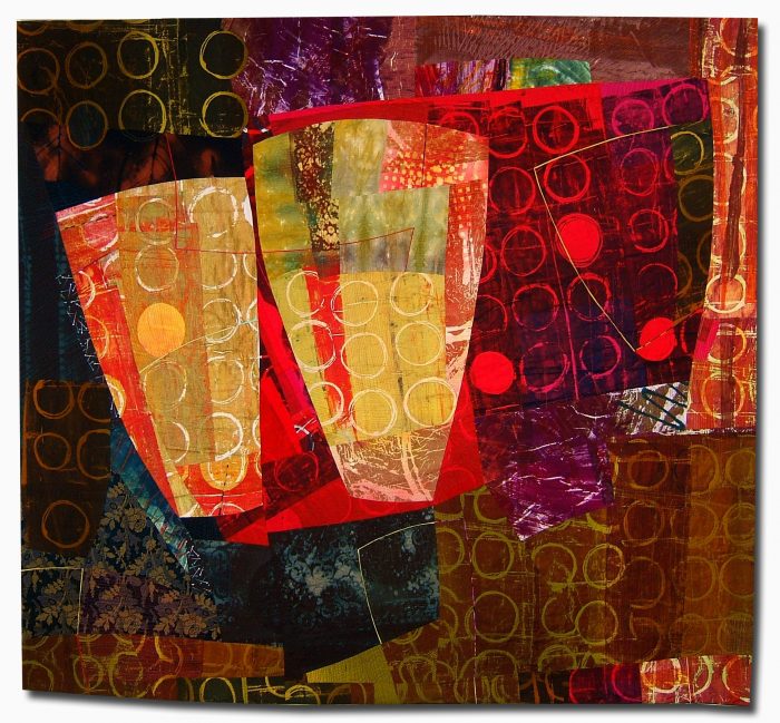
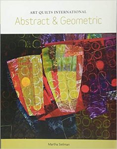
The always vivacious, irrepressible, and dare I say it, totally lovable Pat Pauly: Exuberant doesn’t begin to describe her, or her richly textured art quilts, which appear in THE most distinguished shows, private collections, and books about art quilts.
Mummy Bags, Canopic Jars, 66″ x 56″
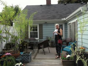
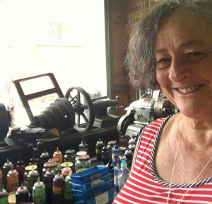
So you can imagine how thrilling it was for me, when I was in Rochester, NY last fall, to get a tour of her house. And now you can, too. The front is charming and neat, but friends come in through the back door.
Pat painted the clapboards of the exterior — she painted the interior, too. Installed cabinets, refinished furniture. A gardener, she planted all the containers, trees, and flower beds. What that means is that, just like with her fabric-printing and art-quilting students, she establishes the ground rules, guides their development, then lets them loose to do their thing.
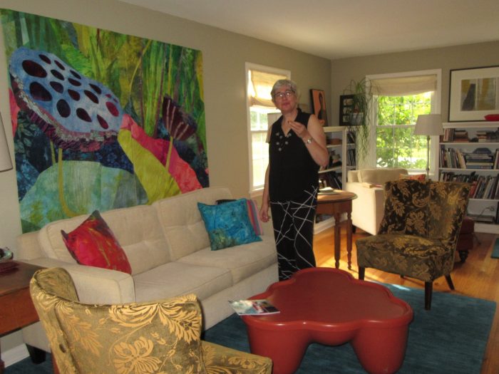
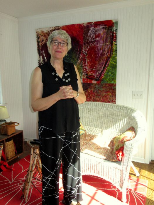
Flowers, or rather, lotus pods command the big diptych which dominated the living room when I visited. This, however, is a space where Pat rotates her giant (relatively speaking) masterpieces. The throw pillows are her work, too. Hot tip: Pat sometimes jumpstarts the process, beginning with linen or cotton ready-made covers which she squeegees and marks with thickened dyes. High-style soft spots that unify the color scheme of the exhibit du jour.
Other corners of the house showcase a cool mix of antiques, vintage, and modern, spare groupings of souvenirs, tchotkes, and art by friends. But it’s her own work, even with smaller dimensions, that invariably captivates your attention. Like the one shown below, Pat’s signature style of layering visual textures in strong, large-scale patterns make for abstract art that seems devilishly complex. Yet she will often produce 40″-squares following her own “Take Two” workshop technique, cutting and combining just two pieces of fabric.
Pat wouldn’t let me take pictures of her basement studio, where she does the messy work of printing on fabrics as well as the improvisational piecing and free-flowing free-motion quilting. Not a ton of space, but suffice it to say it allows her to be her authentic, whirlwind self and create a prolific body of work. Especially remarkable, given the demanding pace of her teaching gigs. She should bottle and sell that energy, if not that talent.
Lucky me, I had the incredible thrill of taking two classes with Pat at QSDS earlier this summer: Glorious Prints, and Take Two. If you hunger for art, inspiration, or adventures in surface design or composition, she’s the teacher you want— PatPauly.com. Check her calendar and see if it meshes with yours. Attend a presentation or program or workshop, and you’ll probably get the opportunity to purchase her gorgeous fabrics. Oh, and if you want the inexpressible pleasure of living with her art, salivate over her portfolio on that website.
After blogging about Pat Pauly, you may find I have some nerve showing you some of the fabrics I created in her workshop…in my next post. Gonna do it anyway…
Last summer, I took a collage class at QSDS–Quilt & Surface Design–from Deborah Fell.
Standing alongside my design wall in Deborah Fell’s class.
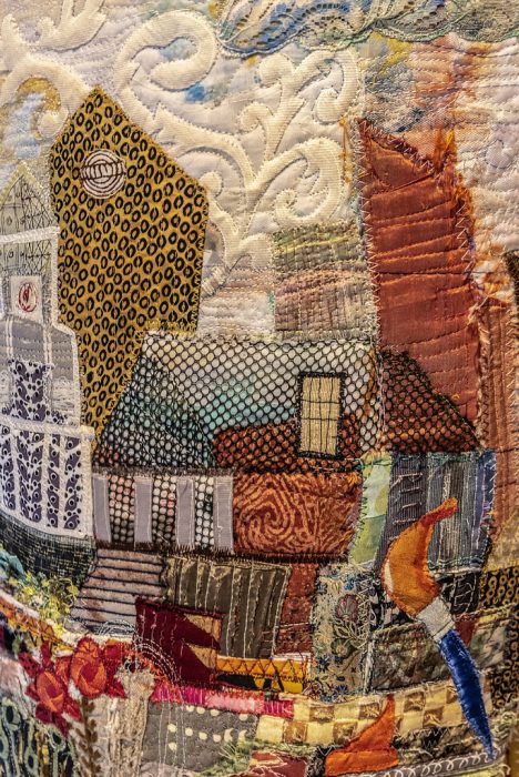
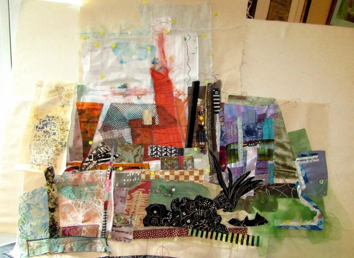
See that sprawling assemblage to the left of my hip? It started as a small abstract composition…abstraction being something I aspire to. But I can’t help myself; my work invariably calls to mind some object or scene, and I’m off to flesh out figurative or landscape designs.
This held true here: I saw buildings and began to recreate my current hometown of Philadelphia. I had a few recognizable buildings, some vague representations, the Schuylkill River on the left, the Delaware River on the right. It came together in stages, and I placed sturdy pieces of canvas or upholstery weight fabric under the expanding areas as foundations for a large, odd-shaped wall hanging.
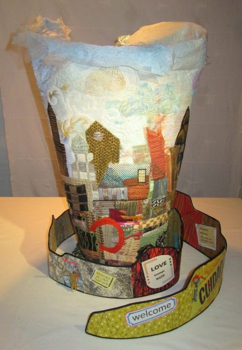
City between two rivers…
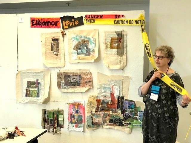
A few months later, I read about a SAQA (Studio Art Quilters Association) call for entry: Forced to Flee. The theme resonated. As a volunteer, I’ve long advocated for compassionate immigration reform and protested against Muslim bans, the Wall, family separations, and inhumane detention centers. I decided to finish my cityscape to express pride that Philadelphia is one among hundreds of sanctuary cities in the U.S. My “city of brotherly love” (sisterly love is implied!) accepts its moral obligation to protect immigrants and refugees. City leaders and activists alike fight against detentions, deportations, family separations, and discrimination. We rise to welcome the stranger, give shelter, secure safe haven for those “forced to flee.”
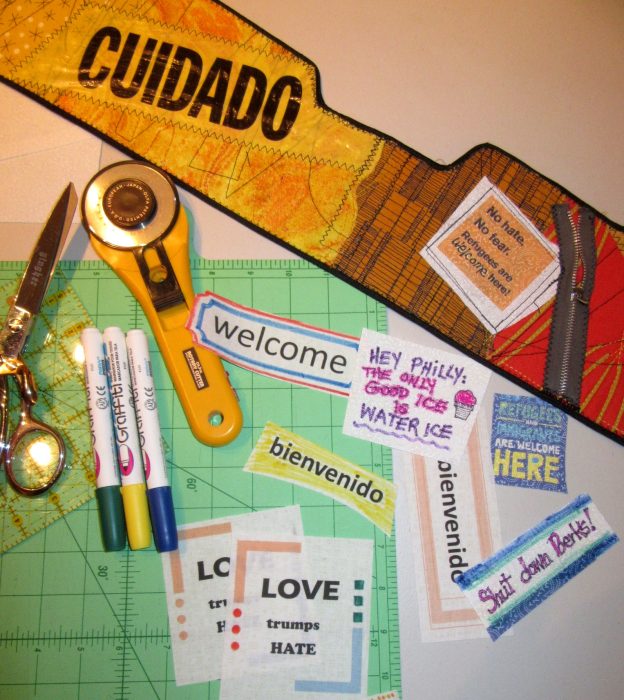
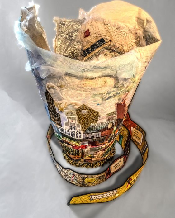
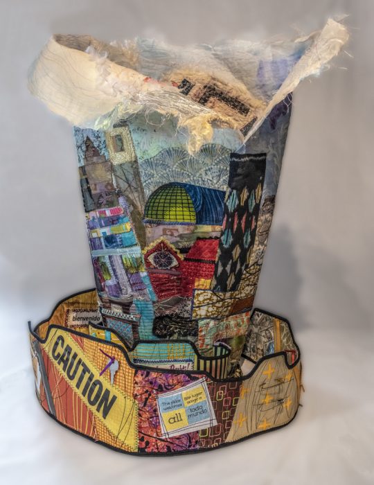
Knowing the caliber of work submitted to a SAQA show, I thought I’d have less competition for a 3-D piece, and be more likely to get in. So, I traced around an oval trashcan for a pattern — cuz what better to give me elegance than a trashcan? I continued to build my city over thick Pel-tex stabilizer so the vessel would be an upstanding example. Alternately, I worked on the inside surface, using a vintage quilt fragment for its soft, comforting associations, plus emergency mylar thermal blankets of the sort that are given to detainees. I cannot express how much struggling, how much cursing, how many broken needles went into assembling this beast. It stands 28” high. To ensure steadiness without adding weights, I fashioned a spiral pathway with signs and symbols of concern and welcome: bi-lingual expressions, caution tape, keys and safety pins and zippers.
There were further frustrations as I hand-stitched the elements together. Then I had to photograph it to try and meet the demands for pixels, clarity, background, and appropriate depth of field. I managed to submit my information and images 45 minutes before the deadline.
I didn’t get in to the Forced to Flee show. I get it. Jurors receive hundreds of submissions and usually curate down to under 50 — for a cohesive, high-quality exhibit at venues with limited spaces. Perhaps my piece was too discombobulated and did not appeal to the judge. Perhaps there were no other 3-D pieces and this would have been odd man out. And perhaps my photos weren’t up to what SAQA demands for not only the judging, but also the catalog.
Rejection gave me several advantages: I really wasn’t satisfied with the piece, and was now free to make significant changes. Another SAQA call for entry beckoned: 3-D expressions. I had time to revise and polish the composition from all sides and the inside. New construction and embellishment strengthened the overall aesthetic and referenced more Philly iconography. I added more vintage mini-blocks and doilies to the inside, and crocheted an oval rug to cozy up the “inner sanctum.” I want those who see the piece to take time to walk around it and peer inside. And yeah, I’m tempted to throw in little stuffed heart-shaped pillows, additional keys, and poems of welcome…but mostly because I don’t know when to stop. What do you think? More secrets and treasures? Or enough already?!?
Happier with the piece, I took the time to hire an expert photographer — Gary Grissom — and set it up in a better-lit niche. Now I felt more confident submitting it to the other show.
More time and attention to detail and good workmanship, along with professional shots, did the trick. I got in!
Icing on this cake is the impressive decision-maker, an art professor and gallery director who is one of the finest modern fiber curators in the world. (Oh, and he’s a Philadelphian.!) SAQA’s website states, “The wide variety of pieces selected by juror Bruce Hoffman include vessels, wearables, wall-pieces, and sculptural artworks. This cutting-edge exhibition shows how textile art can expand both into the third dimension and into the future.”
This exhibition, 3-D Expression, will premiere at the Gerald R. Ford Presidential Museum in Grand Rapids, Michigan in September 2019. I am angling to see while it’s there. Aside from the honor of having my work included, I would be thrilled to study all the other works in the only way they can truly be appreciated: by walking around them and checking them out from every angle.
Meanwhile, I’m back to making essentially 2-D art quilts for a while. Oh, and shopping for a workhorse of a sewing machine that may allow for thick, sculptural work in the months to come.
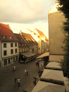
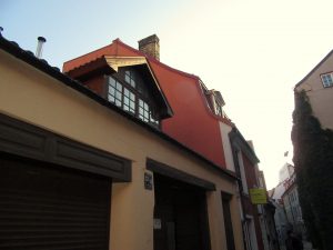
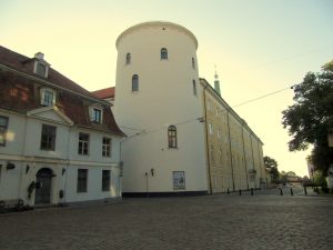
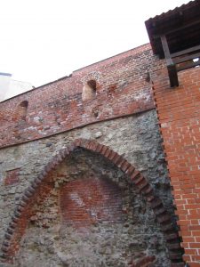
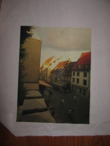
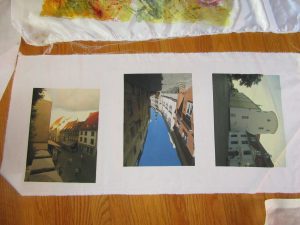
Two weeks before the Disperse Dyeing on synthetics workshop at Lisa “Dippy Dyes” Reber’s house, I was invited to send in photos for transferring. So I went through recent vacation photos, architectural landscapes I’d shot in Riga, Latvia. I wanted my fabric transfers to be correctly displayed, so I flipped them to the mirror image and sent them in as Lisa requested.
Lisa directed us to send our images right to Fine Balance Imaging Studios–which is located in Langley, on Whidbey Island. I have fond memories of vacationing on this charming island, a short boat ride away from Seattle, WA. Kudos for this top quality firm locating in a place where quality of life is so high. Anyhoo, their site says:
If your files are anywhere up to 20MB or so, please send us an email at theprintstudio@gmail.com your file as an attachment and instructions for your job. We’ll follow up with you within 24 hours to verify your request and provide a timeline and estimate.
Gmail user? You can send any size file through email – it will automatically upload to Google Drive and send us a link!
Alternately, Dropbox is a great free service we highly recommend that is easy to use. Upload your file and send us a link via email. [Maybe box.net will also work!]
Please do email us and let us know you’ve sent a file, and specify what you would like for your order.
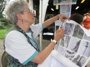
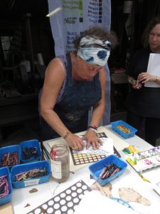
At the workshop, Lisa passed out the large sheets of paper that were imprinted with pigments made for synthetic fabrics. Presumably, you could ask FBI Studios to use the pigment that was right for natural fabrics, too. Here’s Kerry, my classmate, cutting her pictures into individual transfer sheets.
Photos were placed on fabrics, with right sides together, within the hot press. I began, using a poly-cotton broadcloth supplied by Lisa. Excellent saturation and detail!
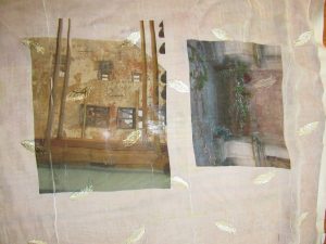
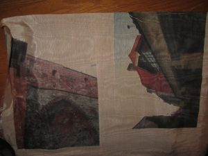
Next, I experimented with my own unusual fabrics. Below, two photos transferred onto a piece of polyester chiffon that is embroidered with little leaves or feathers. Under that, two photos transferred onto a peach polyester moire.
Here are transfers to a sheer pinkish polyester.
I think these will make ethereal overlays to abstract compositions which allude to the ghosts of my family members who lived in Riga and walked the same streets I did. Some were tradesmen, involved in manufacturing of paints and turpentine, so I believe they would approve.
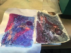
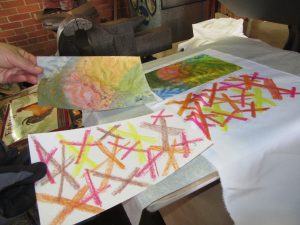
Brushing on “cool black” dye over painted and crayoned paper. Check out my last two posts here and here to find out why. My choice of dyes were squirted into ice cube tray compartments, because you only need a little. Each dye is identified with a green masking-tape tag, because really, the look of the dye is rarely telling.
The right half is the transfer of my workings onto satin polyester fabric. Then I printed a second time, resulting in the quieter colors of the left half.
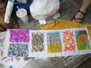
I preferred the poly cotton–more like the natural fabrics I use in my art quilts and craft pieces (table runners, pillow covers, tote bags, etc.). Here are two printings from one crayon-and-dye sketch, but with extra dye brushed on to bridge the gap between them.
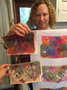
I was big into circles, and printing twice, with the second aligned. Inadvertently, I made myself a bodacious bra, huh?!
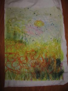
Last one shows a lapse back into traditional territory–a landscape. But even like the scribblings of the other experiments, this will probably be cut up and used as components of an abstract art quilt. Although, with all my circles, I can’t help but think toward Drunkard’s Path patchwork. In any case, I found these sips and gulps of disperse dyeing quite intoxicating.
At the workshop mid August, I learned so much from the trials–almost all successful! Just a few tribulations!–of my sister classmates. Although they experimented with lots of surface textures a la Lisa “Dippy Dyes” Reber, I’m going to share what we did using Miriam Jacobs’ techniques, which I am absolutely jazzed about. As Miriam showed us (see my last post) we worked on paper, first with fabric crayons. We placed textures under the paper and then made rubbings, adding lines or marks as desired. Day one, I worked alongside Janet, who is making a rubbing. Then, we painted thick, liquid dyes on top. When we were done, we carried the paper and a piece of synthetic fabric over to the hot press. Kind of like using a sandwich press, but bigger, heavier, and tight enough to make the thinnest croque monsieur you can imagine. Lisa sets hers at 345 degrees and times the transfer for 29 seconds. Miriam sets hers for a little cooler, and a little longer.
The biggest surprise is the Voila! moment, when you get to see exactly what color that dye produced. It’s not always obvious from the paper, that’s for sure. Check out these examples from Grace, with paper and resulting fabric:
Janet quickly mastered ghosting: reprinting with softer and softer effects. Kerry was very diverse in disperse dyeing, but here’s her crayon and dye work.
Diana went bold, and produced a prodigious amount of work. “Hot off the press,” so to speak, she’s already ordered all the tools and supplies she needs to keep going.
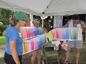
A mind-blowing bevy of techniques filled a two day workshop I took last weekend. Disperse Dyes on Synthetic Fabrics was going to be taught by two accomplished specialists, each with her own extensive repertoire. Held at the home of Lisa “Dippy-Dyes” Reber in quaint little Red Hill, PA, Lisa shared her methods for mottling, sun-printing, salt sprinkling, chain- and tube-wrapping, scrunching, photo-transfer and more. She shared her supplies–tools and liquid dyes which we could choose, referencing her thoughtfully painted chart of colors, tints, and hues.
At the same venue, Miriam Jacobs–formerly known as Mert, or Mertle the Turtle Fabric Arts, won over our attention to how she creates complex cloth, packing on a myriad of techniques including crayon drawing and rubbing, dye-painting, dye scraping, paper scrunching, heat-pressing, ghost-printing, and juxtaposing.
Glorious, jaw-dropping gorgeousness. In the next post, I’ll show you what my talented classmates did…and the wealth of surface designs on various fabrics that will doubtless fill my fall with quilting projects. Stay tuned.
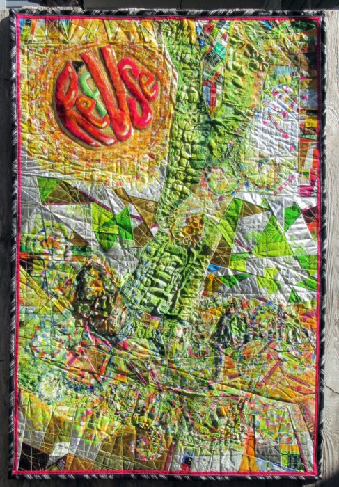
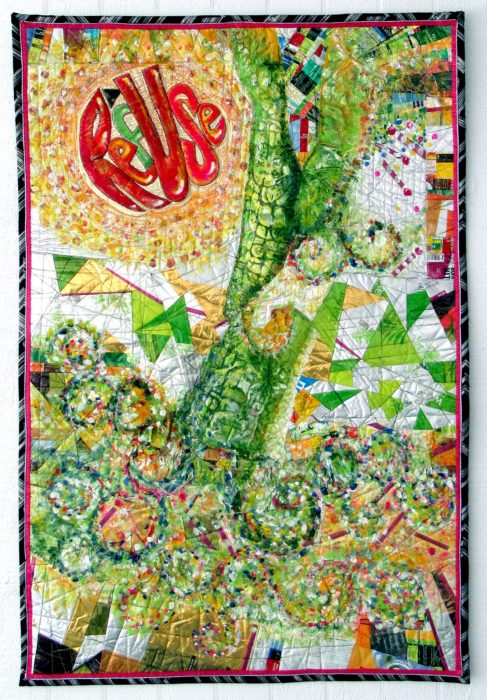
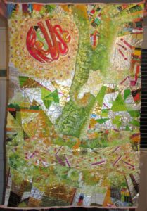
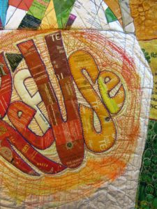
Here’s my finished piece, ReUSe/REFuse. 32″ x 48″ Photographed in harsh, side-lit natural light.
Certainly a learning experience. So grateful for all the wonderful advice I got from you blog-commenters: I emphasized the message text as well as I could, repeated the look of its circular shape, sought to add layers of paint to some areas, like posters peeling away, and to keep the color contrast, using pointistic dabs to lead the eye around the piece.
Just in time to enter it in the Mancuso Tri-State Quilt Show (March), and in the much more selective SAQA Textile Posters show…Here’s hoping it will be chosen by either or both, and have someplace to be seen in the flesh, er…cloth, er… mixed media of the trash kind.
Another photo, this time with indirect sunlight. Doesn’t show up the bubbling, but hies to the evenly-lit image requirements–all this amateur photog can handle with her little automatic Canon Powershot, no photo studios, reflective umbrellas, etc. etc. I’m always jammed right up to the entry deadlines, story of my life, so no time (or money) to hire a pro to shoot my piece.
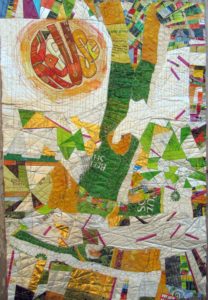
If you’ve read my last two blog posts, you’ll know that I’ve been working on a textile poster, pieced and appliqued out of trash–used packaging. A lot of the assembly came about in flip-and-stitch sections, with quilting to flatten everything down onto felt, then onto a backing.
The problems I saw were a jumble of clutter and a lack of cohesiveness. Many thanks to everyone who left a comment with a suggestion. I considered every single one. And I was determined to move on to address the problem, to redress and resolve those issues, and others brought to my attention, with paint.
Paint day 1–Brushwork, dabbing, sponging, dotting the fuchsia matchsticks—! or i?, adding a soft color to the f in RefUSe:
Better. But still, not half as cohesive as I’d like. On to Paint Day 2, now armed with my favorite paint tool, the Gelli Gel Plate–for mono-printing, and a few high quality tubes of acrylic. Continued to daub, sponge, and brush.
Getting there, now, I think. It’s a lot more impressionistic, which helps to blend the sections for the cohesion I’m after. A lot more yellow, yellow-green, and orange tones, for warmth and sunniness. I’m thinking most of what Joan had to say: “I would use paint so it would have the look of a wall that multiple posters have been ripped from and covered with more posters. I would soften some, completely paint over areas and leave some bright…”
I’ve darkened the S in RefUSe, and the outer edges of the second e–which seems to need a bit more darkening to be readable…Not that ReUS doesn’t have some merit as a message. It’s about “us” doing our part. And hopefully, this message won’t be interpreted as a plea for nationalism over globalism, cuz this citizen really doesn’t cotton to the America First slogan we keep hearing over and over…
OK, focus on your art, Eleanor. We’re not trying to be controversial this time. Honest.
Composed. Meaning that I’ve put all the elements together for my latest work in progress, and the composition is complete. Brother — or should I say, Bernina, did I have a time quilting those bubbled, melted woven plastic pieces, which was a bag of beet pulp for horse feed (thank you Ms. Vola). See my last post, Bubble, Bubble, Melt & Muddle. Went through a lot of needles, needless to say. Packaging from other used products–coffee bags (thank you Emmetts and local coffee shop), tea bag envelopes (thank you Carl, Barb, Lesley, and Liz), and foil enclosures for items like smoked salmon and Alka Seltzer tablets, constitute the rest of the surface. Oh, and I threw in some plastic mesh citrus bags.
Yep, this is part of my ReUse series, made from my stash of trash. A green quilt, to be sure. The text riffs on the word Reuse, as in recycle. Ref-use, meaning garbage. And Re: Use, referring to our use of dwindling resources. Maybe even Refuse — to be a user, a conspicuous consumer.
So here I am. Piece needs some work in straightening and finishing the edges.
Considering crossing some of those fuchsia dashes. More is more??
Nuh-uh. What this piece REALLY needs is what my sewing studio needs: some serious decluttering.
See, I’m not showing off. Or fishing for compliments. Quite the contrary, I’m at a hypercritical stage, and fairly desperate for ideas and direction.
Let me interject here that this piece answers a call for entering 32″ x 48″ textile posters from Studio Art Quilters Association (SAQA). So, much as I’d like to severely crop it–which would be in service to the art, that would be a big capitulation of this opportunity for exposure.
Trial by computer: I translate the image to black and white, to view the contrasts and overall composition in a simplified way. I also added a border, to represent a binding all around:
Which tells me that there is just too much variance of contrast–too much piecing, making it jumpy and jarring.
I’ve decided to use paint to reduce the patterning. Excited about using a brayer to capitalize on the bubbled and quilted textures, for an effect resembling crackling. With hopes that the paint doesn’t crack off or flake…Will I need a primer? A sealant? I’m thinking of a whitewashing effect. Not necessarily white, but swathes of a single shaded color to blend areas of random piecing. [Note to self: Next time, keep crazy quilt patchwork to blocks, to contain and restrain the craziness. And make me less crazy.]
I’m no wiz at photo-editing to preview how this might look, but I have an “add flash” feature to show how lightening the whole thing might look, and I’ve added a light green border to stand in for binding:
Better, I think. Paint will also cover up any exposed brand names or logos of companies whose legal departments have nothing better to do than threaten artists and exhibitors.
The good news is, with this shiny, plasticized surface, I can easily sponge off newly-applied paint that doesn’t do it for me.
Friends, when I say I welcome comments, that is an understatement. Very grateful to get your artistic perspective. What do you think I should do?


 The right half is the transfer of my workings onto satin polyester fabric. Then I printed a second time, resulting in the quieter colors of the left half.
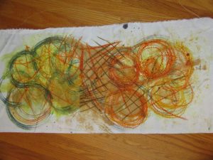 I preferred the poly cotton–more like the natural fabrics I use in my art quilts and craft pieces (table runners, pillow covers, tote bags, etc.). Here are two printings from one crayon-and-dye sketch, but with extra dye brushed on to bridge the gap between them.
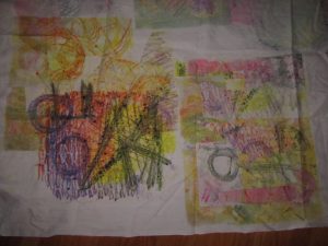
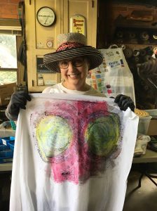 I was big into circles, and printing twice, with the second aligned. Inadvertently, I made myself a bodacious bra, huh?!
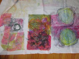

 If you’ve read my last two blog posts, you’ll know that I’ve been working on a textile poster, pieced and appliqued out of trash–used packaging. A lot of the assembly came about in flip-and-stitch sections, with quilting to flatten everything down onto felt, then onto a backing.
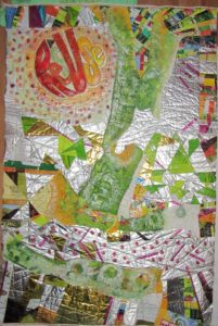

 Yep, this is part of my ReUse series, made from my stash of trash. A green quilt, to be sure. The text riffs on the word Reuse, as in recycle. Ref-use, meaning garbage. And Re: Use, referring to our use of dwindling resources. Maybe even Refuse — to be a user, a conspicuous consumer.