Eleanor Levie HomeAboutEditorial ServicesBooksGallerySpeaker TopicsWorkshopsPast BookingsFree StuffLInks Contact Me

Inspiring Quilting: Elly's blog to boost your creative IQ

Archive for the ‘Personally Speaking’ Category

Overdressing!

Saturday, January 28th, 2017

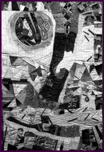
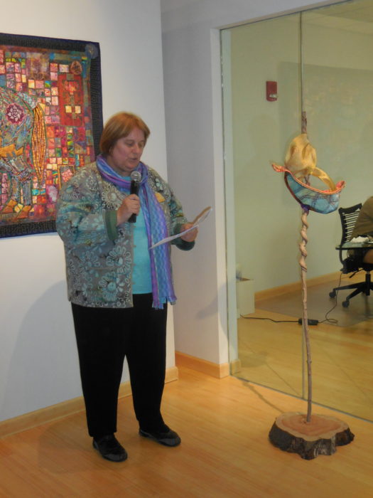
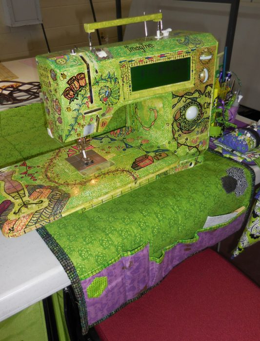
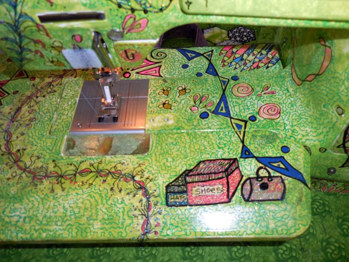
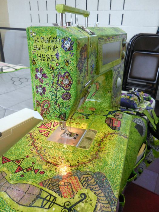
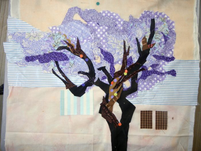
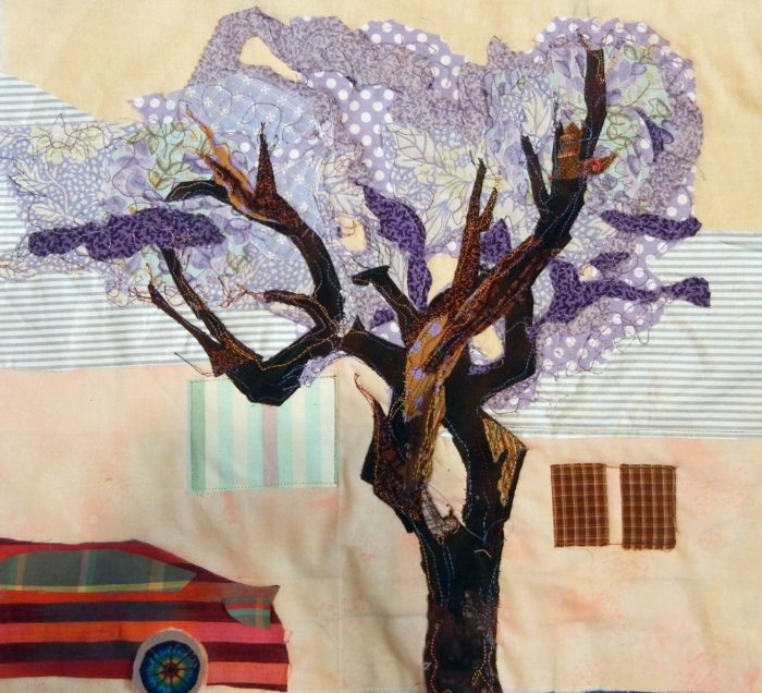
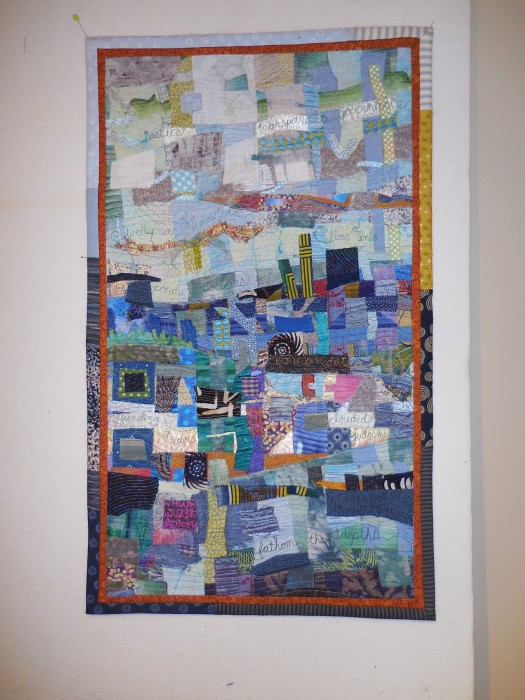
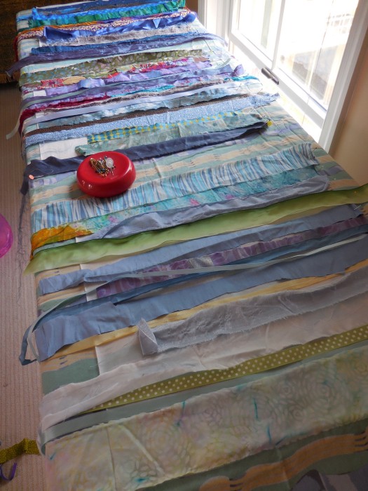
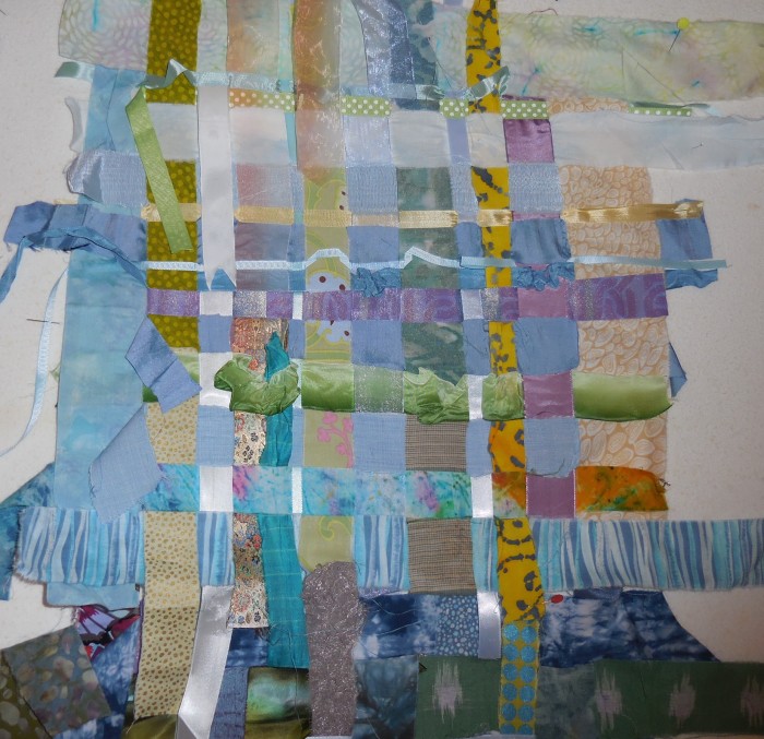
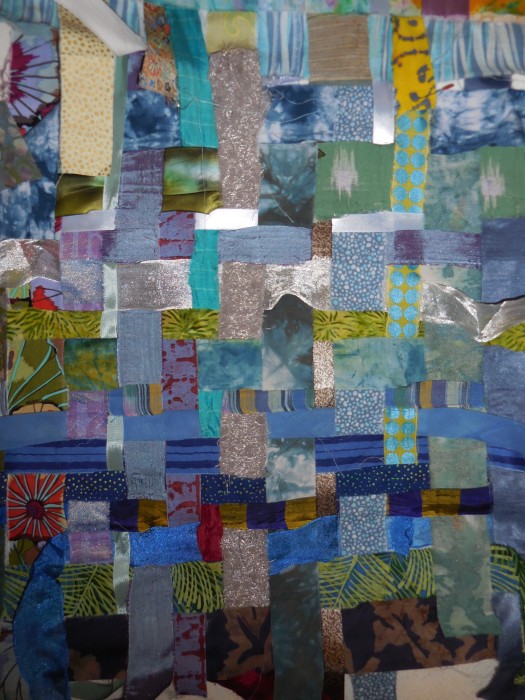
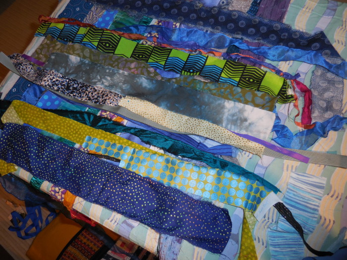
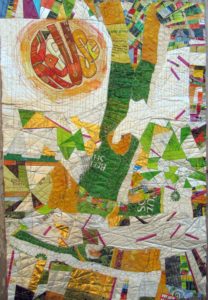
If you’ve read my last two blog posts, you’ll know that I’ve been working on a textile poster, pieced and appliqued out of trash–used packaging. A lot of the assembly came about in flip-and-stitch sections, with quilting to flatten everything down onto felt, then onto a backing.

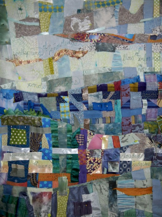
The problems I saw were a jumble of clutter and a lack of cohesiveness. Many thanks to everyone who left a comment with a suggestion. I considered every single one. And I was determined to move on to address the problem, to redress and resolve those issues, and others brought to my attention, with paint.


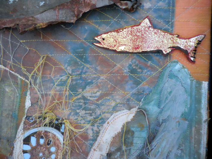
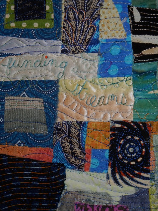
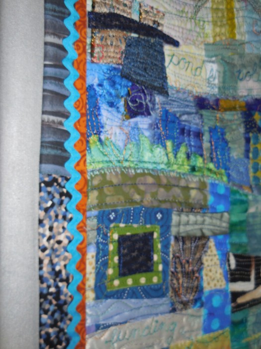
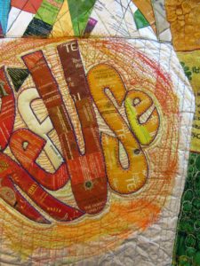
Paint day 1–Brushwork, dabbing, sponging, dotting the fuchsia matchsticks—! or i?, adding a soft color to the f in RefUSe:

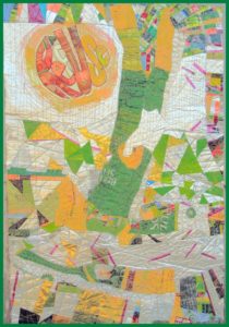
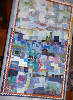
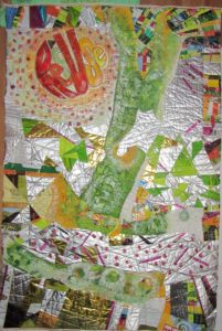
Better. But still, not half as cohesive as I’d like. On to Paint Day 2, now armed with my favorite paint tool, the Gelli Gel Plate–for mono-printing, and a few high quality tubes of acrylic. Continued to daub, sponge, and brush.


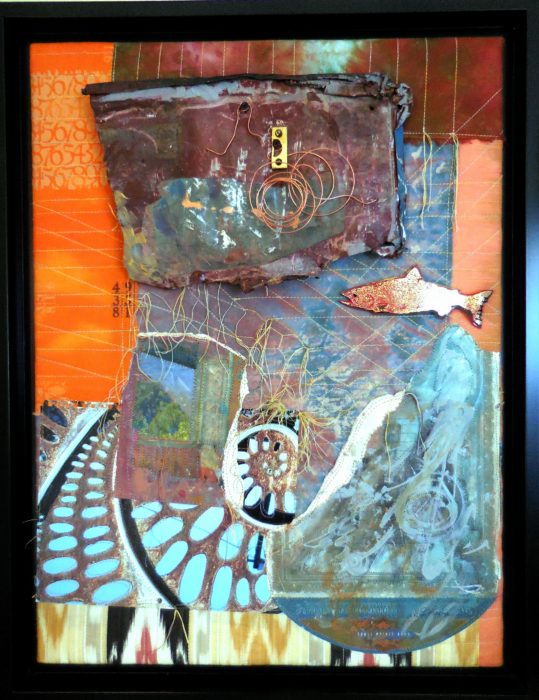
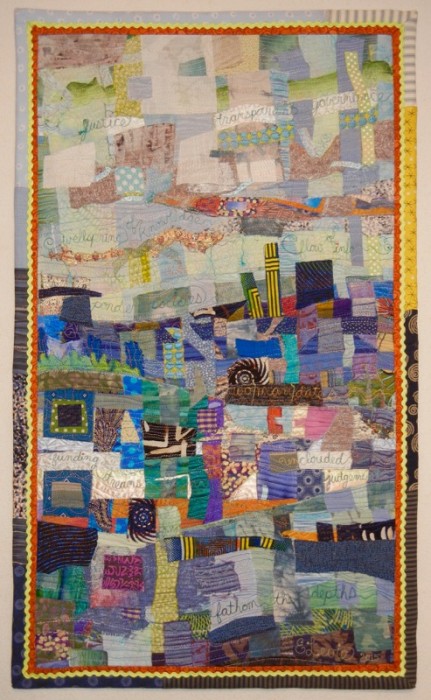
Getting there, now, I think. It’s a lot more impressionistic, which helps to blend the sections for the cohesion I’m after. A lot more yellow, yellow-green, and orange tones, for warmth and sunniness. I’m thinking most of what Joan had to say: “I would use paint so it would have the look of a wall that multiple posters have been ripped from and covered with more posters. I would soften some, completely paint over areas and leave some bright…”

I’ve darkened the S in RefUSe, and the outer edges of the second e–which seems to need a bit more darkening to be readable…Not that ReUS doesn’t have some merit as a message. It’s about “us” doing our part. And hopefully, this message won’t be interpreted as a plea for nationalism over globalism, cuz this citizen really doesn’t cotton to the America First slogan we keep hearing over and over…

OK, focus on your art, Eleanor. We’re not trying to be controversial this time. Honest.

Addressing, Redressing

Wednesday, January 25th, 2017

Composed. Meaning that I’ve put all the elements together for my latest work in progress, and the composition is complete. Brother — or should I say, Bernina, did I have a time quilting those bubbled, melted woven plastic pieces, which was a bag of beet pulp for horse feed (thank you Ms. Vola). See my last post, Bubble, Bubble, Melt & Muddle. Went through a lot of needles, needless to say. Packaging from other used products–coffee bags (thank you Emmetts and local coffee shop), tea bag envelopes (thank you Carl, Barb, Lesley, and Liz),  and foil enclosures for items like smoked salmon and Alka Seltzer tablets, constitute the rest of the surface. Oh, and I threw in some plastic mesh citrus bags.

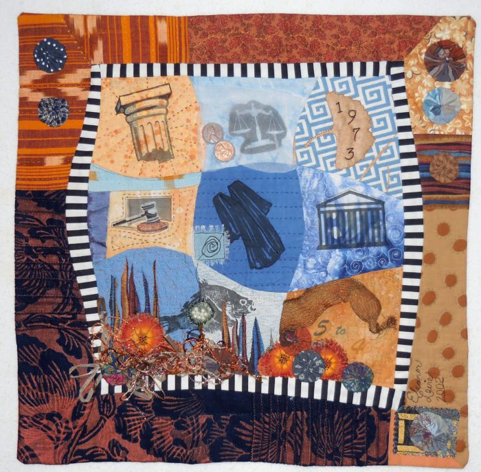
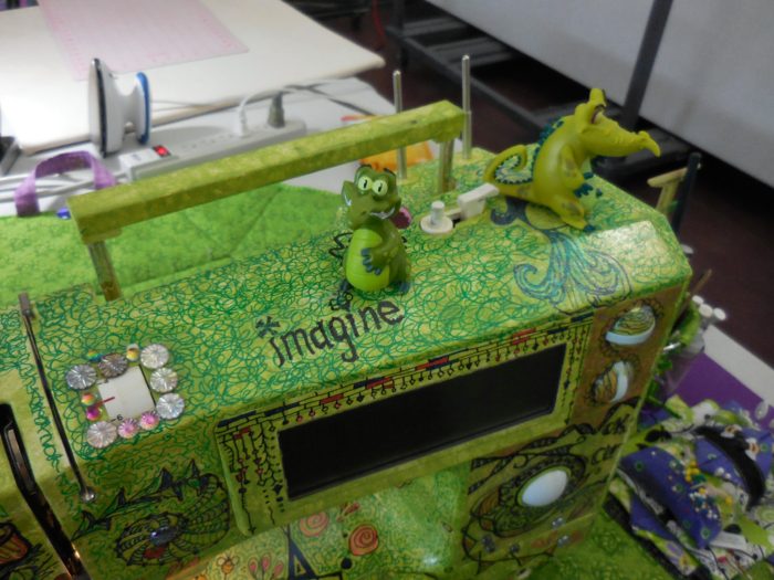
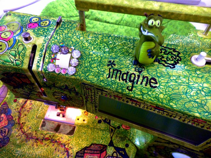
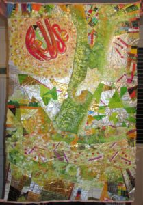
Yep, this is part of my ReUse series, made from my stash of trash. A green quilt, to be sure. The text riffs on the word Reuse, as in recycle. Ref-use, meaning garbage. And Re: Use, referring to our use of dwindling resources. Maybe even Refuse — to be a user, a conspicuous consumer.

So here I am. Piece needs some work in straightening and finishing the edges.

Considering crossing some of those fuchsia dashes. More is more??

Nuh-uh. What this piece REALLY needs is what my sewing studio needs: some serious decluttering.

See, I’m not showing off. Or fishing for compliments. Quite the contrary, I’m at a hypercritical stage, and fairly desperate for ideas and direction.

Let me interject here that this piece answers a call for entering 32″ x 48″ textile posters from Studio Art Quilters Association (SAQA). So, much as I’d like to severely crop it–which would be in service to the art, that would be a big capitulation of this opportunity for exposure.

Trial by computer: I translate the image to black and white, to view the contrasts and overall composition in a simplified way. I also added a border, to represent a binding all around:

Which tells me that there is just too much variance of contrast–too much piecing, making it jumpy and jarring.

I’ve decided to use paint to reduce the patterning. Excited about using a brayer to capitalize on the bubbled and quilted textures, for an effect resembling crackling. With hopes that the paint doesn’t crack off or flake…Will I need a primer? A sealant? I’m thinking of a whitewashing effect. Not necessarily white, but swathes of a single shaded color to blend areas of random piecing. [Note to self: Next time, keep crazy quilt patchwork to blocks, to contain and restrain the craziness. And make me less crazy.]

I’m no wiz at photo-editing to preview how this might look, but I have an “add flash” feature to show how lightening the whole thing might look, and I’ve added a light green border to stand in for binding:

Better, I think. Paint will also cover up any exposed brand names or logos of companies whose legal departments have nothing better to do than threaten artists and exhibitors.

The good news is, with this shiny, plasticized surface, I can easily sponge off newly-applied paint that doesn’t do it for me.

Friends, when I say I welcome comments, that is an understatement. Very grateful to get your artistic perspective. What do you think I should do?

The Invention of Wings, from a quilter’s POV

Saturday, November 19th, 2016

HarrietPowers-1

The Invention of Wings, by Sue Monk Kidd, is a wonderful book for lovers of literature, history, and quilts. The author explains:

“I was inspired by the quilts of Harriet Powers, who was born into slavery in 1837 in Georgia. She used West African applique technique and designs to tell stories, mostly about Biblical events, legends, and astronomical occurrences. Each of the squares on her two surviving quilts is a masterpiece of art and narration. After viewing her quilt in the archives of the National Museum of American History in Washington, D.C., it seemed more than plausible to me that many enslaved women, who were forbidden to read and write, would have devised subversive ways to voice themselves, to keep their memories alive, and to preserve their African heritage.

“In the novel, Charlotte is the Grimke’s rebellious and accomplished seamstress, and I envisioned her using needle and cloth the way others use paper and pen, attempting to set down the events of her life in a single quilt. She appliques it with strange, beautiful images—slaves flying through the air, spirit trees with their trunks wrapped in red thread—but she also sews violent and painful images of her punishments and loss. The quilt in the novel is meant to be more than a warm blanket or a nice piece of handiwork. It is Charlotte’s story. As Handful says, ‘Mauma had sewed where she came from, who she was, what she loved, the things she’d suffered and the things she hoped. She’d found a way to tell it.’

“Above all, I wanted Charlotte’s story quilt to speak about the deep need we have to make meaning out of what befalls us. I wanted it to suggest how important it is to take the broken, painful, and discarded fragments of our lives and piece them into something whole. There can be healing, and power, too, in giving expression to what’s inside of us, in having our voices heard and our pain witnessed. As writer Isak Dinesen put it, “All sorrows can be borne if we put them in a story or tell a story about them.”

Bet many of you will agree that putting sorrows — and joys — and deep feelings — and memories — into quilts can be equally therapeutic.


My Choice Nine Patch

Saturday, November 5th, 2016

“In the nineteenth century, quiltmaking was often the only socially acceptable way for a woman to express her political views.” This was the way that the Rocky Mountain Quilt Museum introduced their call for entries for the show that just opened at their new venue in Golden, Colorado: Patchwork Pundits Take On Politics

Now, this is a daring topic. When I visit quilt guilds around the country, the general understanding is that politics and religion are off the table. I have found that traditional quilters, who make up the majority of quilt guilds, tend to be politically conservative. Similarly, they strive to follow the rules of quilting, seeking well balanced, well-executed, beautiful patterns and palettes.

Art quilters, on the other hand, are expected to embed their compositions with deeply held concepts and ideas—often progressive and sometimes provocative, and to choose techniques and materials that are in keeping with the ideas expressed.

I was lucky enough to be juried into this exhibit at the RMQM, with a small quilt–only about 14″ square, that I made many years ago. It’s that most traditional of quilt blocks: the Nine Patch, but I threw in some curves, some imagery, and some unusual materials–including two pennies minted in 1973, to represent my two cents’ worth.

Choice Nine-Patch

Choice Nine-Patch

My statement, in the form of verse, expresses my hope that Roe v. Wade doesn’t get reversed:

Respectfully, this little Nine Patch references “The Nine,”

That highest court in all the land, the real Supremes, or SCOTUS.

The one case they decided almost all can call to mind—

The case that still stirs up debates that we can’t help but notice.

Check out the sac of little pearls–fish eggs, you know, Roe.

Wade in, and then explore the depths of privacy and choice,

Should women self-determine their own fates and families?

My stance is clear, as I hereby give cloth and thread my voice.

My little art quilt was made 14 years ago, but the struggle for reproductive choice, as decided by the Supreme Court in 1973, has never abated. Roe v. Wade hangs on by a thread. It seems to me to be the number one defining issue of this election, both for the presidency and for the Senate that advises and consents on the president’s judiciary nominations.

In any case (except a Court case), this “patchwork pundit” is proud to have my politics hanging on the walls of the RMQM.


Swimming with the Big Fish

Sunday, October 23rd, 2016

I’m flummoxed but grateful that my piece, Swimming Upstream, was juried into the show, Connected by Stitch, the first Pennsylvania regional show by the international Studio Art Quilt Associates (SAQA) at The Gallery at Penn College for the next 6 weeks. And I feel privileged to be among some mighty fine fabric artists.

at-gallery2


Let me share just a few of my faves in this show. I loved this little underwater paradise, a colorful, crocheted coral reef on a bed of quilting. It’s by Stacey Hortner. She’s since made this in monochromatic beiges, to express her concern over the bleaching of coral reefs, due to the massive amounts of CO2 mankind has imposed.

dscn0898

dscn0902

Another fun piece, with a message, is this one by Peggy Hracho. It’s got an abundance of felting, embroidery, quilting. The little girl is exhorted to “go for it,” i.e., touch the art quilt–something most quilt venues don’t allow.

dscn0879

dscn0903


dscn0906

Very exciting for departing from the usual shape and look of a quilt, is by Meredith Re Grimsley. It’s a life-size self portrait, painted and quilted, remarking on the fact that the dress no longer fits; the artist now occupies a different place in her work and in her life.

dscn0861

Finally, before I hit the sack, gotta launch one more photo, a ship by Meredith Eachus Armstrong. Fabric and wood, sculpture more than quilt. dscn0901

This Meredith, more than any other Meredith or any other person, is responsible for making this wonderful show happen. Kudos to her, from me and everyone who agrees that non-traditional contemporary quilt art really floats our boat.

Swimming Upstream

Sunday, October 23rd, 2016

swimgupstreamel

I am a bottom feeder who cannot pass up a slab of rusted metal in the street, the cardboard wrapper for some fancy smoked salmon, texture and patina. I have a box of such hard found pieces. I also have an accordion folder and loose piles of fancy papers, tear sheets, beautiful calendar pages…thank you, Sammie Moshenberg! Thank you, Barbara Adler for that glittery packaging from smoked salmon! From the time I was a girl, I collected my father’s lithography samples from when he worked for a printing company.

The obvious thing to my mind is to combine papers and metals into a collage. But I challenged myself to make unrelated materials play together. One way to do that was to use color—salmon and it’s color complement, light blue—as a way to breed the hard with the soft. Some of the papers had been given  a wash of paint, obliterating a clutter of text and integrating them into a cohesive grouping.

I thought the rusted metal held secrets, and history, and I looked to fabrics with not just color coordination but also unfathomable text and visual texture, to continue that narrative of mystery. Thank you, Lonni Rossi! I quilted them to provide a more stable background, and connected by stitch the ephemera, the old and new papers, with the cotton fabrics. Unsure of where I was going, I arranged and rearranged the composition, and when I thought I was close, I still had challenges of mounting the disparate pieces for durability of display, deciding to pull it over stretcher strips, screw spacer strips to support and elevate the metal piece, and camouflaging the screws with spirals of copper wire.

I was definitely swimming upstream, my title for the piece…. like the salmon, expecting only to get screwed by the all difficulties, and die in the end, that is, to have this project end up in the trash.

But on the other hand, I wasn’t floundering. The work had a nice flow to it, and I never felt I was fighting the current. Maybe that’s because my art quilting has not followed a single direction, despite my deep respect for artists who work in a series. I’m not a serious artist, and I can’t take my work or myself all that seriously. But I have to say, finding connections of line, and a balance of shapes is a very satisfying exercise for me. Perhaps, after all, this mixed media piece may not be a one-off; I just may return to the river where hard and soft textures and disparate elements combine. I’m not fishing for compliments, but I sure welcome feedback!

swimups-detail


Sew Resplendent!

Monday, May 30th, 2016

Visiting with the Columbine Quilters in Colorado, I got to admire the many talents of one member in particular, Pam Ballard. Pam brought her spectacularly unique sewing machine to my workshop, and I’m so glad she did…

1,PB

1

This sewing maven graciously allows me to share her method to machine embellishment:

  1. Tape over all openings to prevent paint from seeping into the machine workings.
  2. Dilute nail polish (in this case, a chartreuse color) with acetone (nail polish remover) in order to lighten it. Apply with a sponge in up and down movements.
  3. Use Sharpie Poster Paint Markers (not permanent ink) to doodle and draw.
  4. Pam just reminded me:  take your machine outside and spray with clear acrylic sealant to seal the poster paint markings. BTW, this is the reason for the poster paint markers—the permanent ink Sharpies would bleed, she found.
  5. E6000 glue is her recommendation for adhering tiny jewels and other bling.

2front,detail

3front


back

side

Nail polish in different colors applied to various presser feet makes the one Pam wants to use stand out in the drawer.

presser-ft

Pam will lend other workshop participants her tools, knowing that as they are clearly identified with her colors and glam touches, she’ll get them back. Also when traveling, Pam stores the spools and coordinating bobbins in translucent pill bottles…a clever organization system if ever I saw one.

tools

No doubt by now you’ve noticed that Pam is partial to a certain color palette. She made the Wonky Nine-Patch blocks in my workshop, and plans to combine them with her hexies in a complex master-work of an art quilt.

PB,hex


Little gators are her mascots and muses!


top

top,alligator

Is this not smashing?! Would you ever consider pimping…er, primping your machine?

I really don’t do “pretty”

Tuesday, May 3rd, 2016

As usual, it was a class–long ago–that started me on a new art quilt. In Lesson 2 of About Style, Pamela Allen assigned us online students to “cut various long skinny shapes out of different fabrics and ‘grow’ your plant in the same way Nature does.”

Rather than “grow” a tree from my imagination, as Pamela does, I relied on photos I took on a trip to Lisbon, when the jacarandas were blooming gorgeous.

DSCN5636

jacaranda1

Started with a background on a quilt sandwich, anticipating a small art quilt:

background

Next, I brought in the trunk for a pretzel-like tree, with a bunch of lavender prints:

jac-1

“Grew” the tree with other, similarly colored fabrics in various shades and tints:

building

Oh, this could be a really pretty picture, a la my photo. I could balance the lower left side with flowering shrubbery.

But then I remembered: I don’t really do “pretty.”

#1, there are so many fabulous art quilters who take “pretty” to levels I could never dream of.

#2, “pretty” can be pretty boring.

Around this time, my sister Carolyn was shopping for a new car. As a wife, she had always deferred to her husband’s choices in this department. As a widow with a new-found sense of her capabilities for research and decision-making, and within short order, she she walked into her local Honda dealership, test-drove, and bought a Honda Accord.

So, in accordance with those trees that grew in a high-trafficked, urban setting, and with tremendous pride in my sister’s taste and independence, I slapped a Honda under the jacaranda. And made my getaway from “pretty.”

jac-honda

Stay tuned to see how this art quilt is going, and growing. As always, comments are much appreciated.


Let It Flow

Saturday, October 24th, 2015

DSCN0401

Ahoy there, mateys! Just picking up from my posts of June 29 and July 1. Seems like I row row row my boat, get off of it, get back to it, and row some more. Isn’t that how everyone courses through their bigger projects?

Please excuse the metaphors, if they don’t float your boat. Always thinking of my son and his fiancee as they about halfway through their one-year trip sailing the Great American Loop, which you can read about on their blog, sailbatic.al.

To refresh everyone’s memory, including my own, the wind beneath my sails is a challenge from Quilts for Change, titled Water Is Life. See this post for info, and this post for my launch of the project.

The weavings came together, with lighter and darker sections cut in curves and overlapped, as shown above. Then, I added stream of consciousness phrases with free-motion script:

  • Justice
  • transparent governance
  • wellsprings of knowledge
  • flow of info
  • ponder policies
  • unclouded judgement
  • funding streams
  • wo/mandates
  • fathom the depths

After that, some dense quilting in wavy lines. Then appliques to lighten some areas, tone down others, add interest and contrast and texture.

DSCN0469


The finishing was a whole ‘nuther trip around the bend. One rust binding all around wasn’t enough, so that became an inset with a pieced binding.

DSCN2905

Still not enough. So I auditioned several different sizes and colors of rickrack. Aqua, white, yellow, blue and gold…

DSCN2893     white rickrack

Opted for a yellow green to add light to the whole. Or, as a mutiny against spending more time and angst over this piece. (I’m ready to set sail on a new project.)

Yes, after months, I have finally reached the shore and completed my art quilt today! And submitted images, a bio and a statement.

Title: Let It Flow

Water is a deeply complex issue, swirling with interwoven challenges of safety, security, social justice, and access.

Only transparently clear, progressive, democratic governance can ensure a good flow of information and funding streams.

As the traditional water gatherers who understand what is best for their communities, women deserve a place in discussions and decision-making. When mandates become “womandates,” results are life-affirming.


Done! And 9 days before the deadline: a record for this captain of last-minute industry. Making art and quilts is usually a lonely, isolated journey, so comments and constructive criticism are always very welcome! 

Let-It-Flow,ELevie – Version 2


Woven Water

Wednesday, July 1st, 2015

Getting right down to it. Here’s today’s progress:

DSCN0754

Warp laid out


DSCN0788

Plain weave—over one, under one, with the lighter values of fabric and ribbons

DSCN0787

Medium tones woven in a basketweave or twill pattern, passing over 2 strips and staggering the next


DSCN0790

Getting ready to weave the darker section.

What? Not looking like water? Will wash away intensity with sheer fabrics, and balance the angles with curvy quilting lines…That’s the plan, anyway. Not that I ever stick to a plan!